Overview
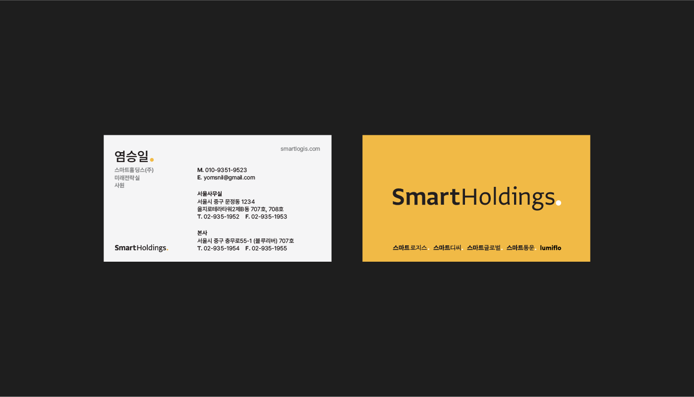
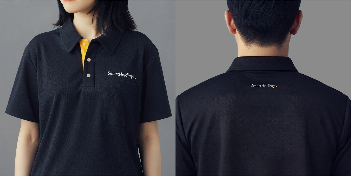
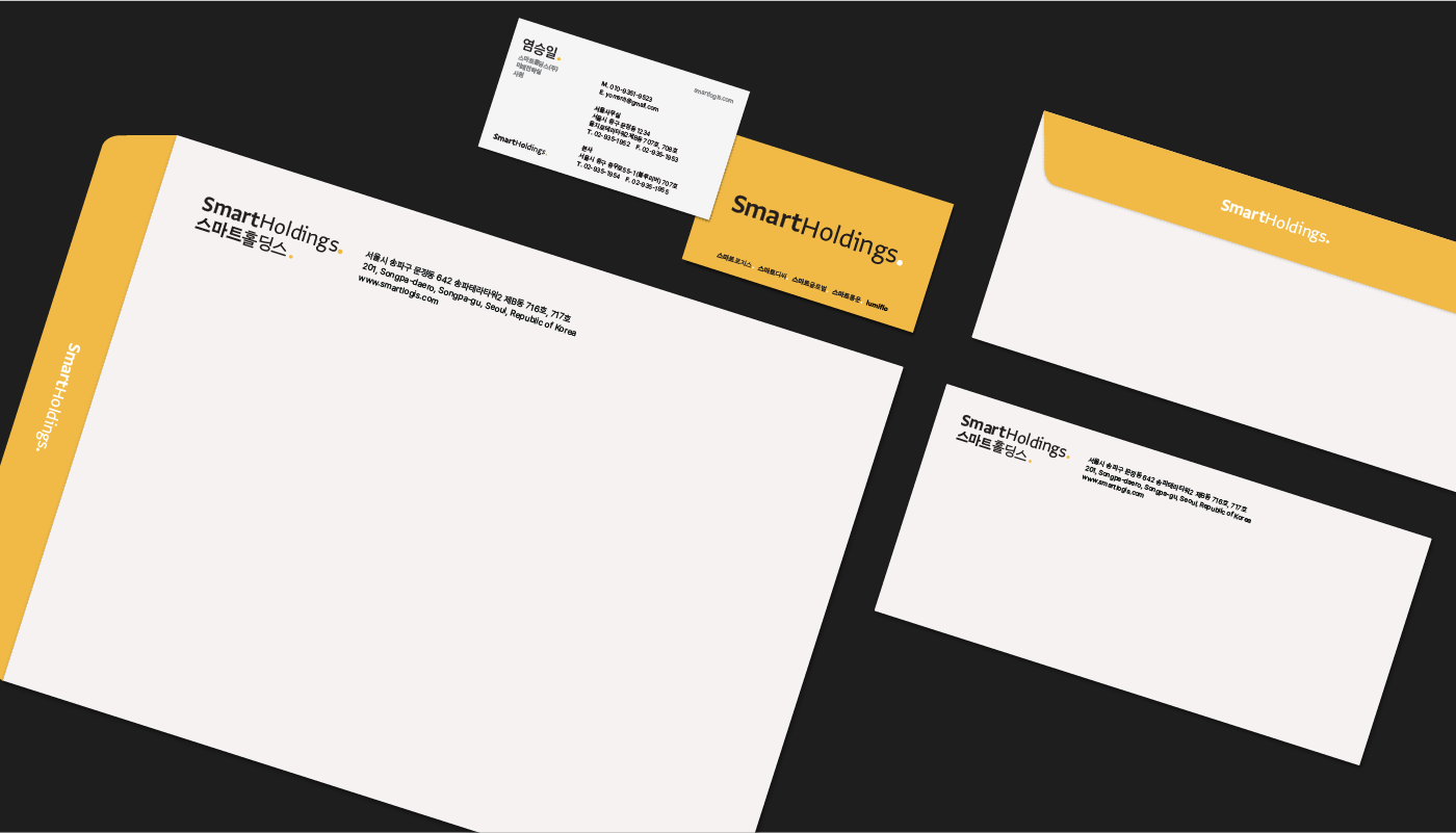
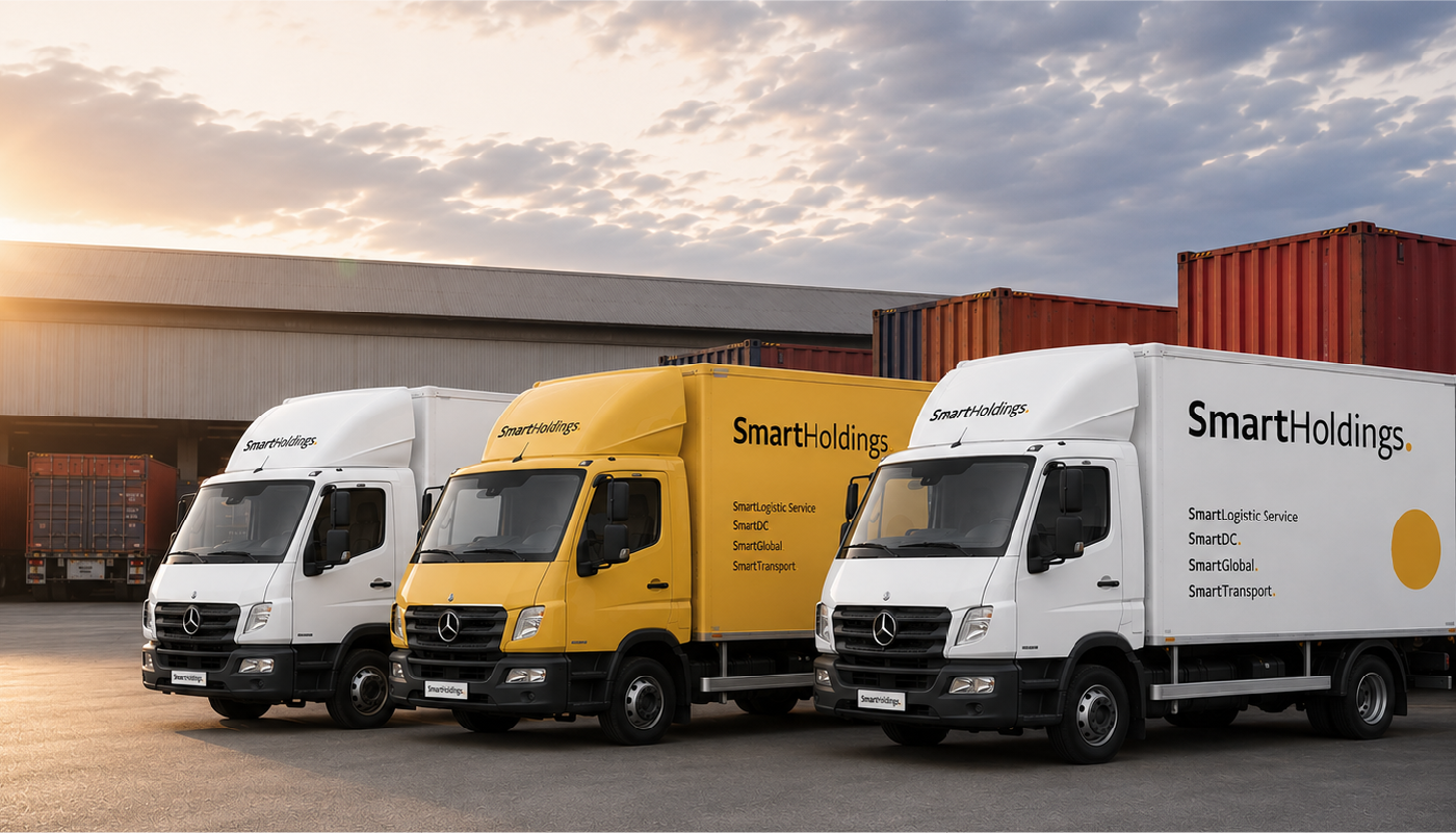
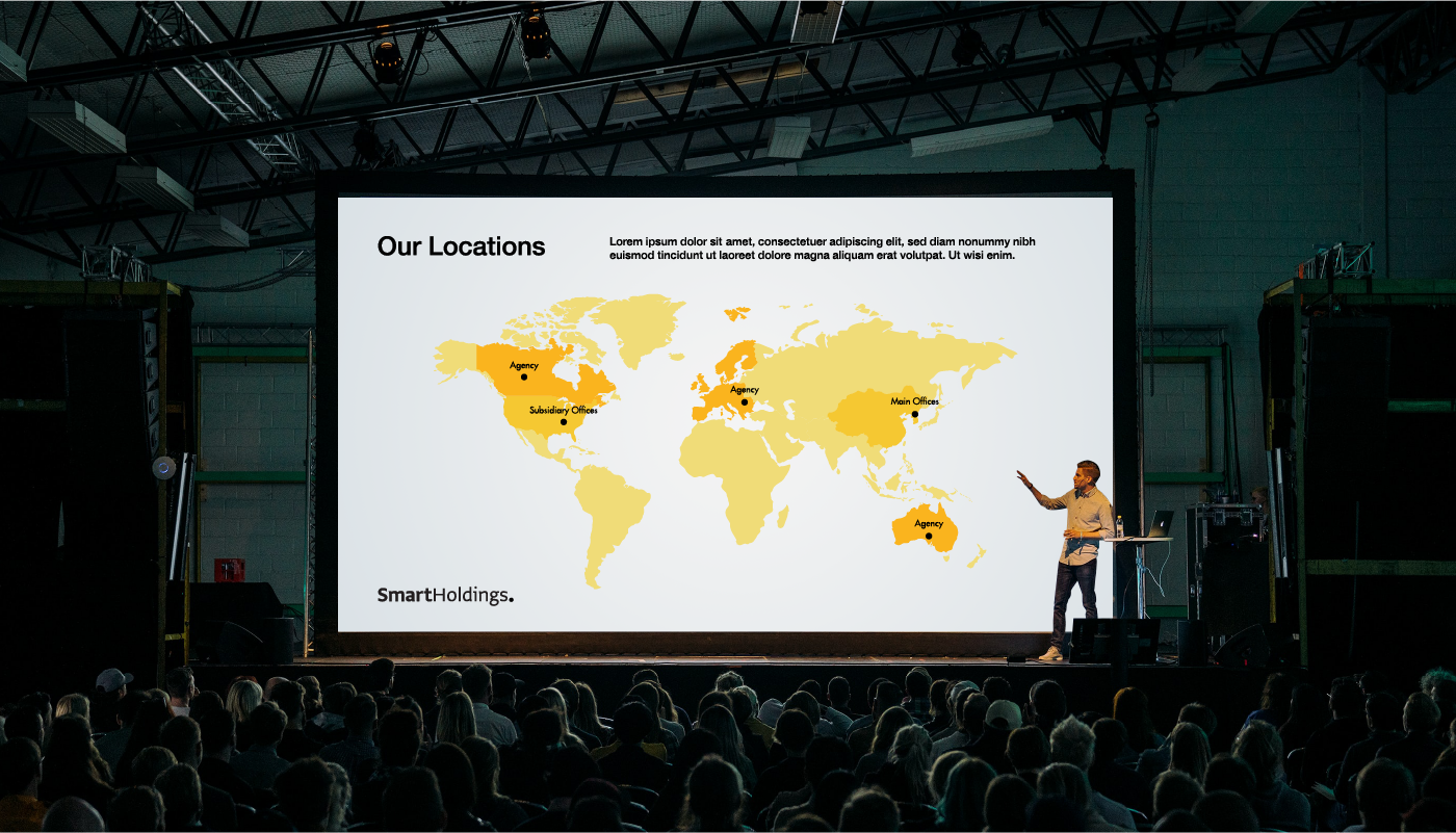
30여 년간 물류 및 부동산 개발 분야에서 전문성을 다져온 스마트홀딩스(주)는 최근 지주회사 체제 전환과 계열사 확장을 단행했습니다.
30여 년간 물류 및 부동산 개발 분야에서 전문성을 다져온 스마트홀딩스(주)는 최근 지주회사 체제 전환과 계열사 확장을 단행했습니다.
이에 발맞추어, 다각화된 사업 영역을 포괄하는 통합 그룹 아이덴티티 디자인을 의뢰해주셨습니다.
Smart Holdings Co., Ltd., which has built expertise in logistics and real estate development for over 30 years, recently transitioned to a holding company structure and expanded its affiliates. In alignment with this, they have commissioned us to design an integrated group identity encompassing diversified business areas.
Smart Holdings Co., Ltd., which has built expertise in logistics and real estate development for over 30 years, recently transitioned to a holding company structure and expanded its affiliates. In alignment with this, they have commissioned us to design an integrated group identity encompassing diversified business areas.
SLS는 근면을 상징하는 꿀벌의 컬러 아이덴티티를 브랜드 컬러로 가지고 있습니다.
새로운 그룹 아이덴티티에도 이를 계승하여, 우리는 브랜드의 유산과 정체성을 연속성 있게 디자인했습니다.
SLS has a brand color identity inspired by the honeybee, which symbolizes diligence. Carrying this over into the new group identity, we designed a continuous connection to the brand's heritage and identity.
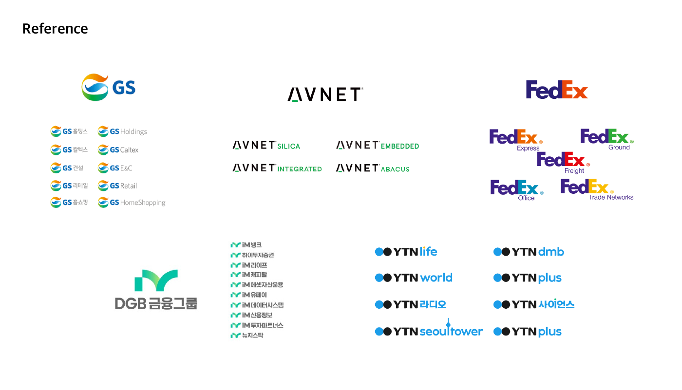
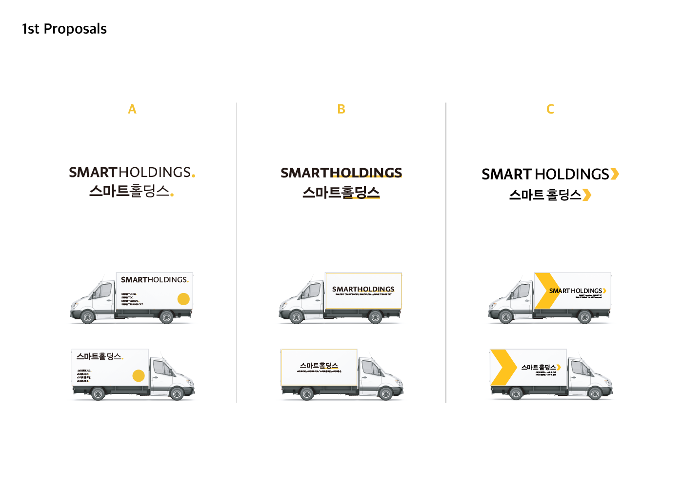
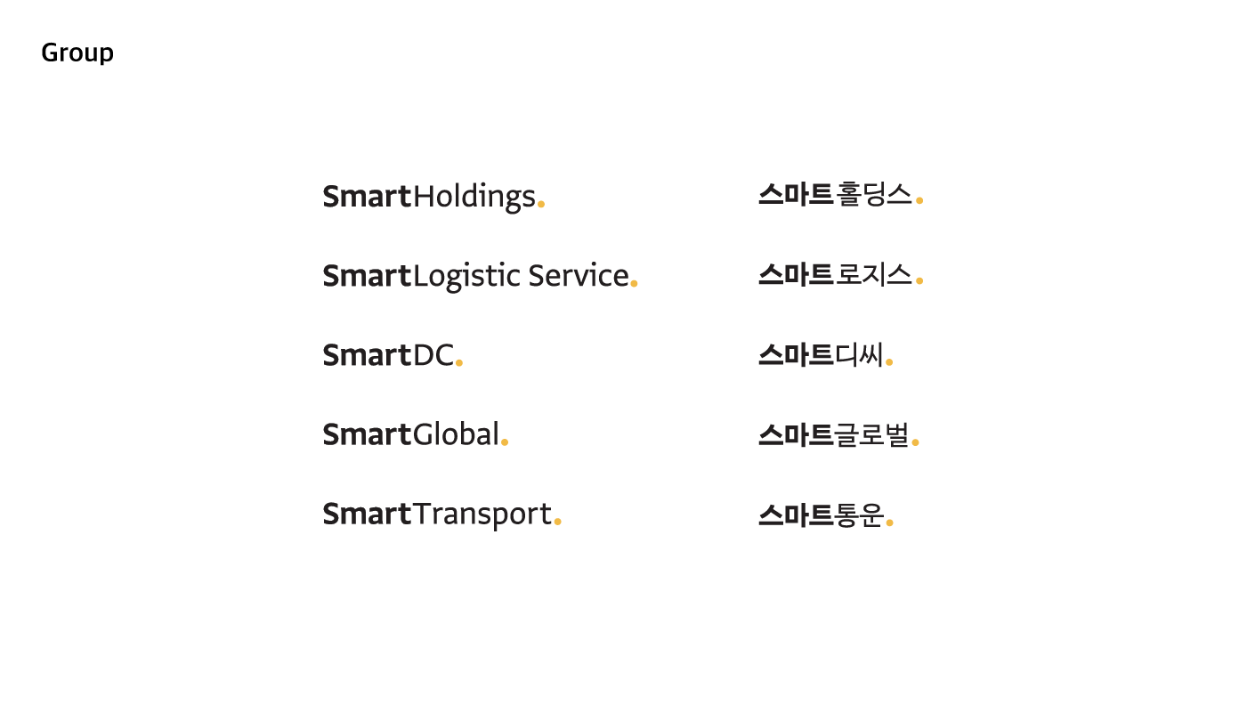
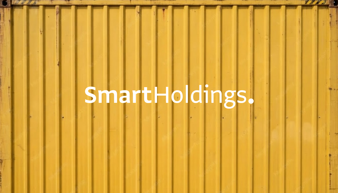
새로운 사명은 스마트와 계열사 분야의 조합 형태로, 'Smart'와 뒷부분을 구분하여 읽히도록 디자인했습니다. 신뢰감을 주면서도 지나치게 무겁지 않은 휴머니스트 산스 서체를 선택했습니다. 디자인 시안은 기존 브랜드 컬러를 이용하고 살려 3종 콘셉트로 도출했습니다.
A안은 비즈니스 솔루션의 마침표를 찍다는 의미로 검은 글씨에 노란색 마침표로 디자인했습니다.
B안은 동일 폰트두께에 사업 분야만 밑줄을 쳐서 해당 영역을 시각적으로 강조하는 디자인입니다.
C안은 화살표를 통해 사업의 근간이 되는 물류와 스피드, 혁신을 상징는 콘셉트를 잡았습니다. 이 중 클라이언트는 A안을 선택했습니다.
A안은 비즈니스 솔루션의 마침표를 찍다는 의미로 검은 글씨에 노란색 마침표로 디자인했습니다.
B안은 동일 폰트두께에 사업 분야만 밑줄을 쳐서 해당 영역을 시각적으로 강조하는 디자인입니다.
C안은 화살표를 통해 사업의 근간이 되는 물류와 스피드, 혁신을 상징는 콘셉트를 잡았습니다. 이 중 클라이언트는 A안을 선택했습니다.
The new company name is a combination of "Smart" and the affiliate's field, and we designed it so that "Smart" and the latter part can be read distinctly. We chose a humanist sans-serif typeface that conveys a sense of trust without being overly heavy, and we developed three design concepts leveraging and reviving the existing brand color.
Concept A was designed with black text and a yellow period, symbolizing putting a period to business solutions.
Concept B is a design that visually emphasizes specific areas by applying underlines only to the business sectors while maintaining the same font weight.
Concept C captured a concept symbolizing logistics, speed, and innovation—the foundation of the business—through arrows. Among these, the client selected Concept A.
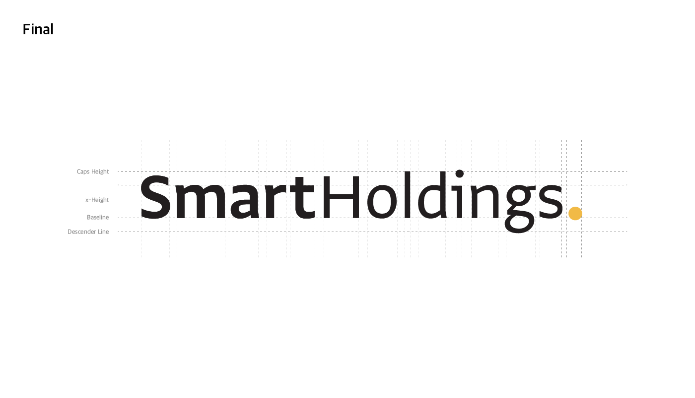
로고를 대문자로 하면 시각적 주목도가 높고 강인한 브랜드 이미지와 신뢰감을 줄 수 있는 반면, 소문자로 하면 친근하고 부드러운 인상을 주며 모던하고 트렌디한 분위기를 연출할 수 있습니다. 이번 프로젝트에서 클라이언트가 소문자 로고를 원함에 따라, 최종적으로는 소문자 워드마크를 최종 로고로 확정했습니다.
While using uppercase letters for a logo can provide high visual prominence, a strong brand image, and a sense of trust, using lowercase letters gives a friendly and soft impression while creating a modern and trendy atmosphere. Since the client wanted a lowercase logo for this project, we ultimately finalized the lowercase wordmark as the final logo.