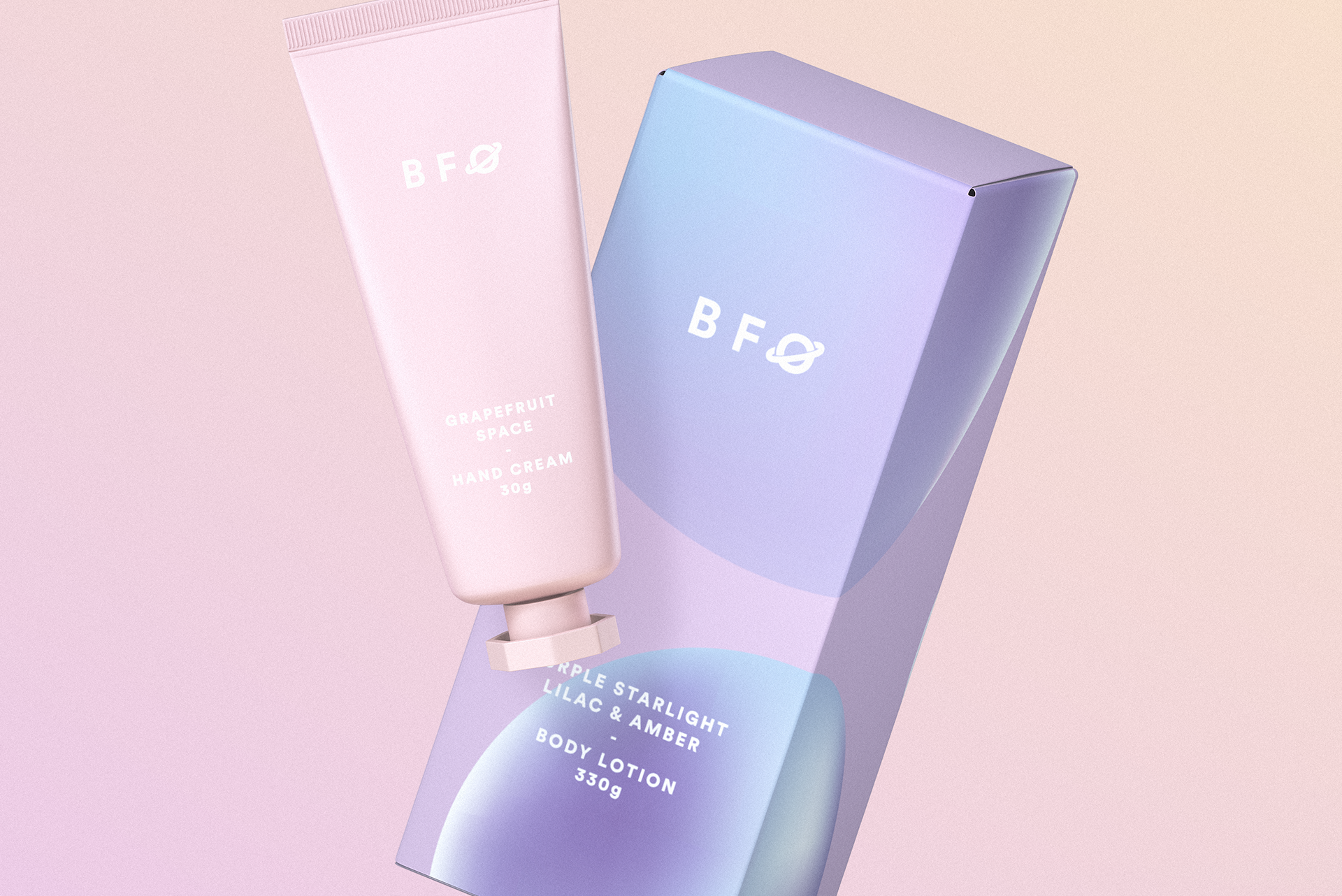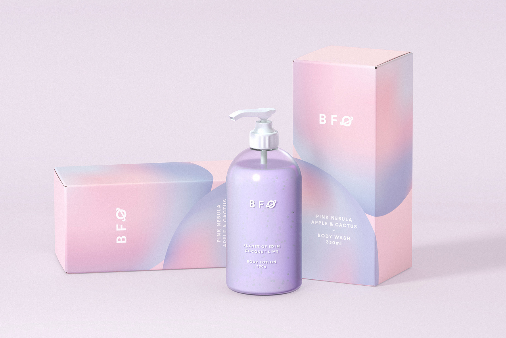

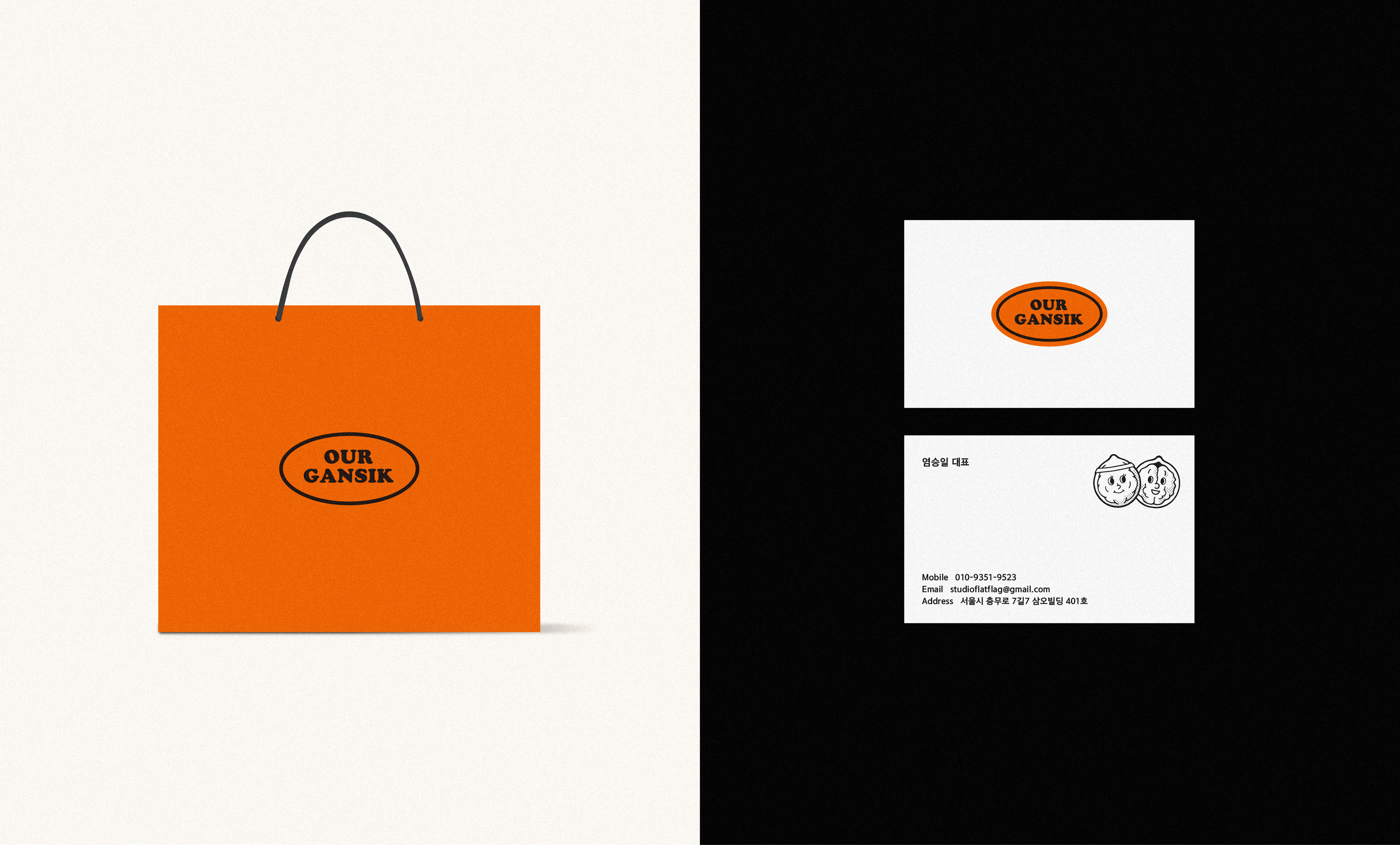
Background
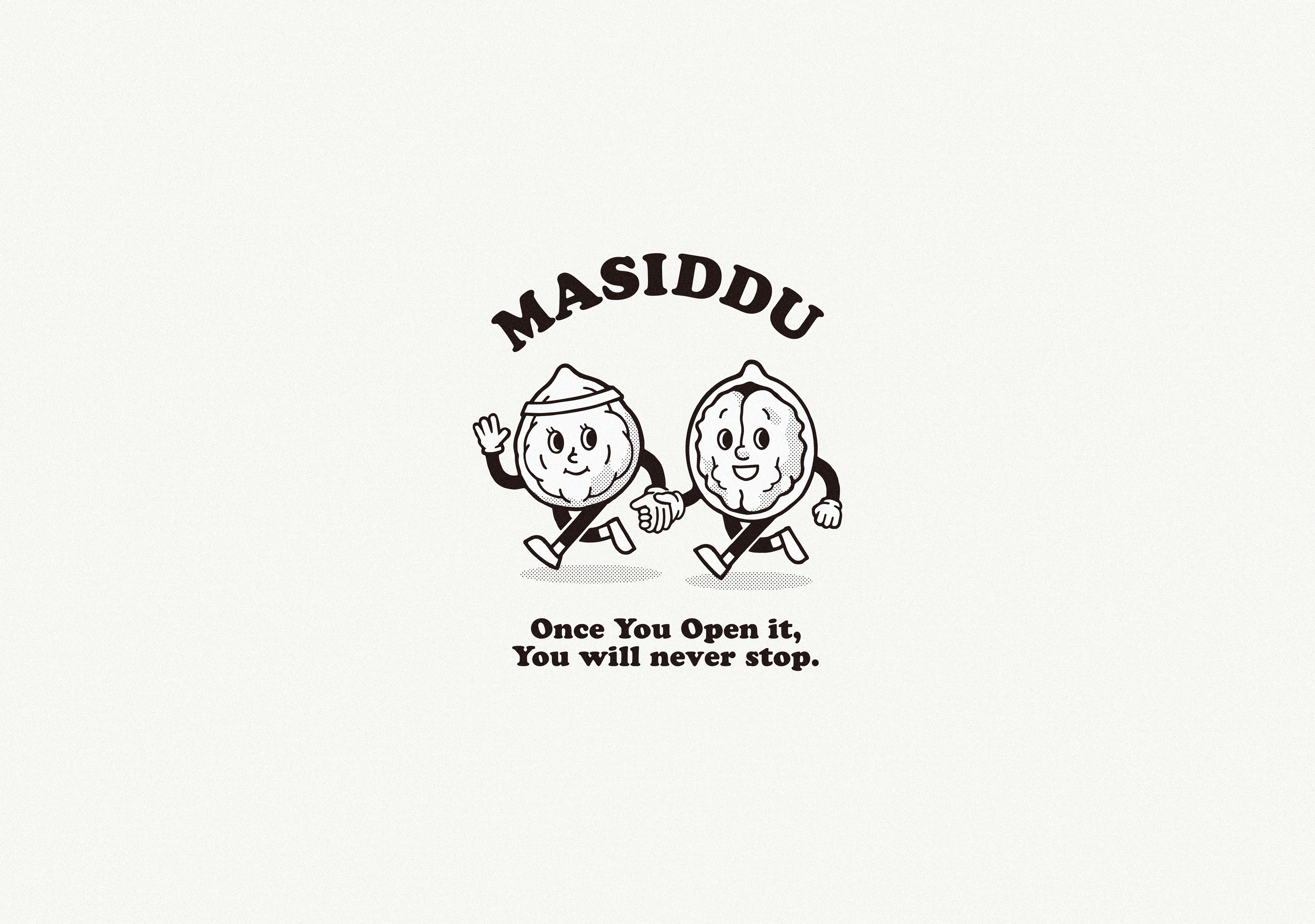
기존의 맛있두는 붓글씨 워드마크로 한국의 전통간식으로서의 정체성을 표방하고 있었습니다. 클라이언트는 브랜드에 새로운 변화를 원하셨고, 이후 전개하시는 품목과 타겟 연령층을 들어보고, 기존보다 젊은 감각의 브랜드로의 리뉴얼을 권해드렸습니다. 주원료가 호두였기 때문에 호두를 캐릭터로 하고, 영문표기 위주의 디자인으로 리뉴얼 방향성을 확립했습니다.
The old Masiddu’s brand design was a calligraphic word mark which its attempt was to express the identity of a Korean traditional snack. Our client wanted a new change for the brand, so after thoroughly discussing the target age group the direction they had in mind we offered a brand renewal with a younger sense of taste than the previous design. Since the main ingredient is a walnut, we made a character out of it and further focused on using English word marks generally.
The old Masiddu’s brand design was a calligraphic word mark which its attempt was to express the identity of a Korean traditional snack. Our client wanted a new change for the brand, so after thoroughly discussing the target age group the direction they had in mind we offered a brand renewal with a younger sense of taste than the previous design. Since the main ingredient is a walnut, we made a character out of it and further focused on using English word marks generally.
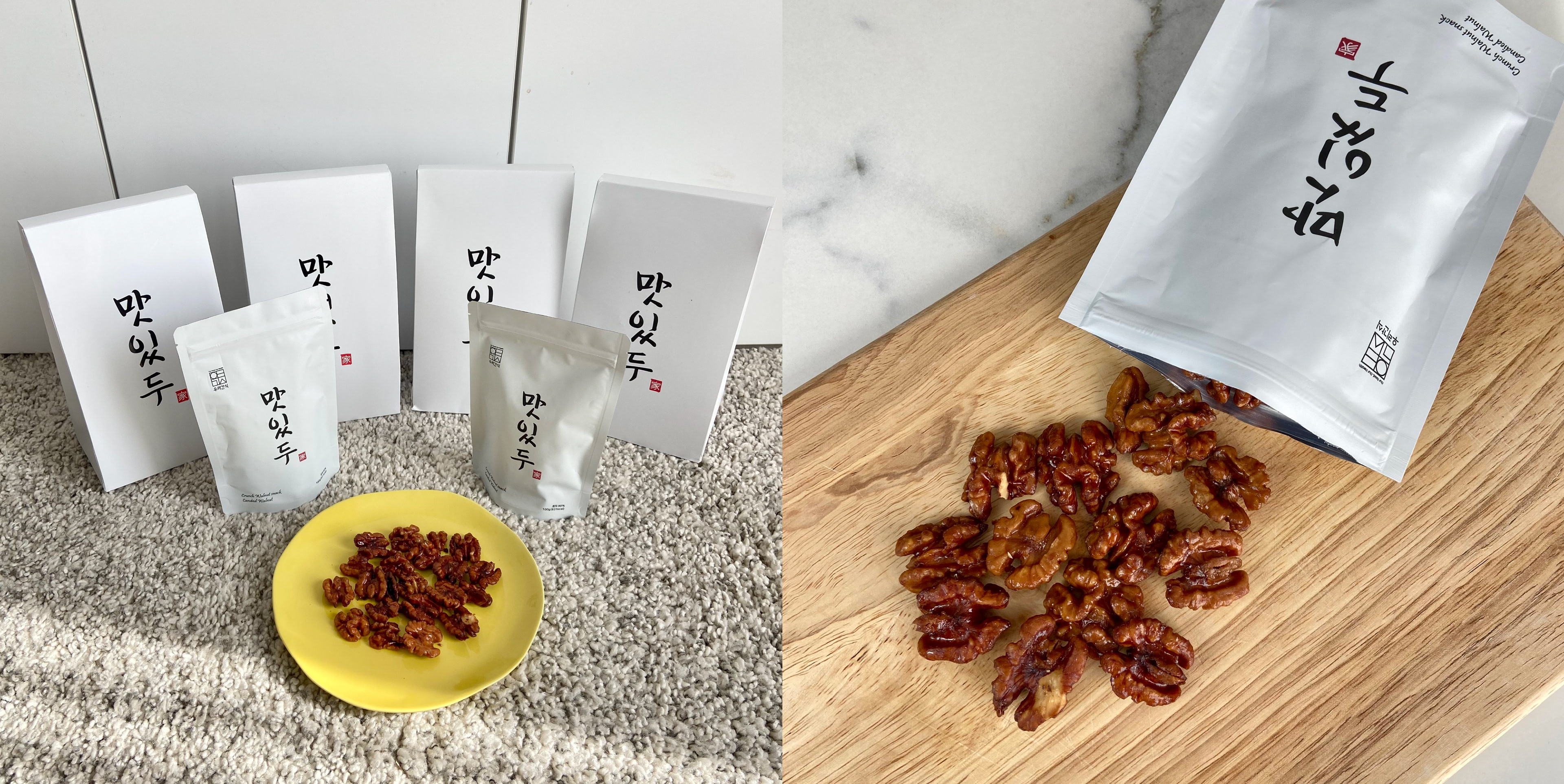
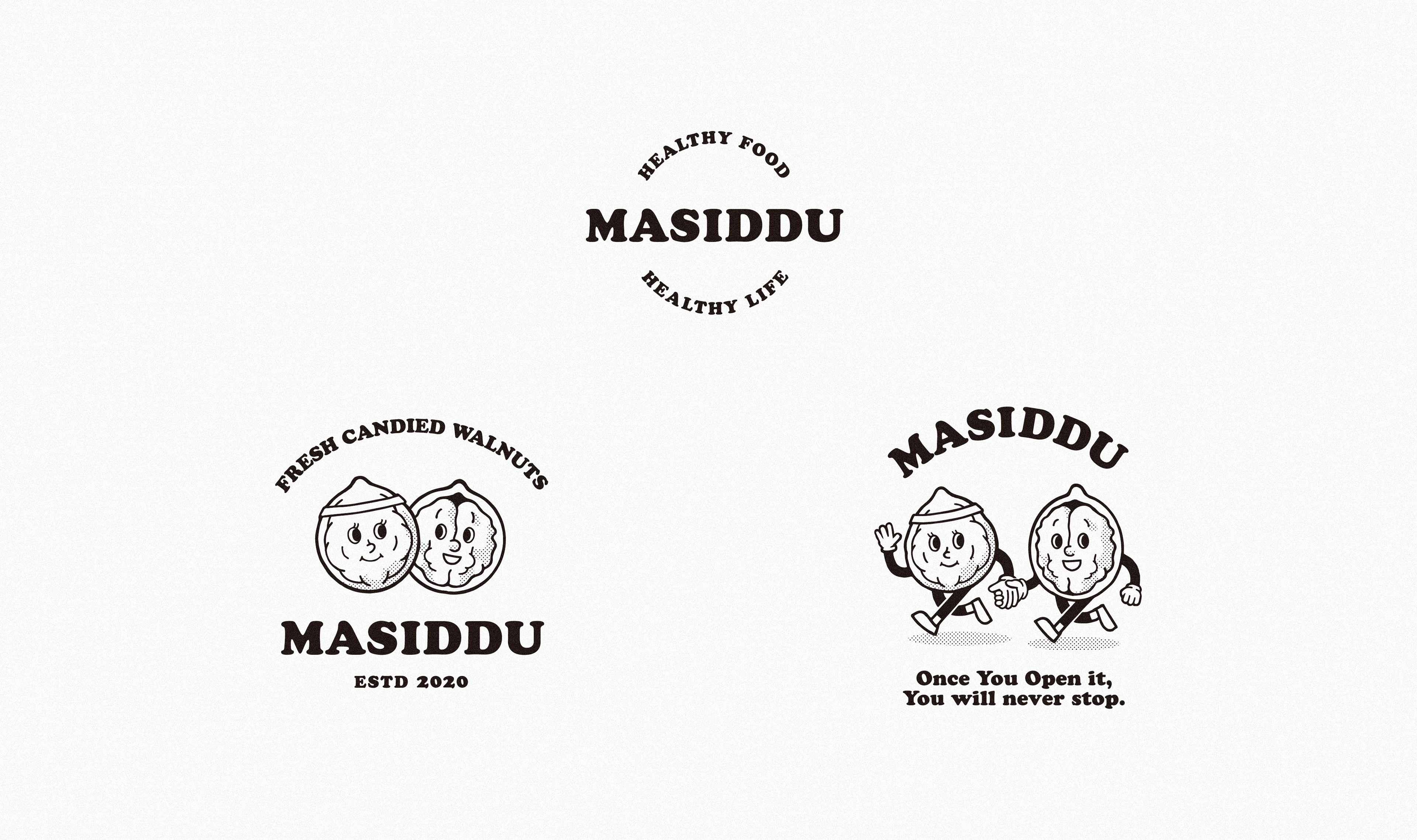
Illustration & Slogan
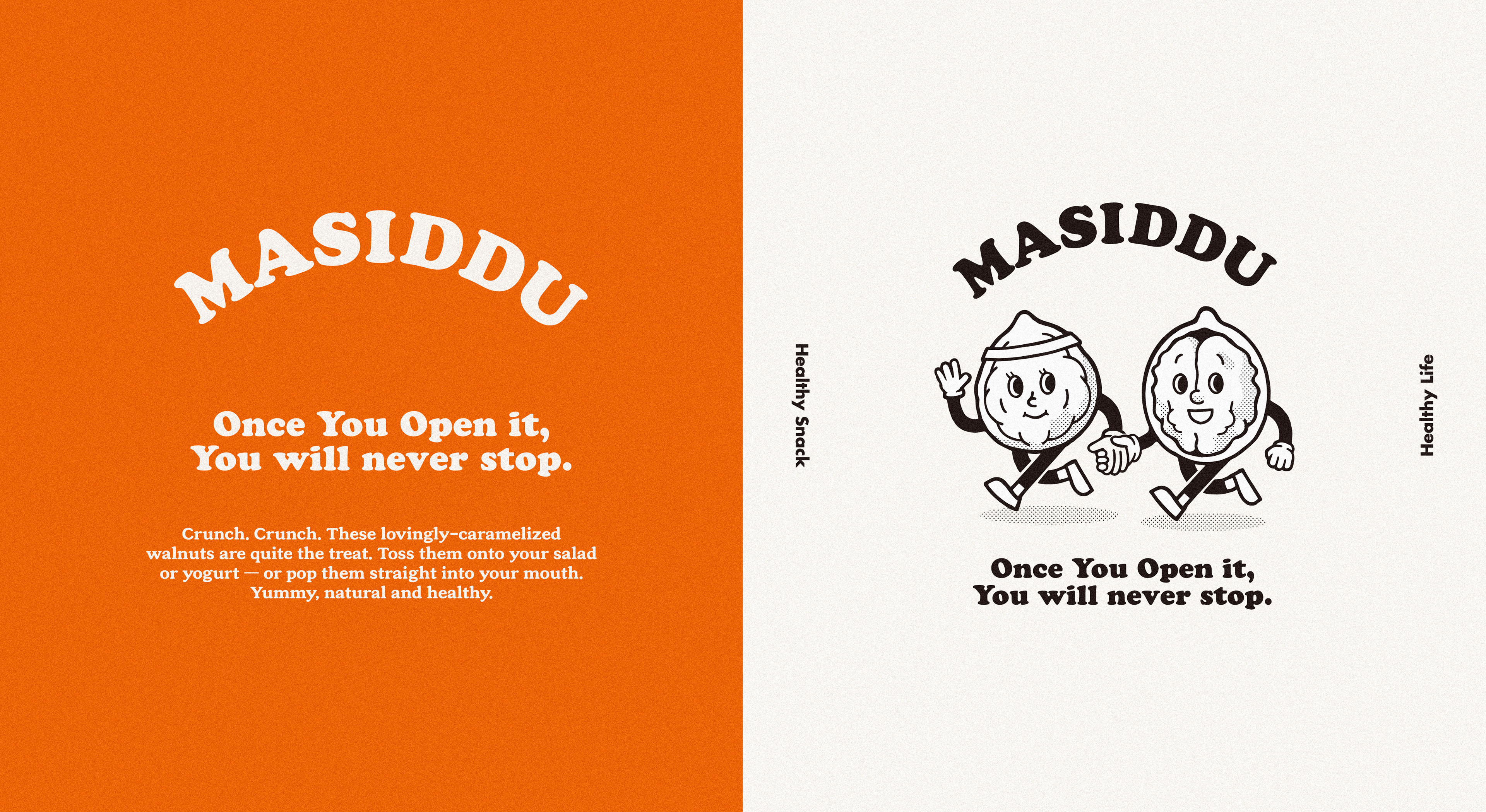
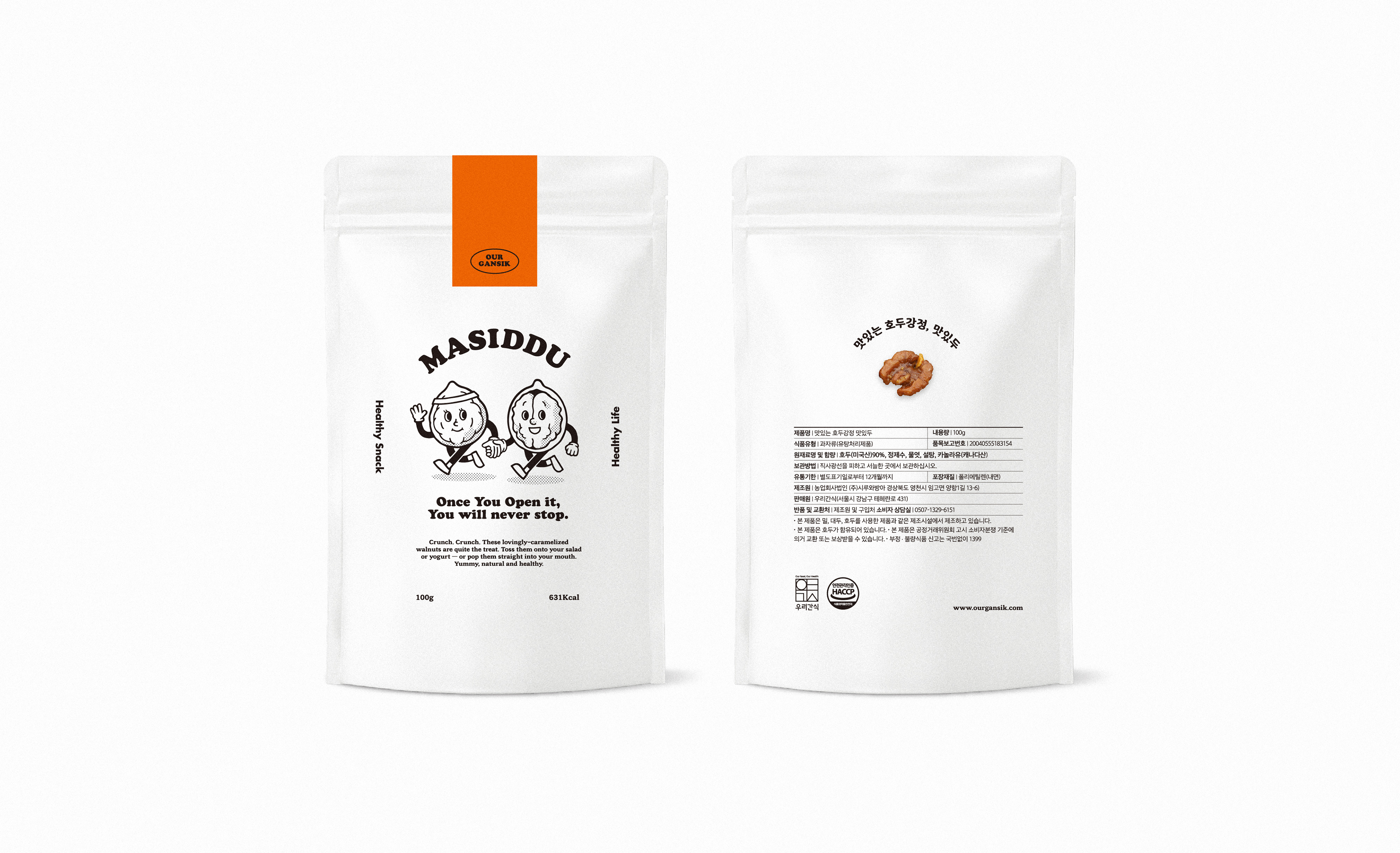
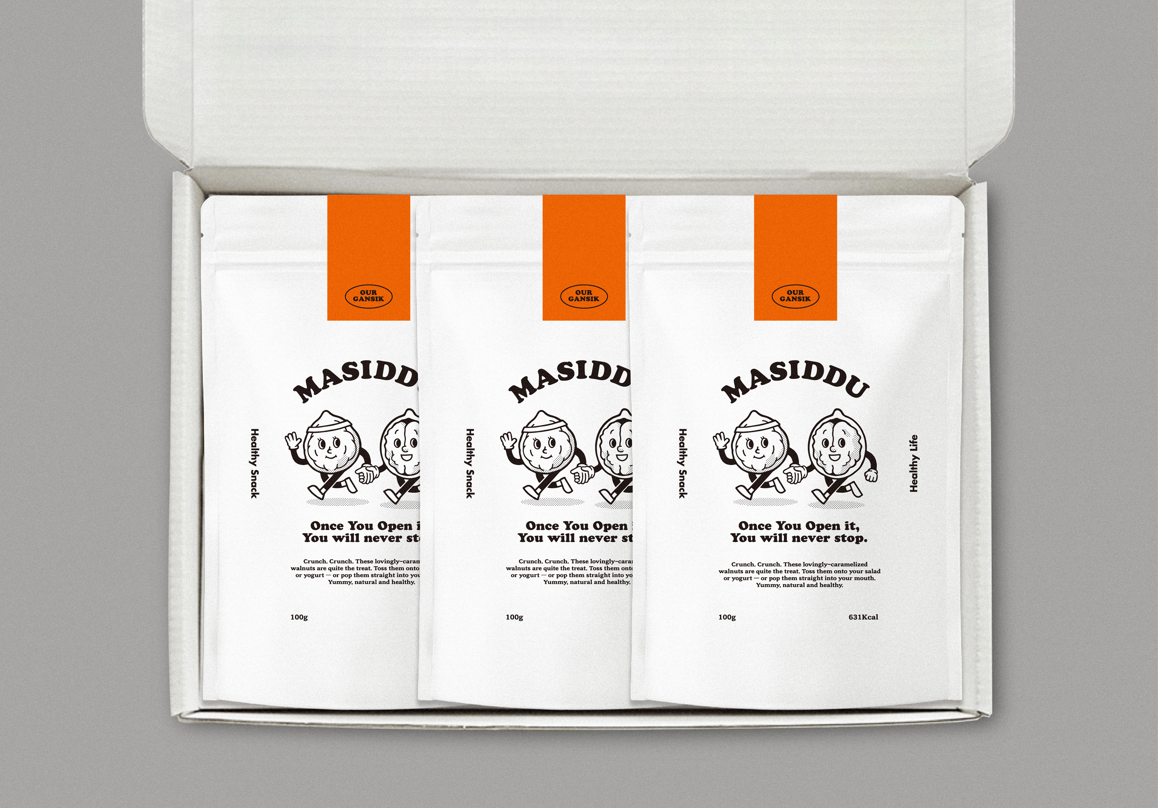
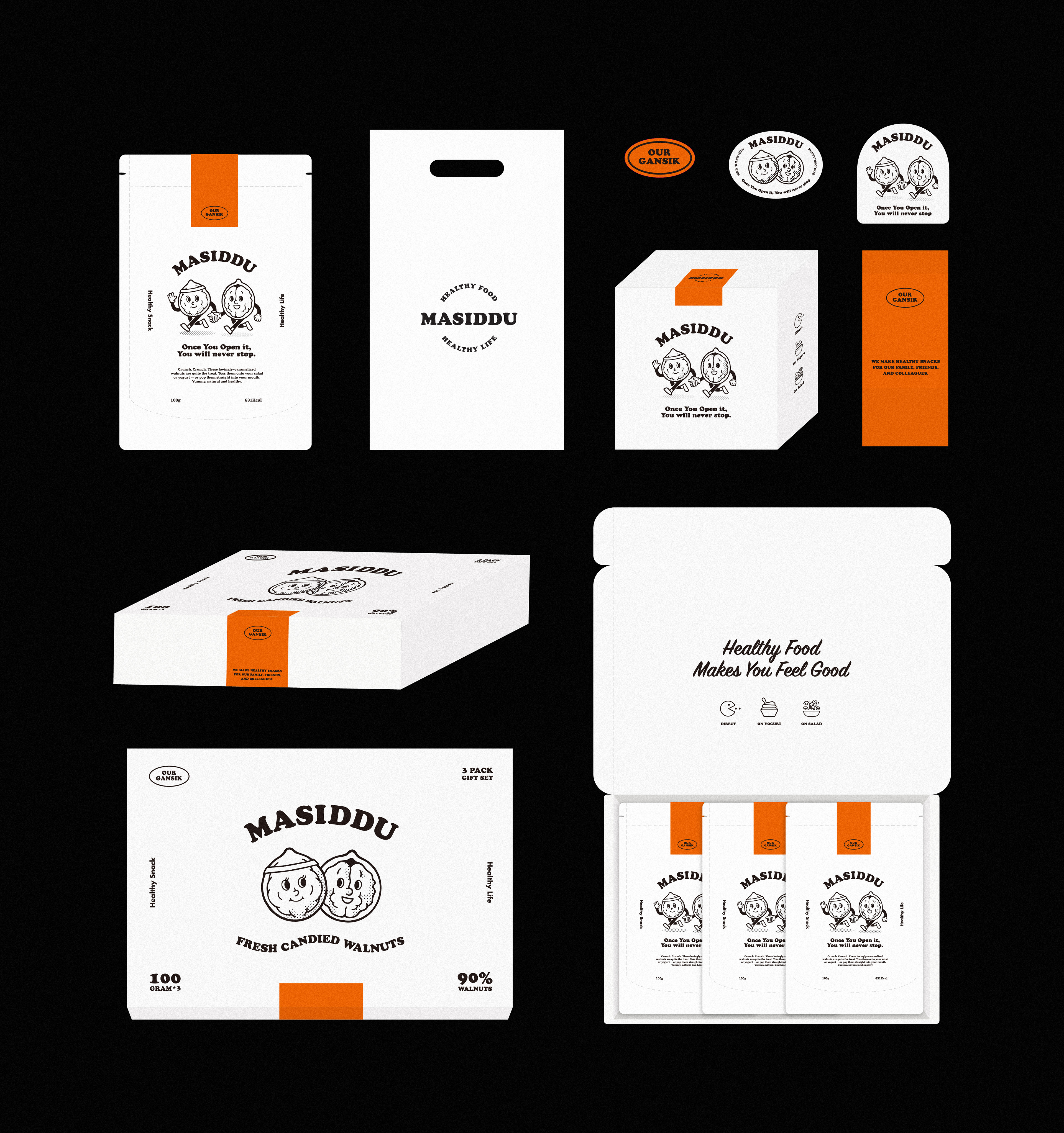
호두라는 원물 자체가 울퉁불퉁하여 다소 징그럽게 느껴질 수 있는 점이 고민이었지만, 한번 보면 잊을 수 없는 강한 인상을 남기기 위해서 개성 넘치는 일러스트레이션 시안을 권해드렸습니다. Once you open it, You will never stop. 이라는 슬로건도 함께 제안해드렸습니다.
Our issue was that a raw walnut had a rough texture, so expressing it as an illustrative character be tricky for it can be expressed unpleasantly. However we were able to create a lively illustration design that would be memorable right at a first glance. We also offered a slogan, “Once you open it, You will never stop.”
Our issue was that a raw walnut had a rough texture, so expressing it as an illustrative character be tricky for it can be expressed unpleasantly. However we were able to create a lively illustration design that would be memorable right at a first glance. We also offered a slogan, “Once you open it, You will never stop.”
Contact
IG @studioflatflag
studioflatflag@gmail.com
copyrightⓒ 2021 All rights reserved by Studio Flat Flag