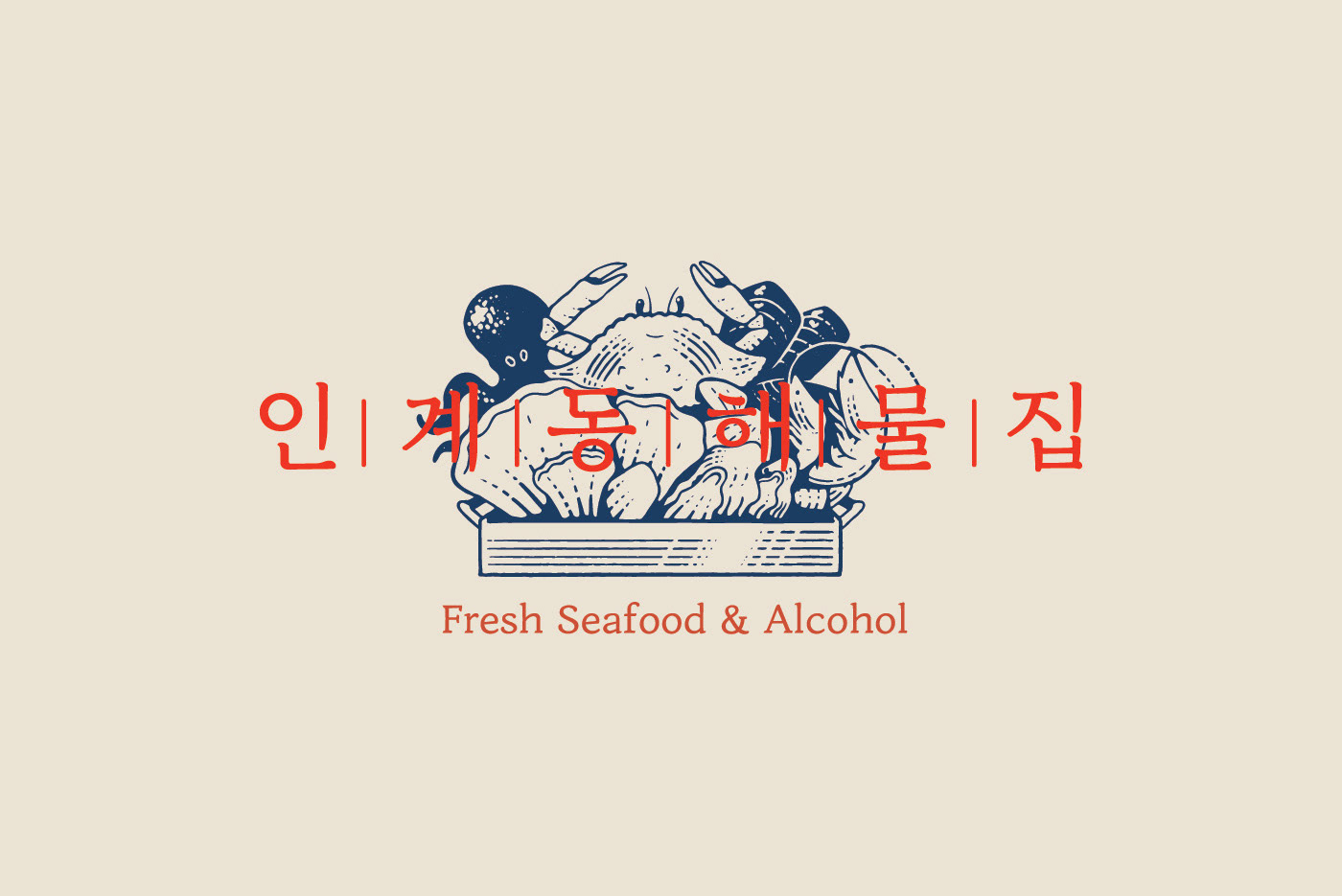

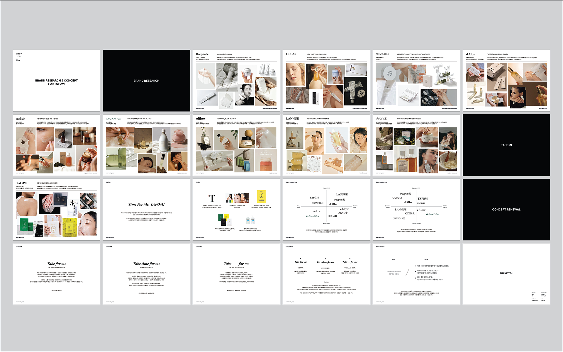
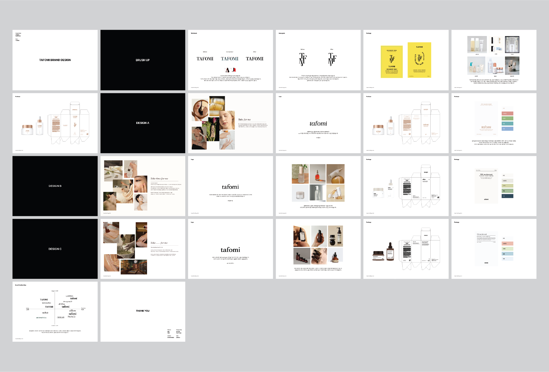
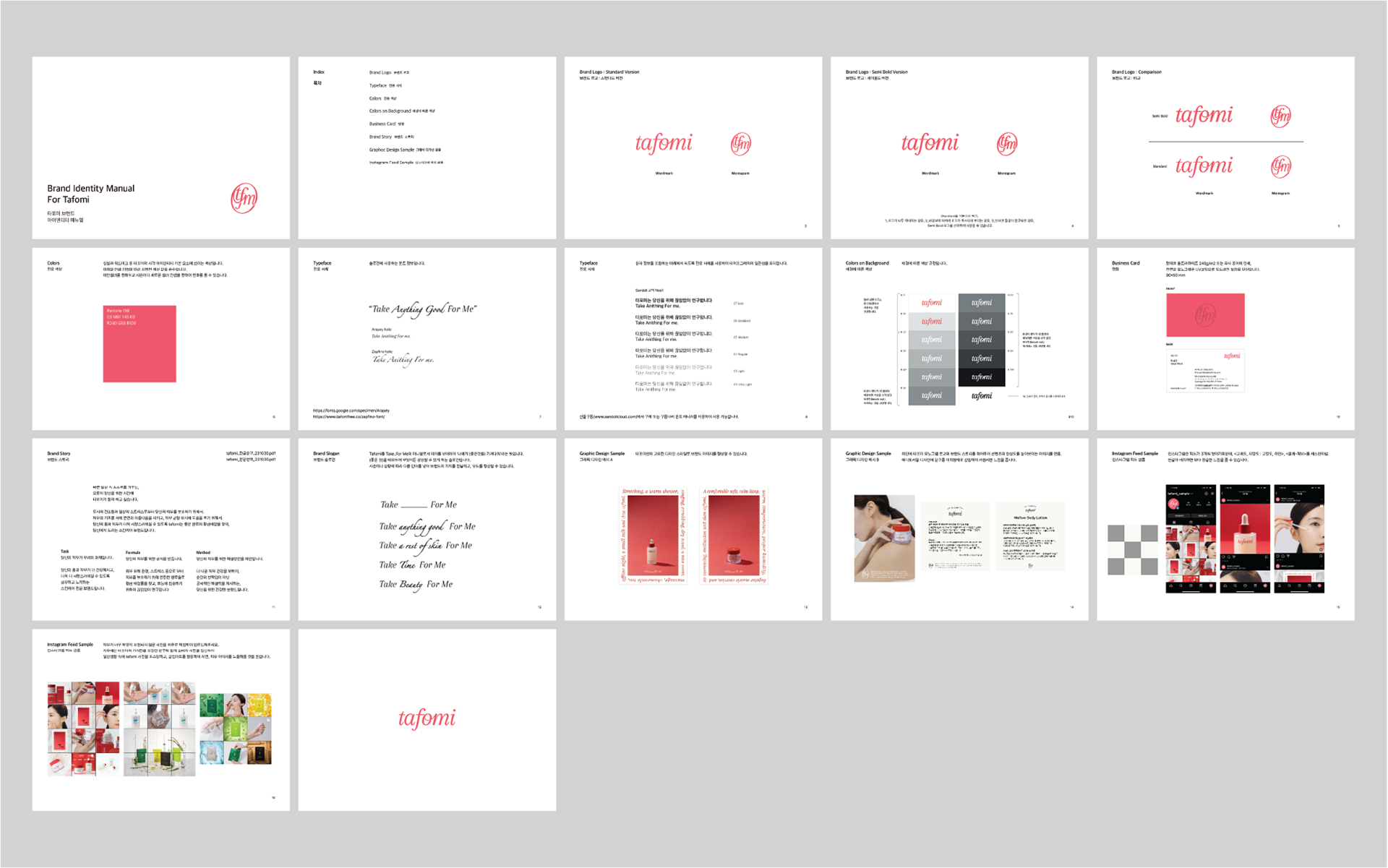
타포미 브랜드 리뉴얼: 유연하고 감각적인 변화
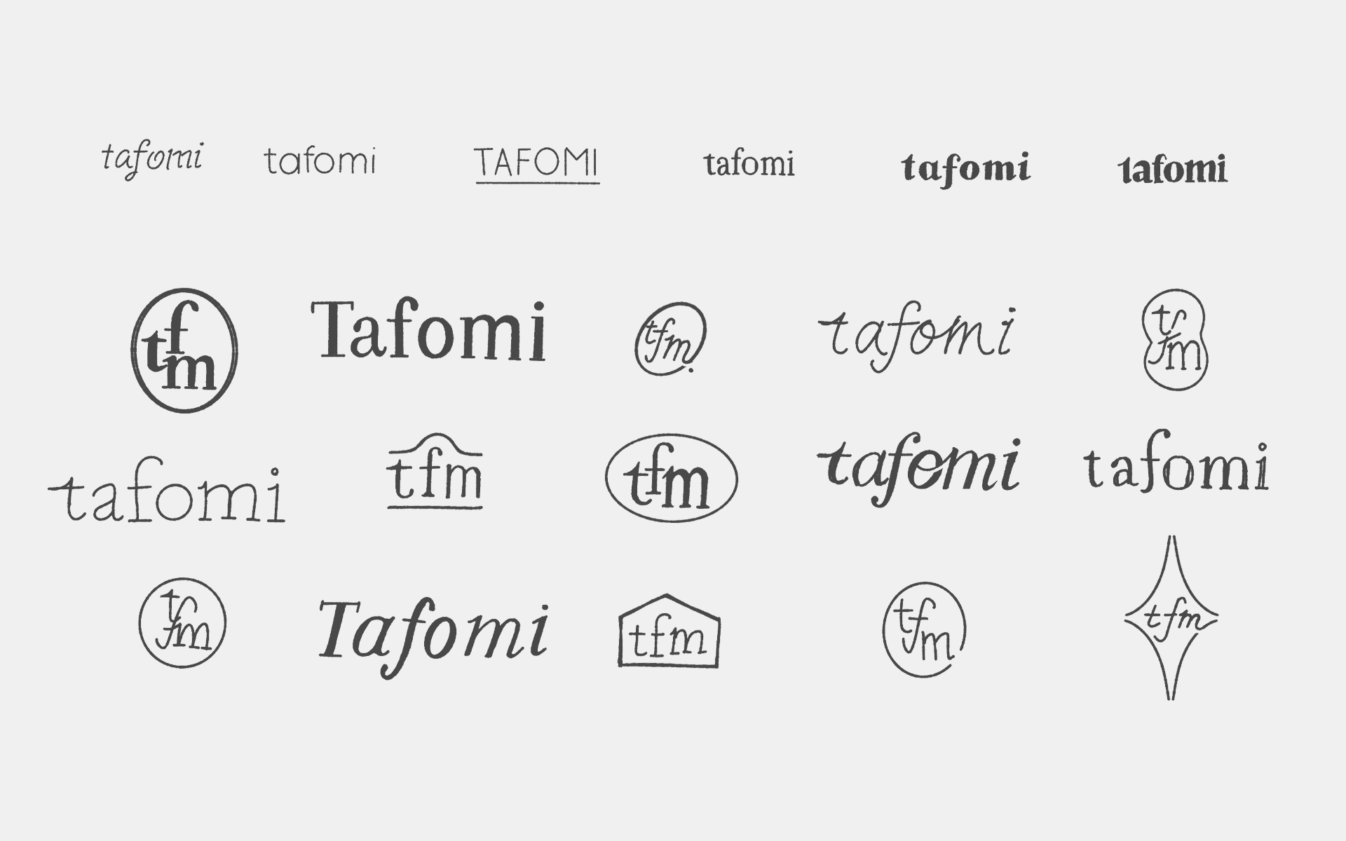
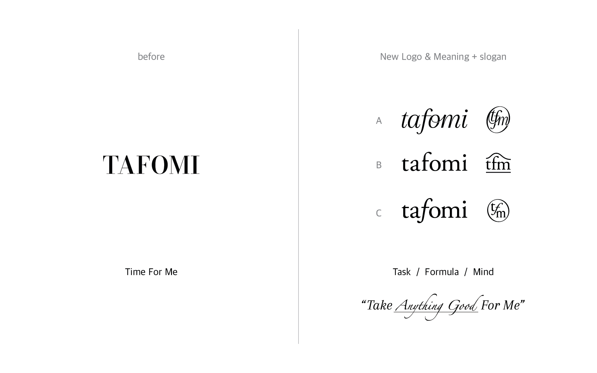
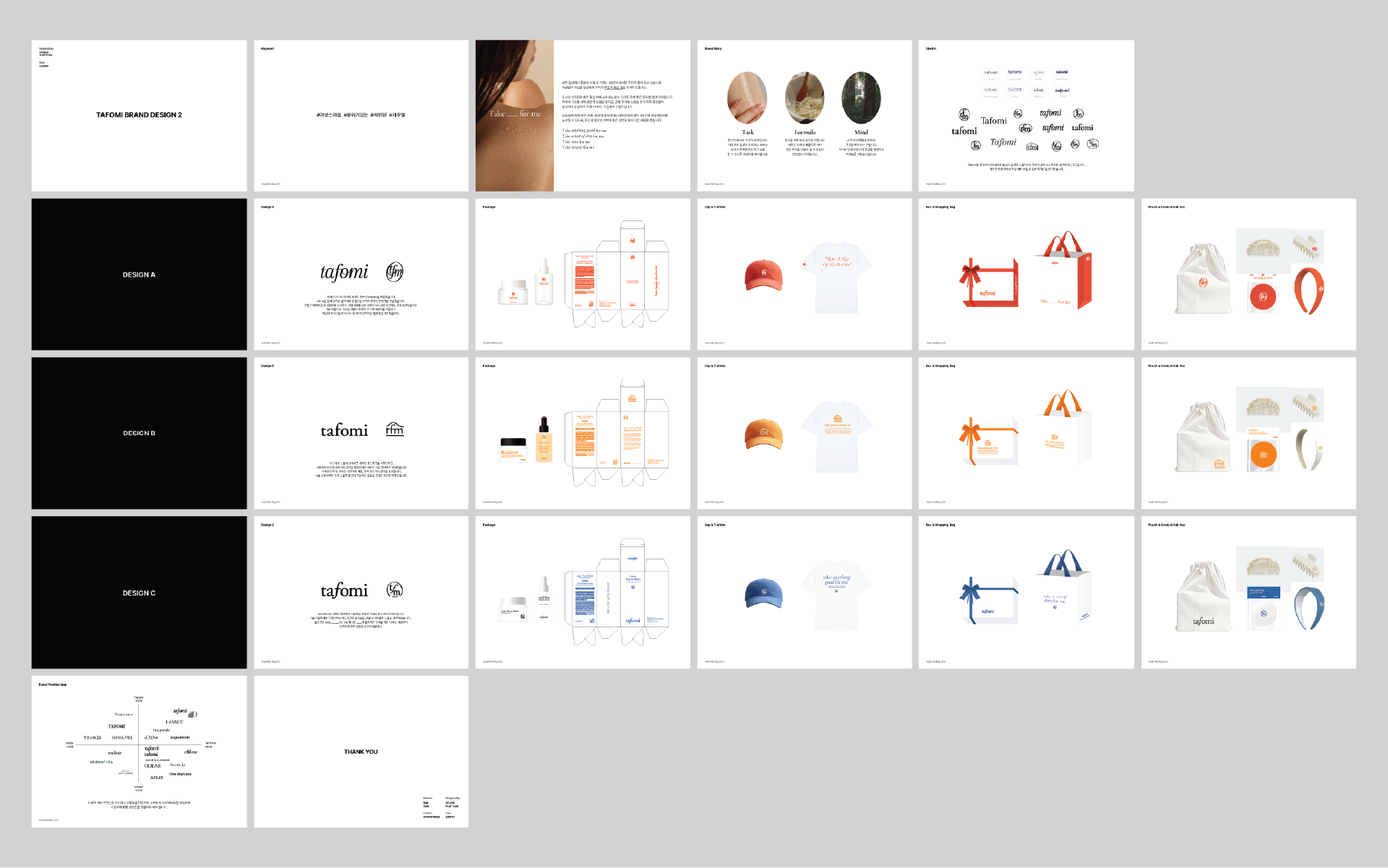
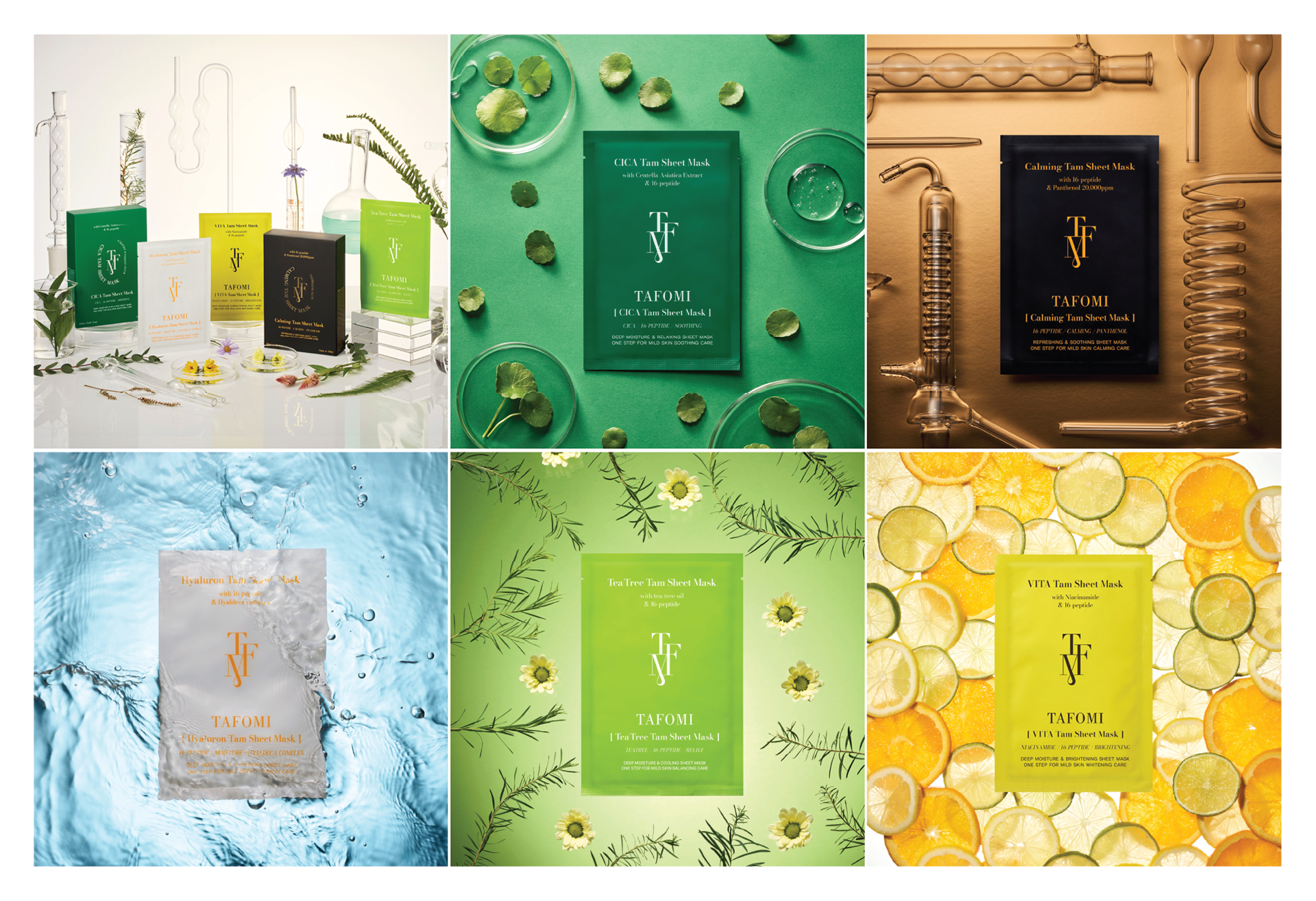
기존의 강직하고 보수적이었던 타포미의 브랜드 이미지를 보다 현대적이고 여성스러운 감성으로 탈바꿈하는 리뉴얼 프로젝트를 진행했습니다. 동종 업계의 디자인 트렌드 분석을 바탕으로 최적의 브랜드 방향성을 도출하였으며, 이에 맞춰 로고 디자인부터 브랜드 스토리, 패키지 시스템, 어플리케이션까지 통합적인 비주얼 아이덴티티를 구축했습니다. 특히 새로운 브랜드 무드를 극대화하기 위해 직접 포토슈팅을 기획·진행하여 완성도 높은 브랜드 경험을 설계했습니다.
Tapomi Brand Renewal: Crafting a Sophisticated Identity
We undertook a comprehensive brand renewal for Tapomi, transitioning its previously rigid image into a more fluid and feminine brand identity. By analyzing current industry design trends, we established a strategic direction that resonates with modern aesthetics. This project encompassed a full visual identity system—including a new logo, brand storytelling, packaging, and applications. To ensure a cohesive brand experience, we also directed a custom brand photoshoot to capture the refined essence of the new Tapomi.
Brand Concept & Slogan
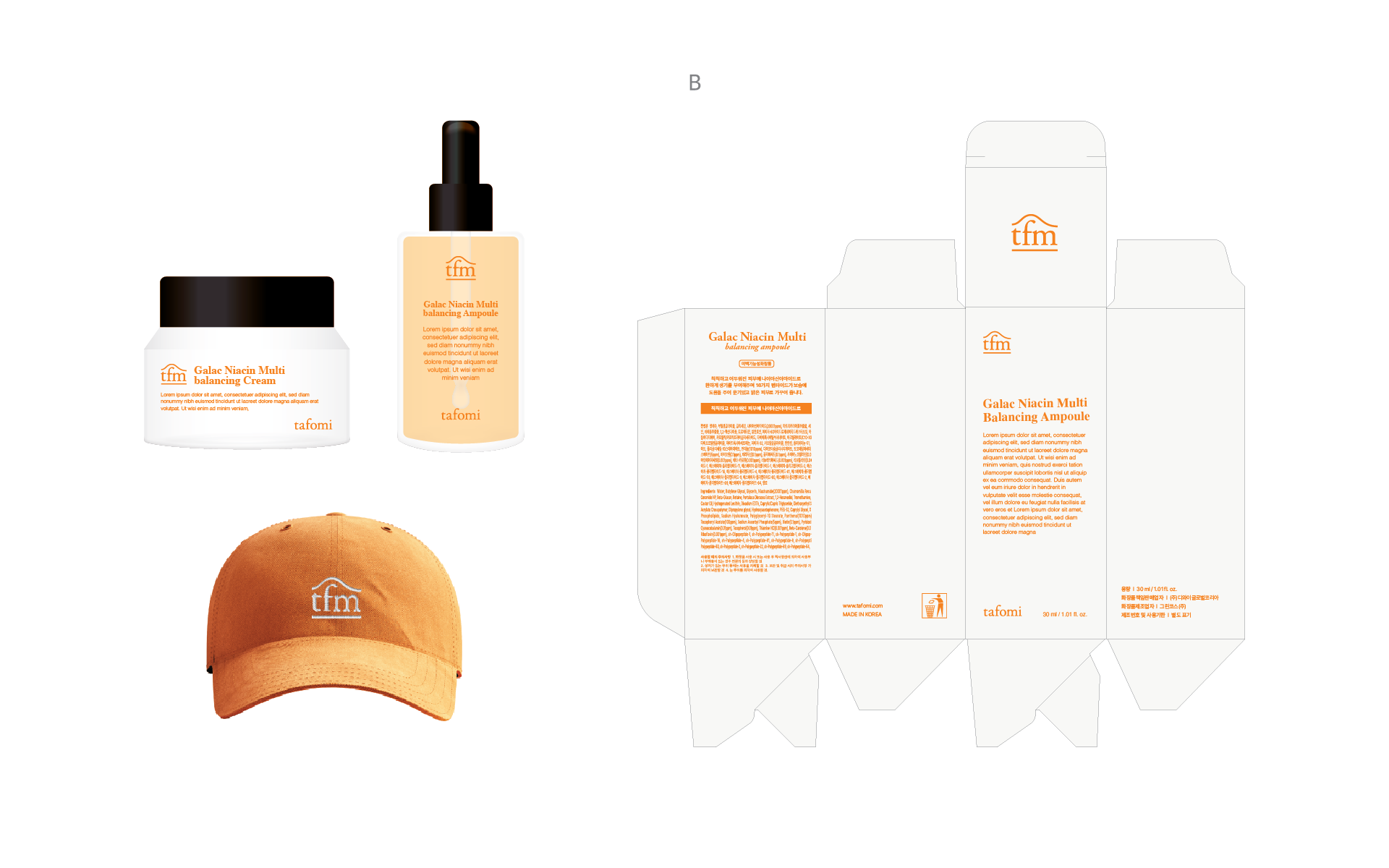
New Definition: T.F.M (Task, Formula, Mind)
단순한 피부 관리를 넘어 **Task(전문성), Formula(처방의 기술), Mind(내면의 케어)**라는 세 가지 핵심 키워드를 통해 피부 미용에 대한 새로운 가치를 부여했습니다. 이는 타포미가 추구하는 진화된 브랜드 철학의 근간이 됩니다.
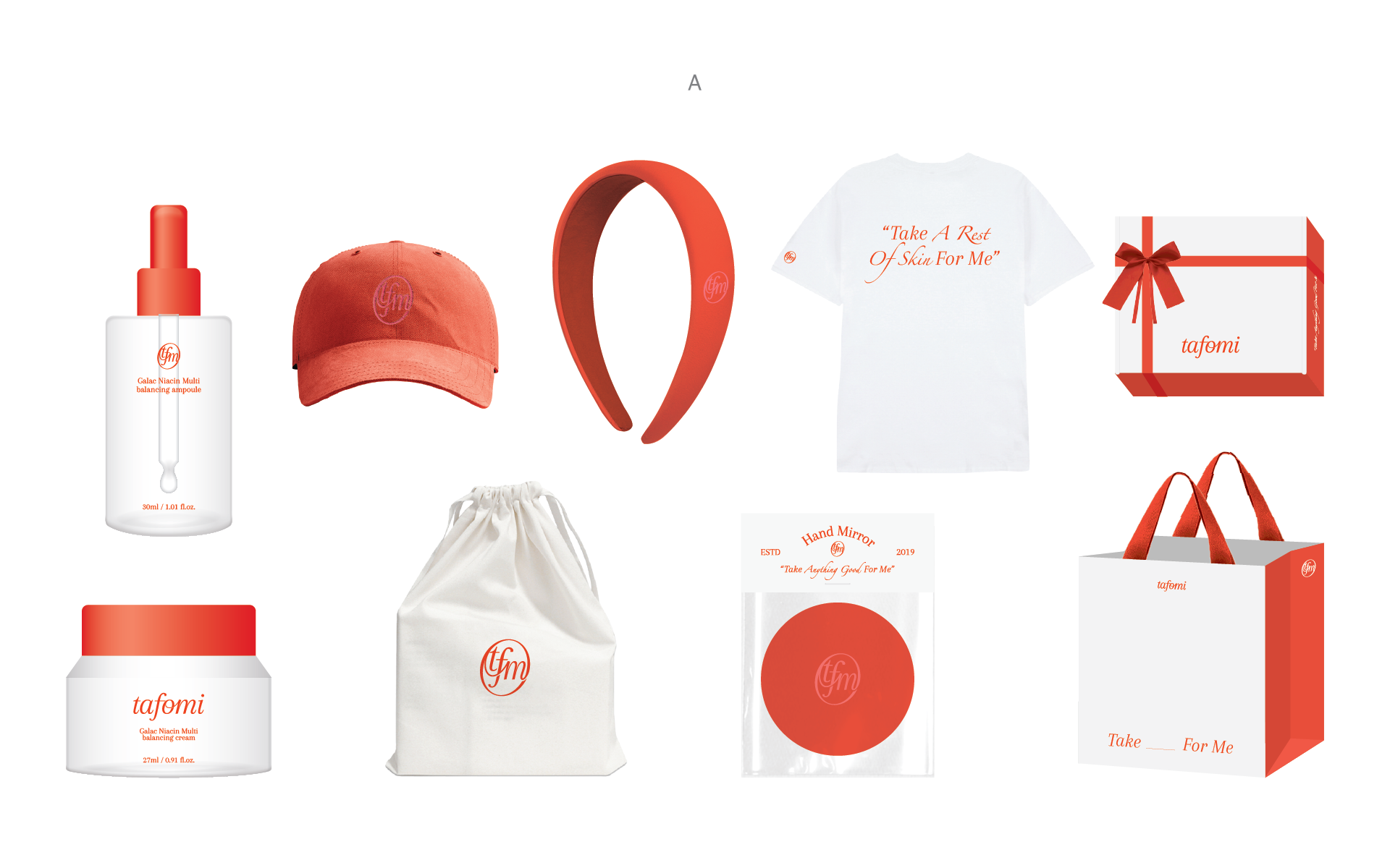
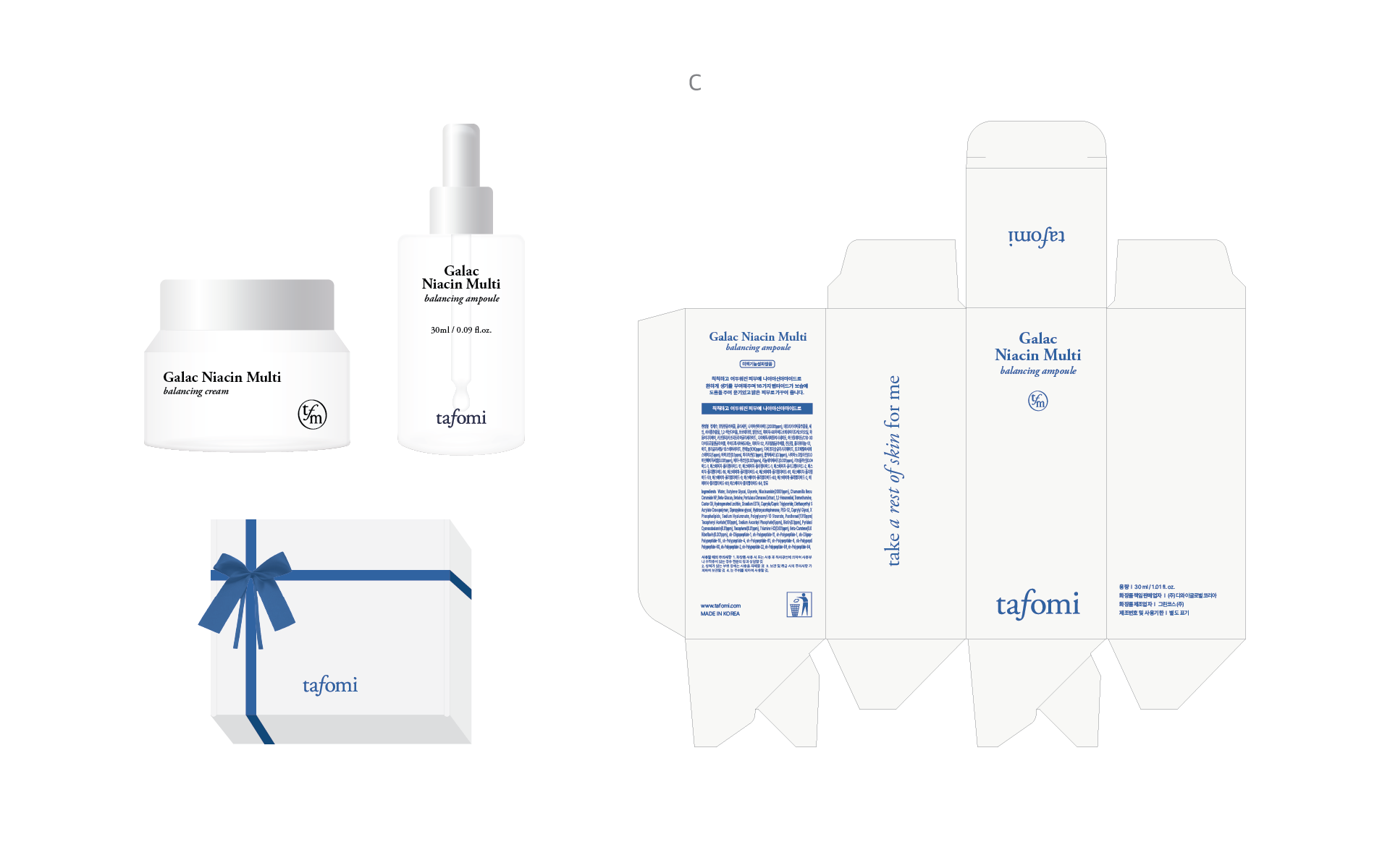
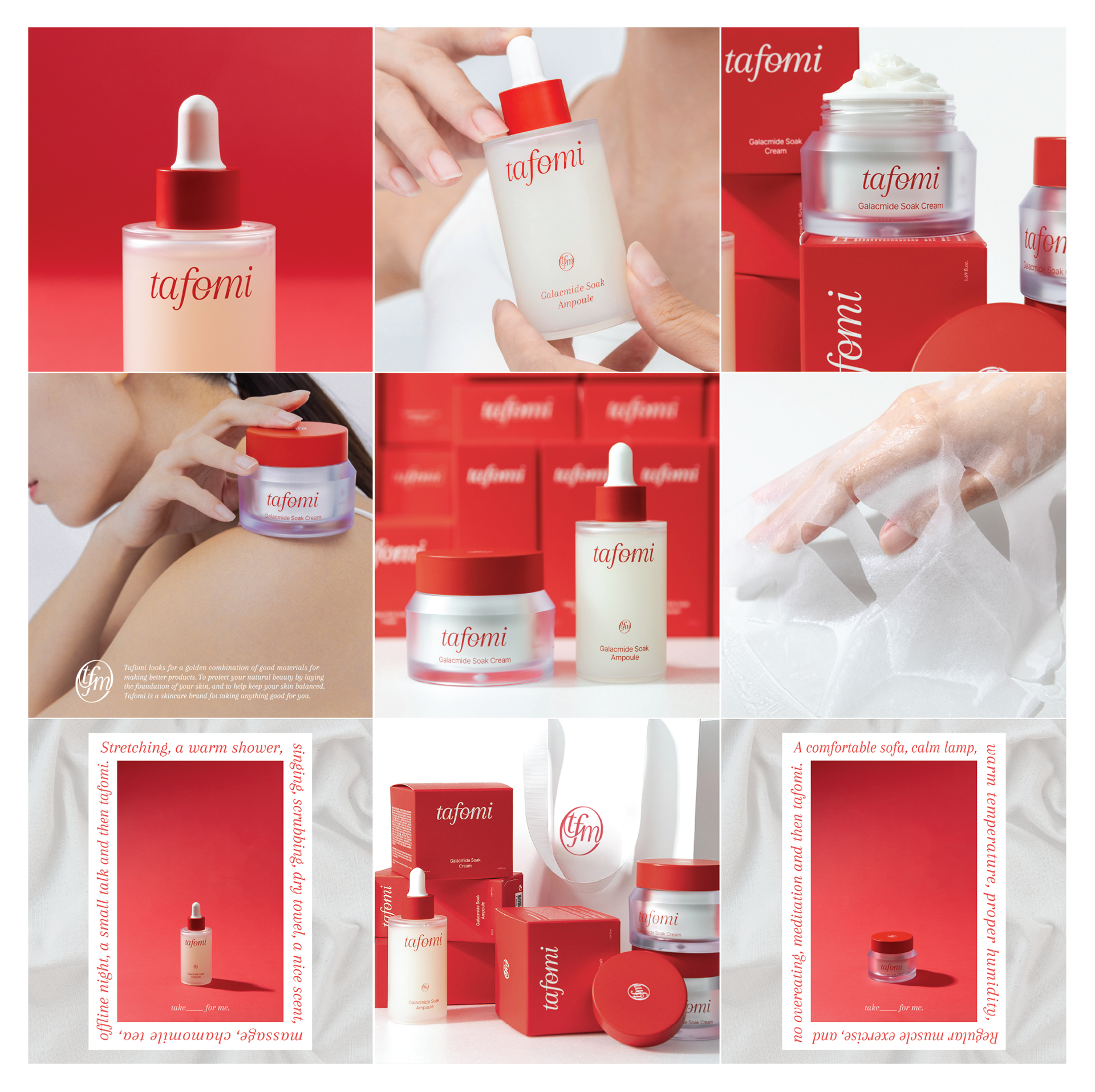
Brand Slogan: "Take ( ) For Me"
비주얼 리뉴얼과 함께 새로운 브랜드 슬로건 **"Take ( ) For Me"**를 제시했습니다. 괄호 안의 여백은 고객 개개인의 피부 고민과 스스로를 위한 시간을 채워 넣는다는 의미를 담고 있으며, 맞춤형 케어와 나를 위한 휴식을 강조합니다.
We redefined the essence of skincare through three core pillars: Task (Professionalism), Formula (Scientific Approach), and Mind (Holistic Care). This conceptual framework serves as the foundation for Tapomi’s evolved brand philosophy.
To accompany the visual renewal, we introduced a new brand slogan, "Take ( ) For Me." This versatile phrase invites customers to fill the void with their personal skincare goals, emphasizing a customized and self-focused beauty ritual.
Contact
@studioflatflag
studioflatflag@gmail.com
@studioflatflag
studioflatflag@gmail.com
copyrightⓒ 2025 All rights reserved by Studio Flat Flag