
Brand Identity Design
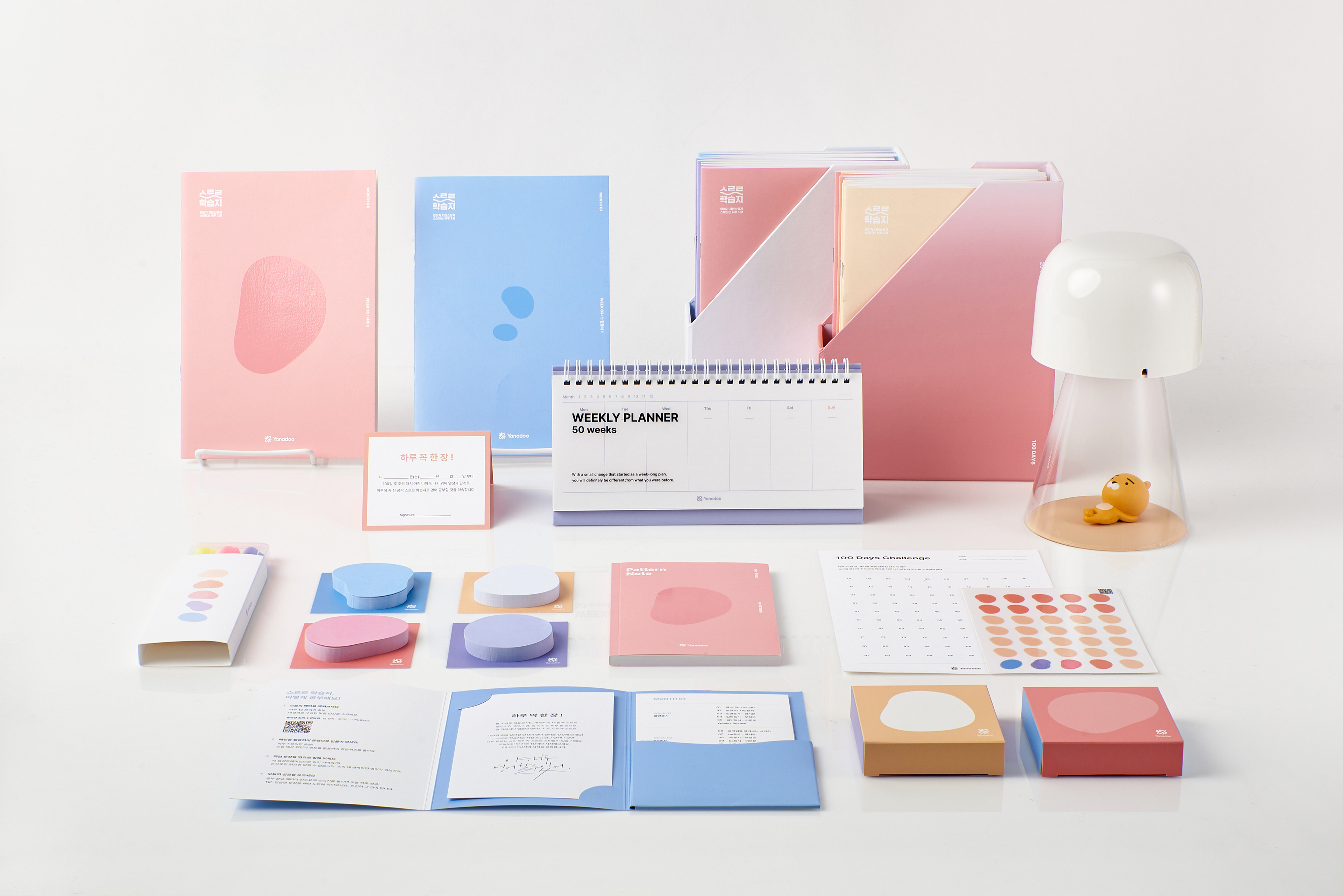
야나두 스르르 학습지의 패키지 세트를 디자인했습니다.
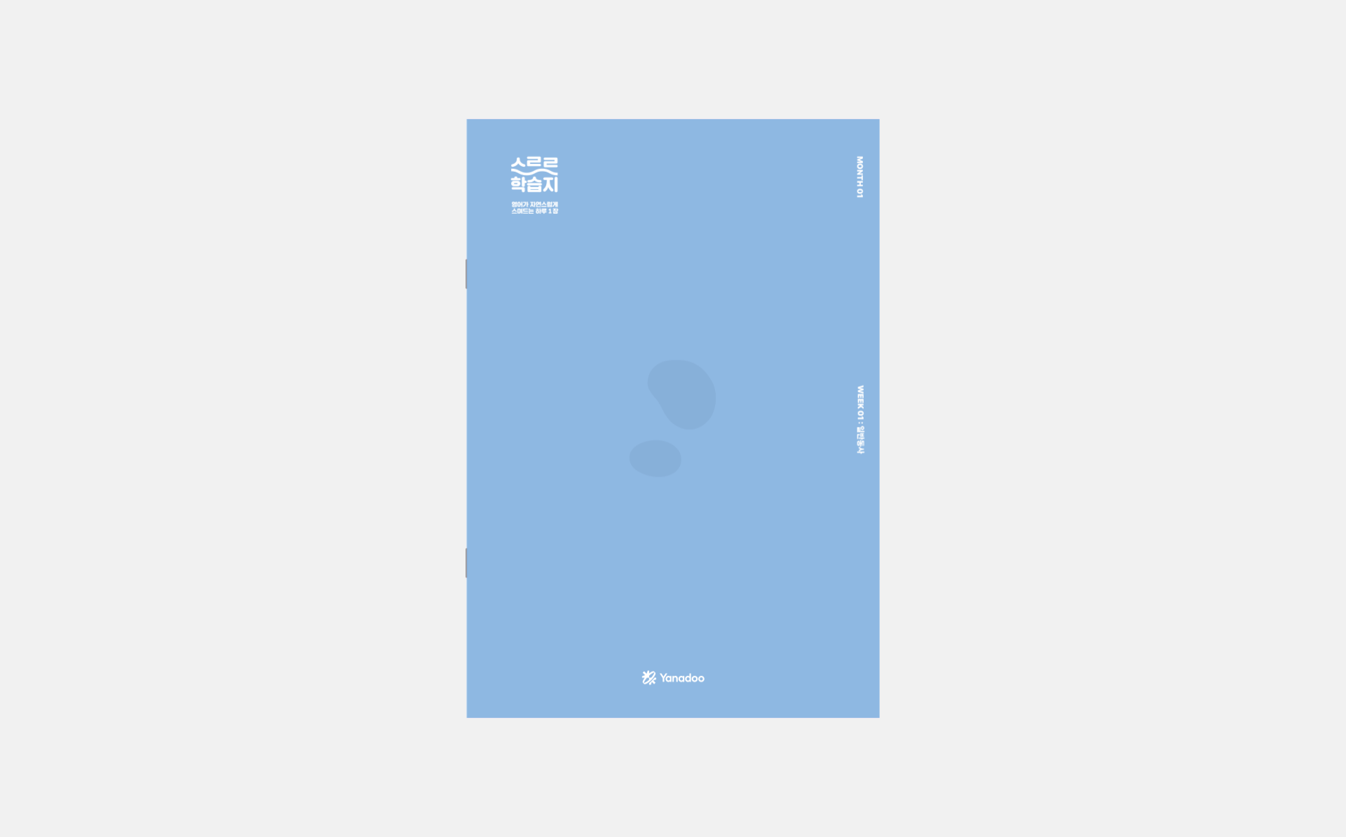
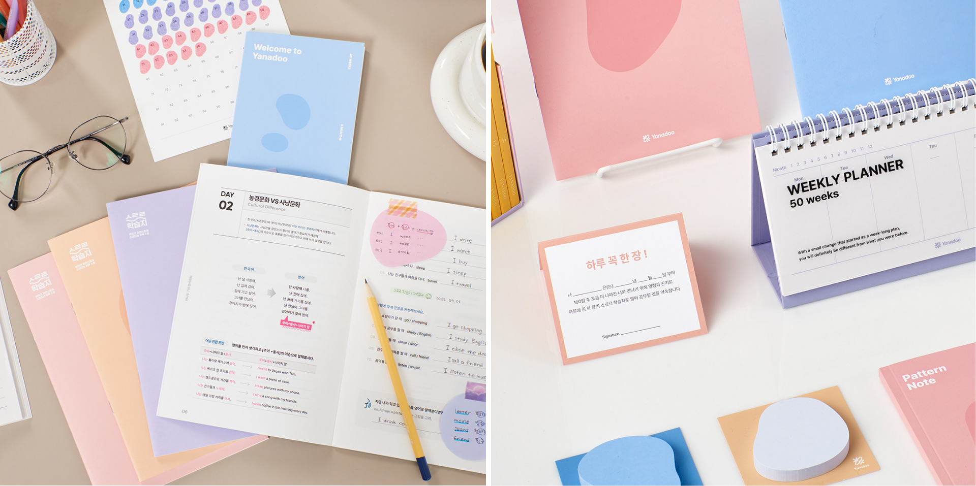
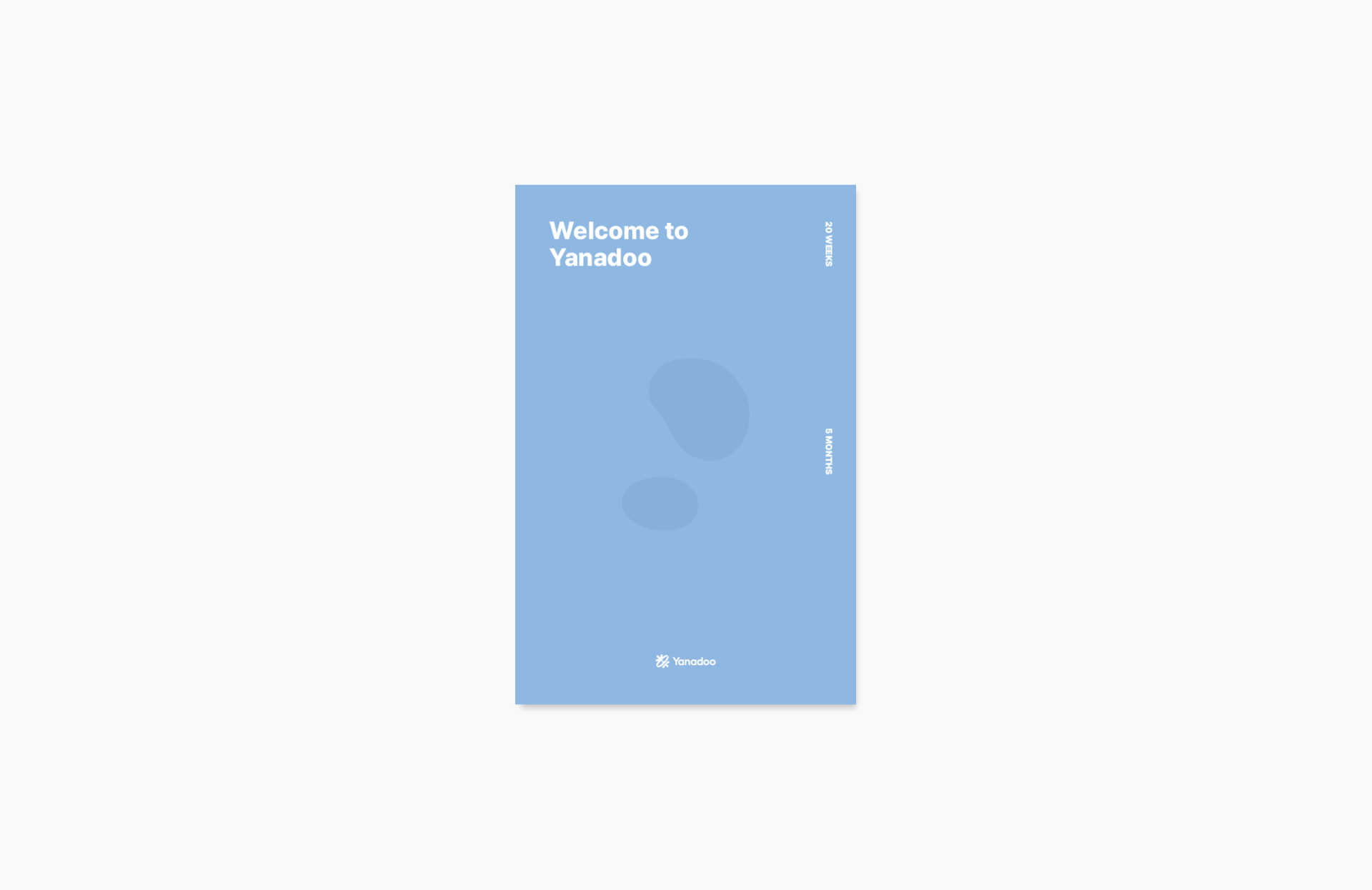
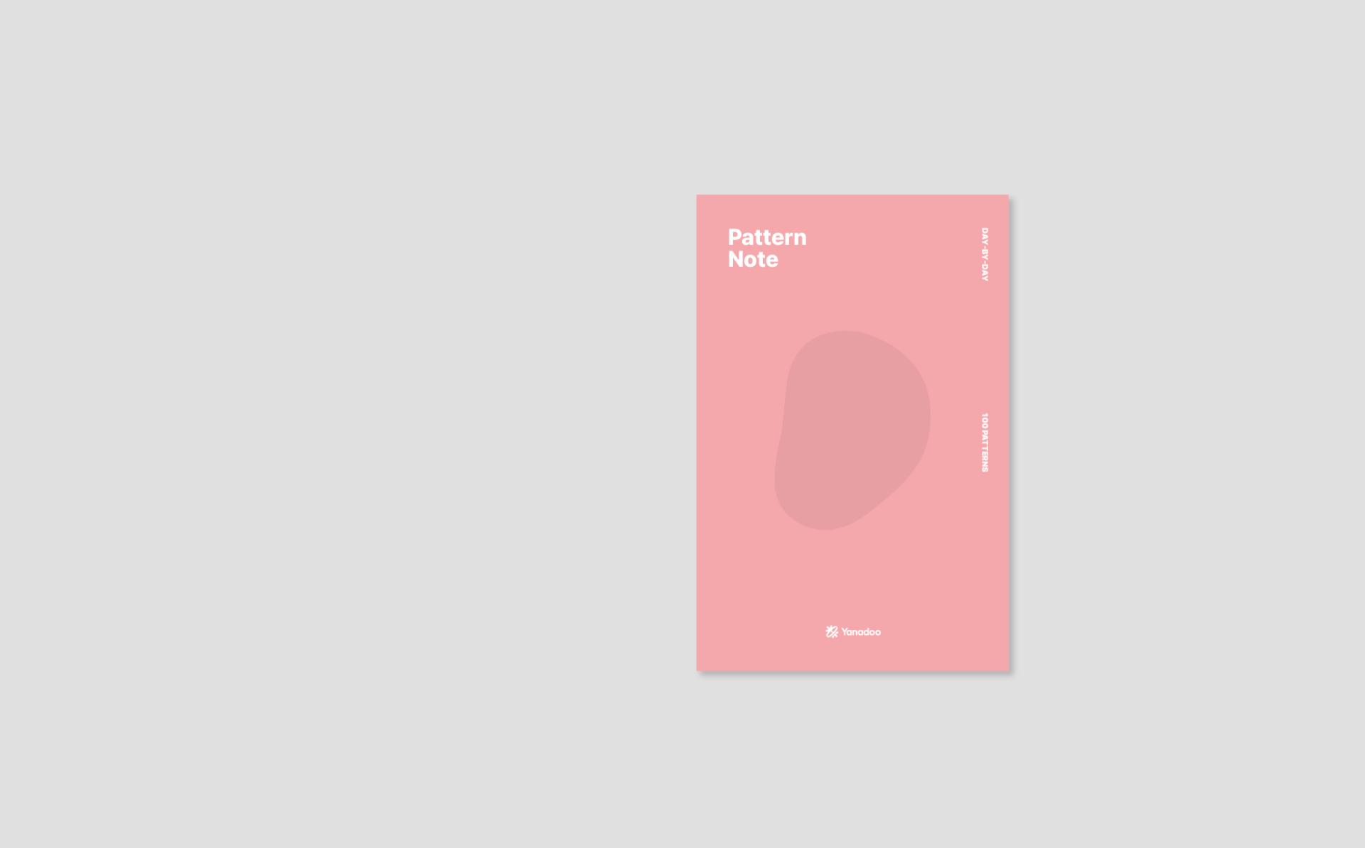
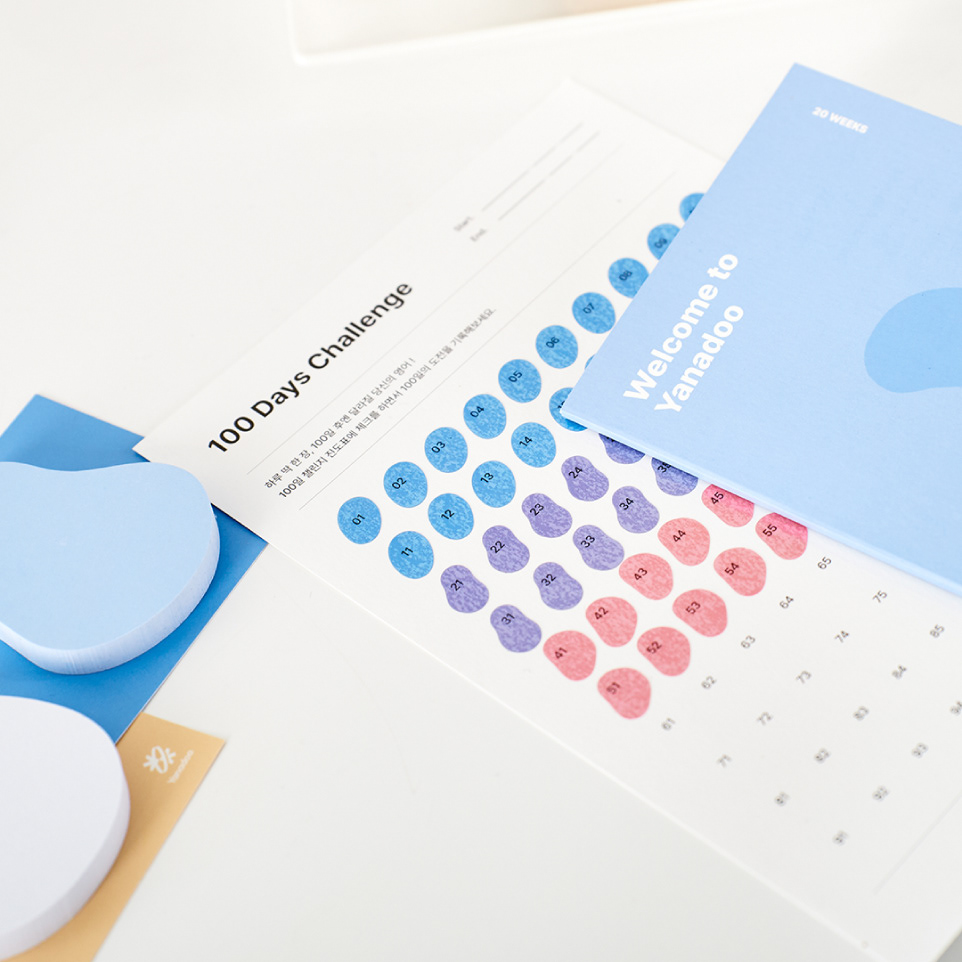
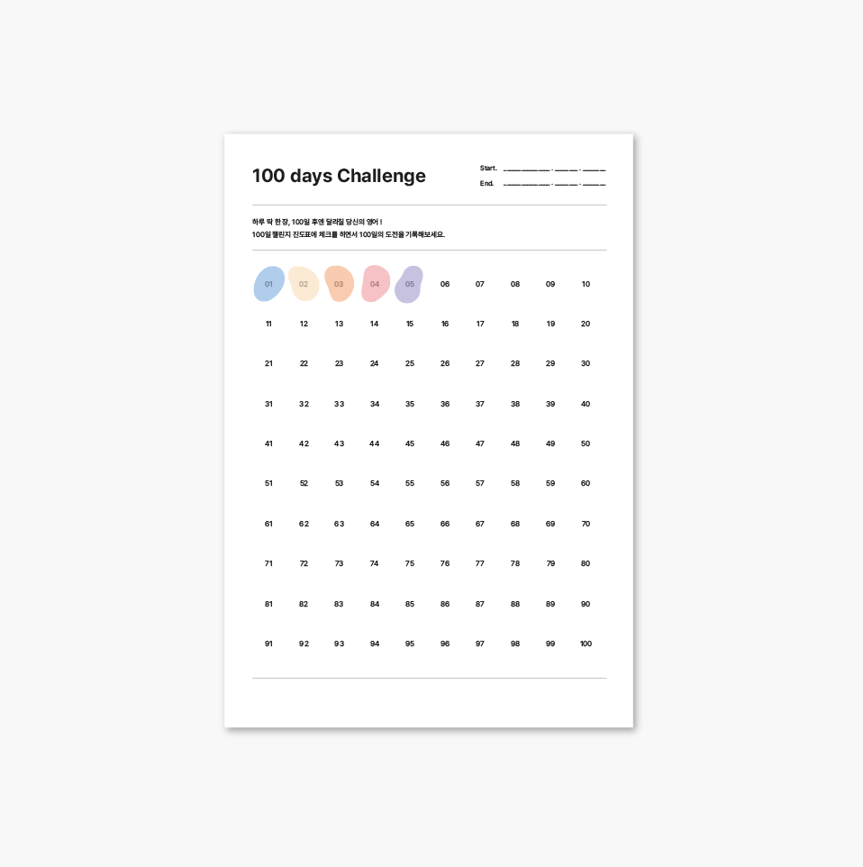
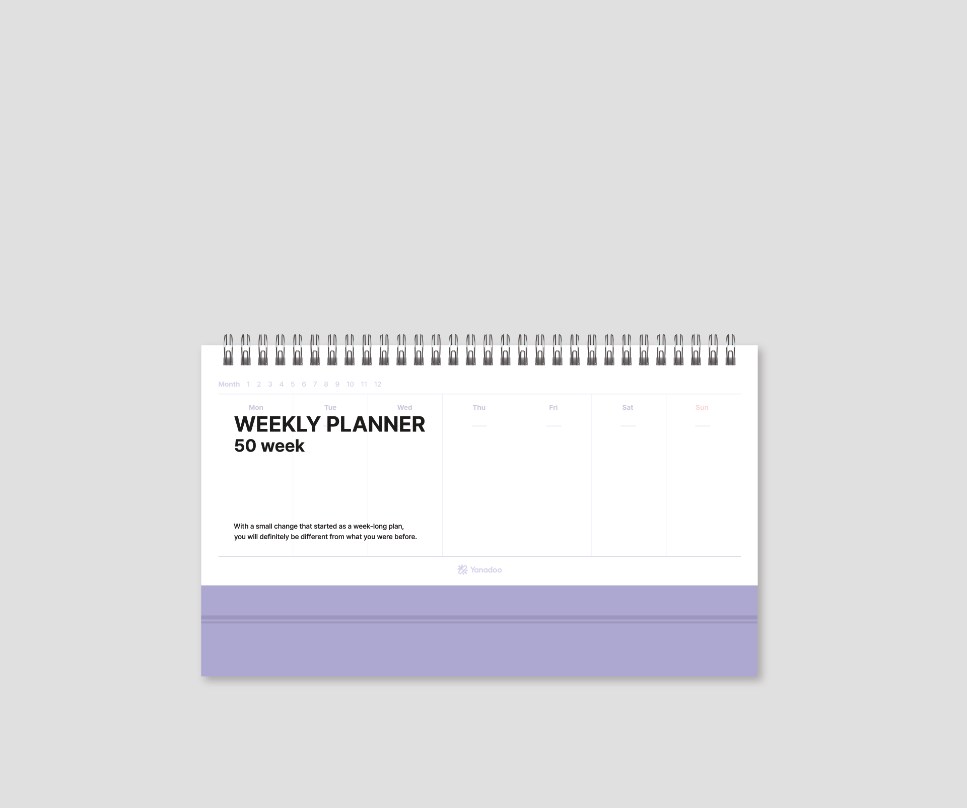
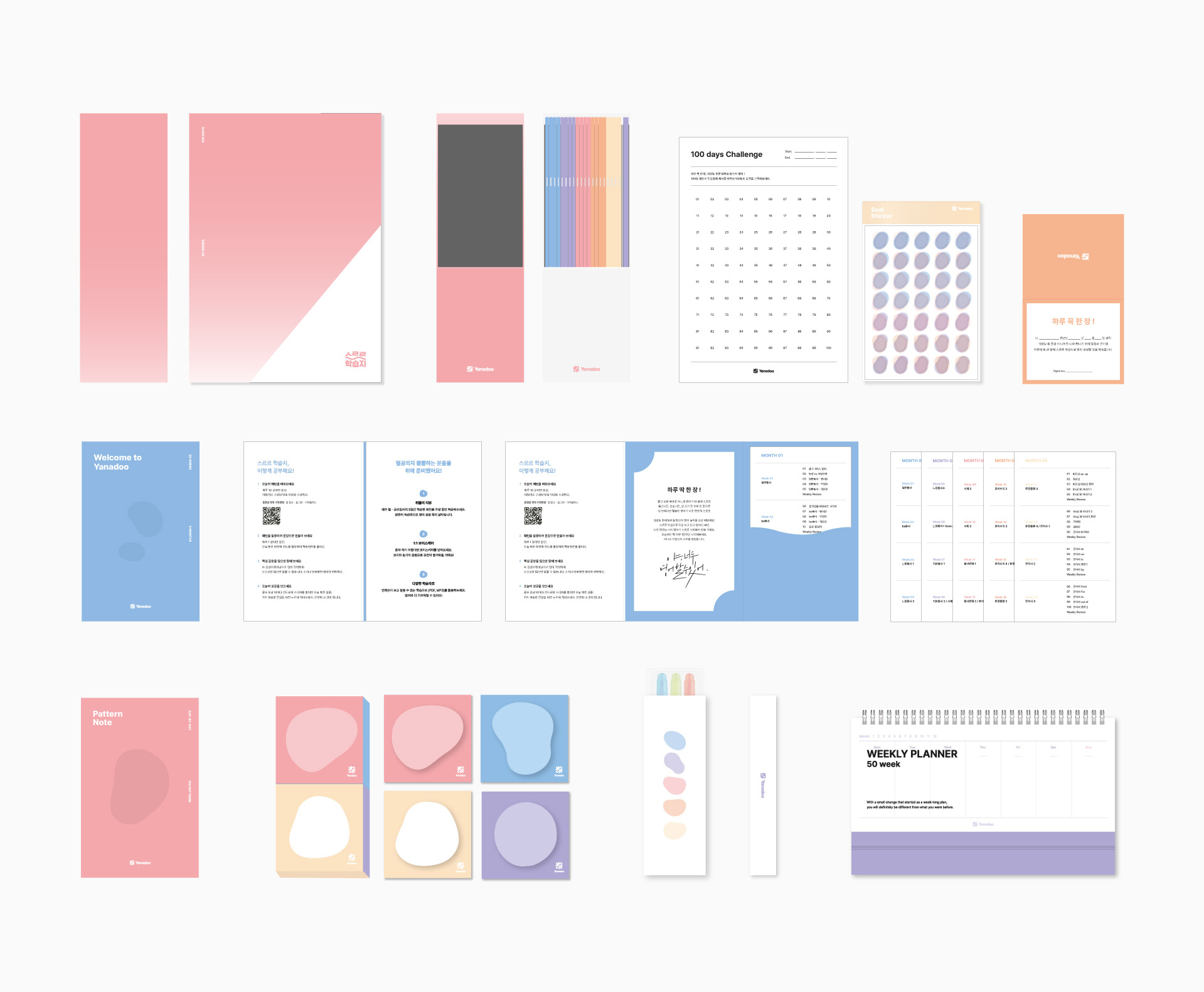
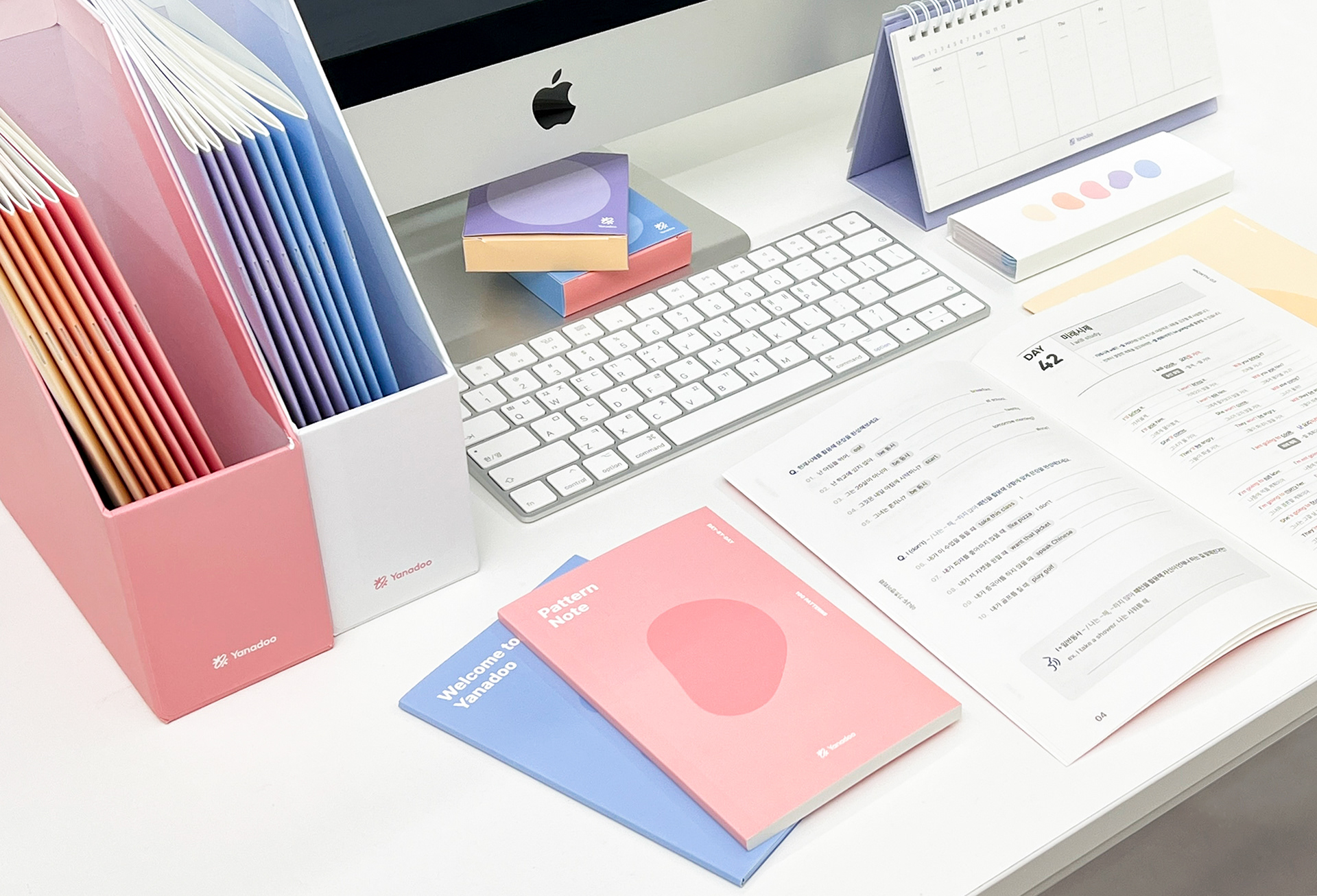
패키지 사이즈와 굿즈 품목을 정해서 제안하였고, 패키지 컬러 컨셉, 키비주얼, 내지 편집디자인을 진행했습니다. '스르르'는 나도 모르는 사이에 영어실력이 향상된다는 의미의 네이밍입니다. '스르르'라는 키워드에 맞추어 물이 종이에 서서히 스며드는 모양을 학습지의 키비주얼로 삼았습니다. 웰컴카드, 서약서, 패턴노트, 100일 챌린지가 있는 설렘 키트와 포스트잇, 형관펜, 위클리 플래너가 있는 습관 형성 굿즈를 구성하였습니다.
패키지 사이즈와 굿즈 품목을 정해서 제안하였고, 패키지 컬러 컨셉, 키비주얼, 내지 편집디자인을 진행했습니다. '스르르'는 나도 모르는 사이에 영어실력이 향상된다는 의미의 네이밍입니다. '스르르'라는 키워드에 맞추어 물이 종이에 서서히 스며드는 모양을 학습지의 키비주얼로 삼았습니다. 웰컴카드, 서약서, 패턴노트, 100일 챌린지가 있는 설렘 키트와 포스트잇, 형관펜, 위클리 플래너가 있는 습관 형성 굿즈를 구성하였습니다.
We designed a package set of Yanadoo SRR workbooks.
We suggested the package size, study items, the package color concept, key visual, and the editorial design. The name 'SRR' means that The English will improve without even realizing it. The key visual is the shape of water slowly seeping into the paper according to the keyword 'SRR'. We have organized a motivation kit with a welcome card, pledge, pattern note, and 100-day challenge, and habit-forming goods with post-it, highliter pen, and Weekly planner.
We suggested the package size, study items, the package color concept, key visual, and the editorial design. The name 'SRR' means that The English will improve without even realizing it. The key visual is the shape of water slowly seeping into the paper according to the keyword 'SRR'. We have organized a motivation kit with a welcome card, pledge, pattern note, and 100-day challenge, and habit-forming goods with post-it, highliter pen, and Weekly planner.
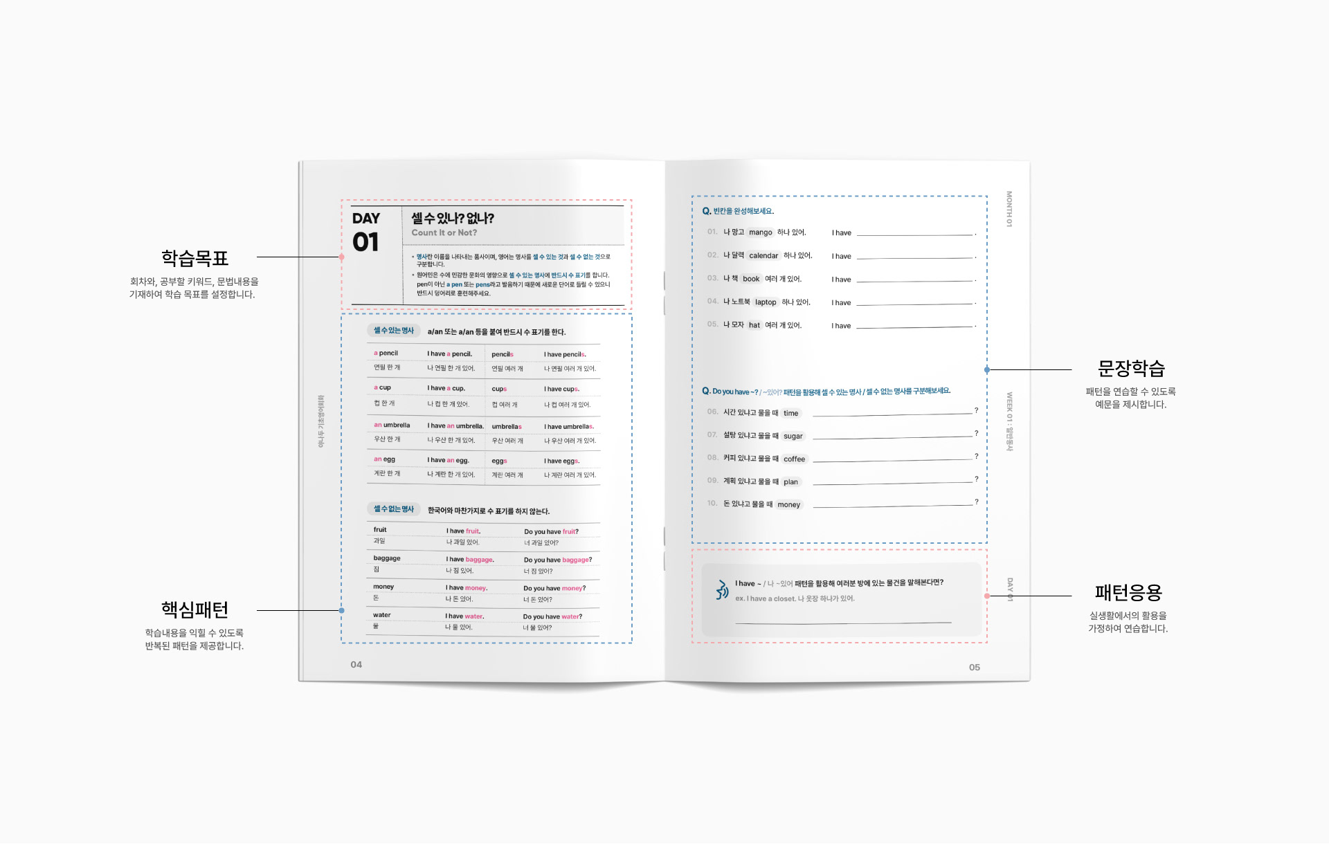
좌측에 학습목표와 학습내용을 표기하고, 우측에는 연습문제를 배치하는 형식으로 반복학습이 가능하도록 페이지를 디자인했습니다.
We placed a learning goal and contents on the left page, the pattern exercises on the right page.
The page was designed to allow repetitive learning.
The page was designed to allow repetitive learning.
Contact
studioflatflag@gmail.com
copyrightⓒ 2022 All rights reserved by Studio Flat Flag