Overview
홍대 중심가에 위치한 클라이밍 센터 ‘볼더프렌즈(Boulder Friends)’를 위한 브랜드 디자인입니다. 그룹핑(Grouping)의 가치를 추구하는 유쾌한 체육시설이라는 컨셉에 맞는 귀여운 캐릭터 일러스트레이션 중심의 작업입니다.
This is a brand design for Boulder Friends, a rock-climbing center located in the heart of Hongdae (Hongik University area). We made a lovely character illustration design that fits the enjoyable mood of the sports facility that seeks the value of Grouping.
The First proposal
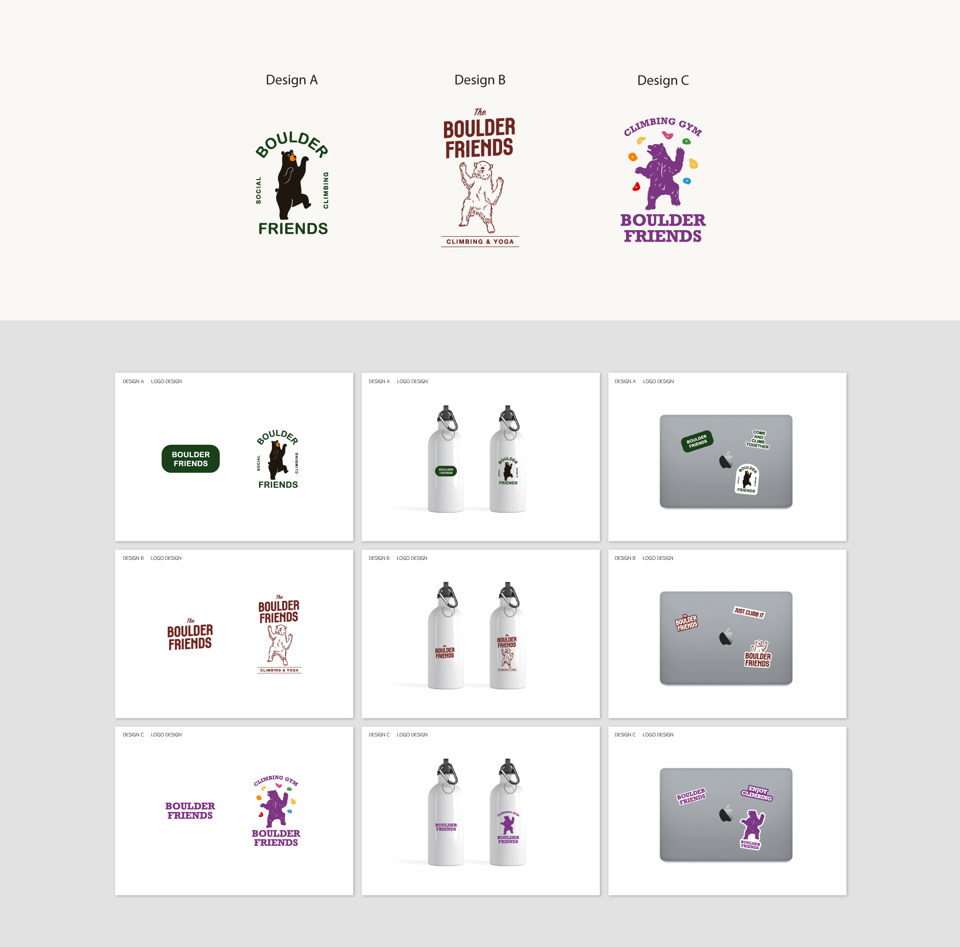
볼더프렌즈의 첫 디자인 시안입니다. 암벽 등반을 즐기는 곰 캐릭터로 메인 이미지를 잡았습니다. 둥글둥글하여 귀여운 인상을 주는 서체와 일러스트를 사용한 Design A, 아메리칸 빈티지 풍의 일러스트레이션을 사용한 Design B, 카리스마 있는 곰과 귀여운 볼더의 대비를 이용하여 시각적 경쾌함을 담은 Design C로 작업하였습니다.
This is the first design proposal of Boulder Friends. We used a bear character enjoying rock-climbing as the main image of the brand. Design A uses a round illustrative style of font and character that gives a cute and lovely impression, Design B uses American Vintage style of illustration, and Design C shows more vitality by using a charming bear with cute and colorful boulder design illustration in contrast with each other.
The Second Proposal
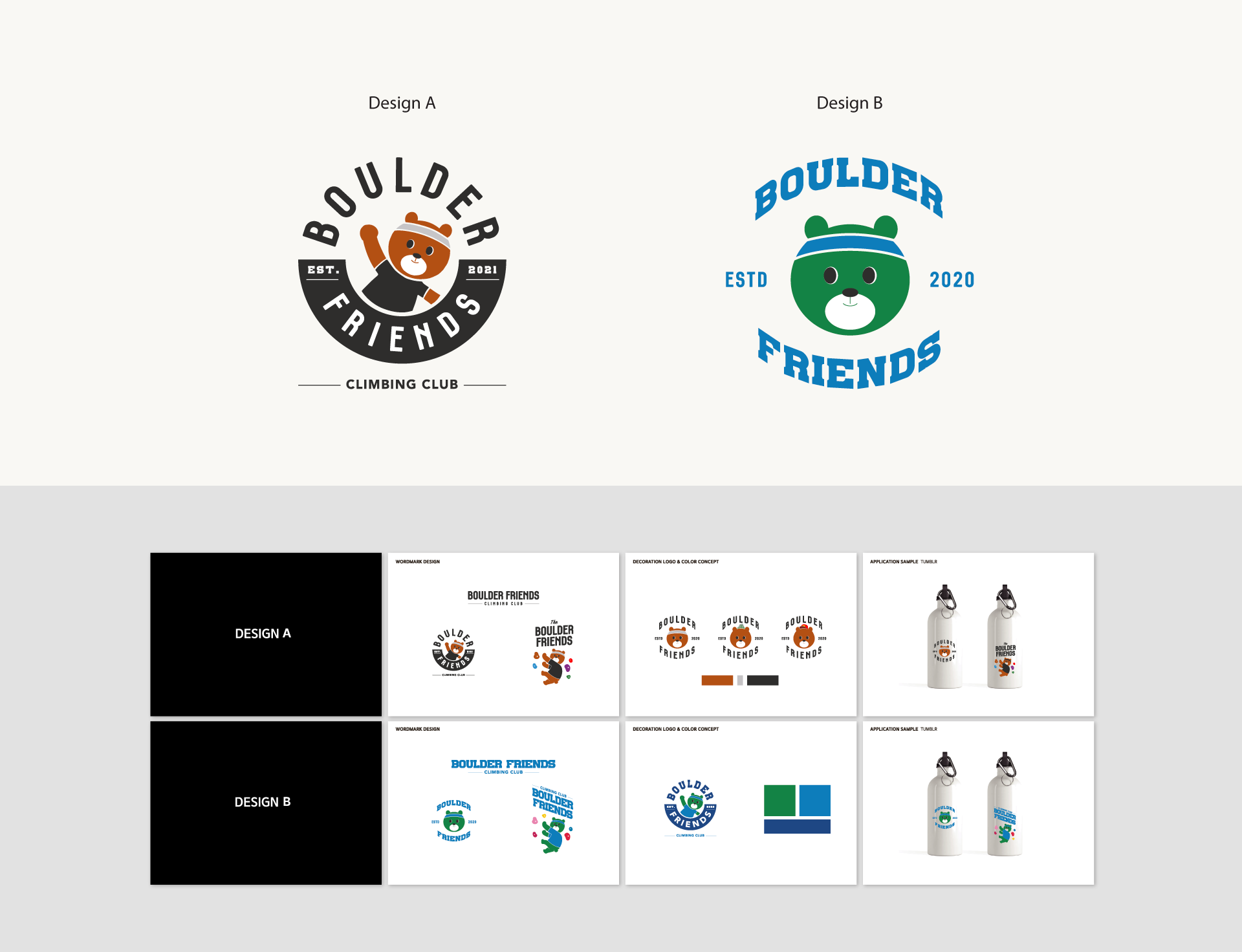
볼더프렌즈의 두번째 시안입니다. 첫번째 시안 곰 일러스트레이션을 발전시켜 ‘캐릭터화 된 동물 심볼’을 디자인하였습니다. 안정적인 컬러를 사용하여 제작한 Design A, 미국 스포츠구단 느낌의 서체와 호기심을 자극하는 컬러배치를 활용해 활동적인 느낌을 유도한 Design B 입니다.
This is the second design proposal of Boulder Friends. We developed it from the first draft bear illustration to a 'characterized animal symbol'. Design A uses calm, solid colors, and Design B uses an interesting color arrangement that triggers one’s curiosity together with a typeface that gives an image of a classic American sports team.
Design Development
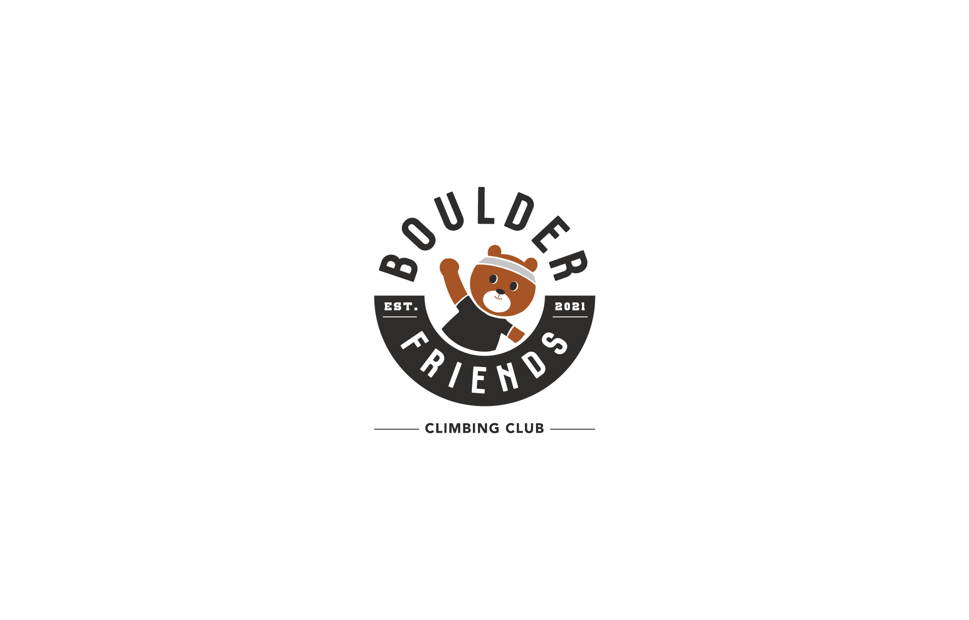
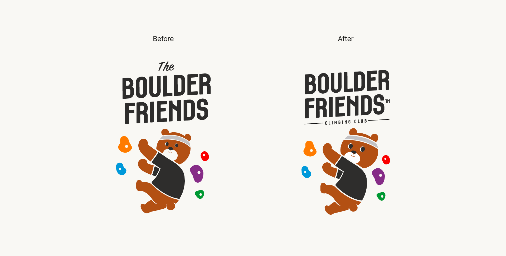
채택된 시안에서 폰트와 일러스트레이션 일부를 조정하여 브랜드 로고를 확정하였습니다. 일러스트레이션의 경우 머리와 눈 크기를 키워 귀여운 느낌을 살리는 방향으로 수정되었습니다.
We confirmed the brand logo by modifying some aspects of the typeface and illustration from the chosen proposal. The head and the eyes of the character illustration was edited to be bigger to give a more cute effect.
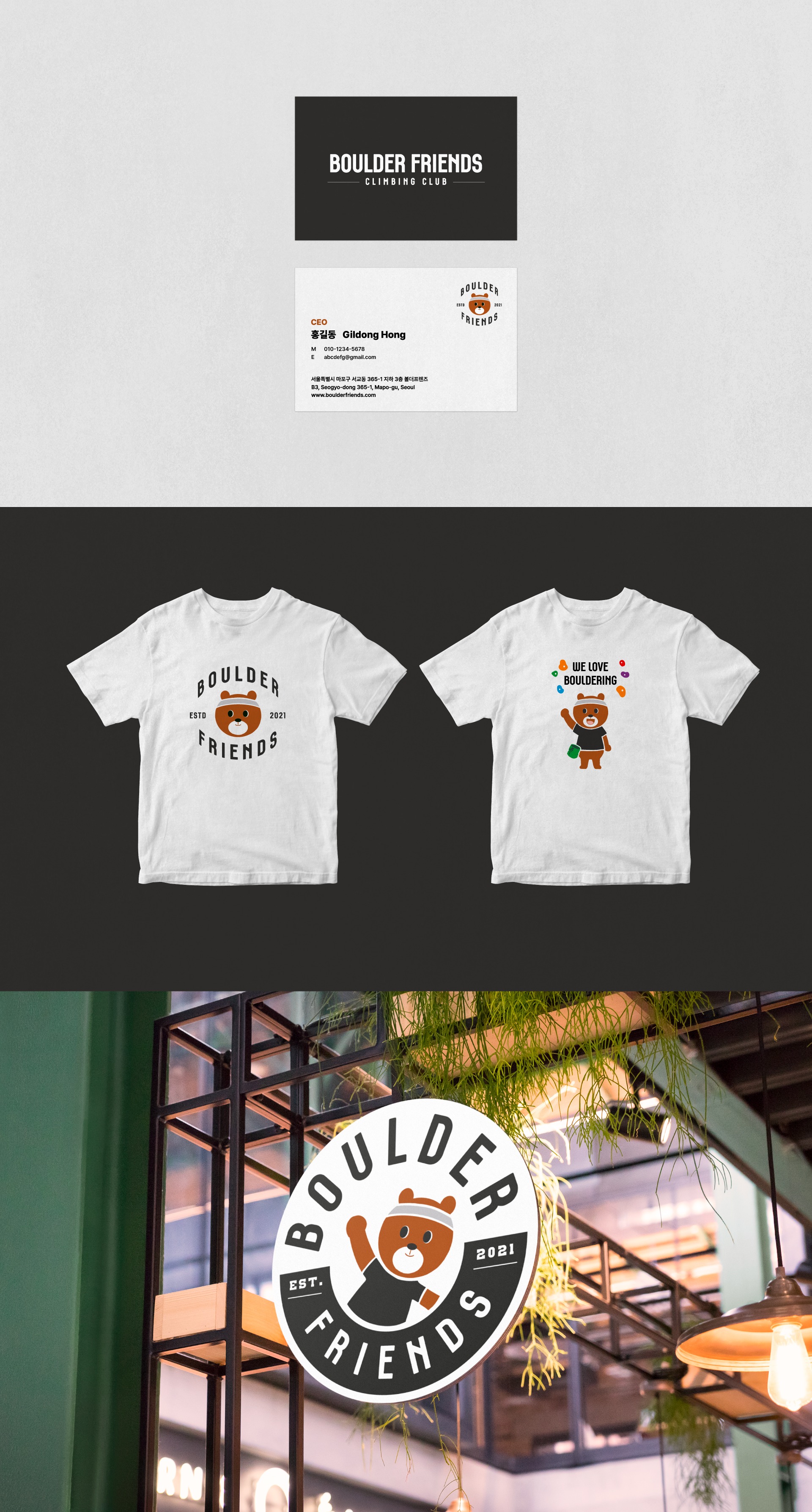
Brand Logo
Brand Color System
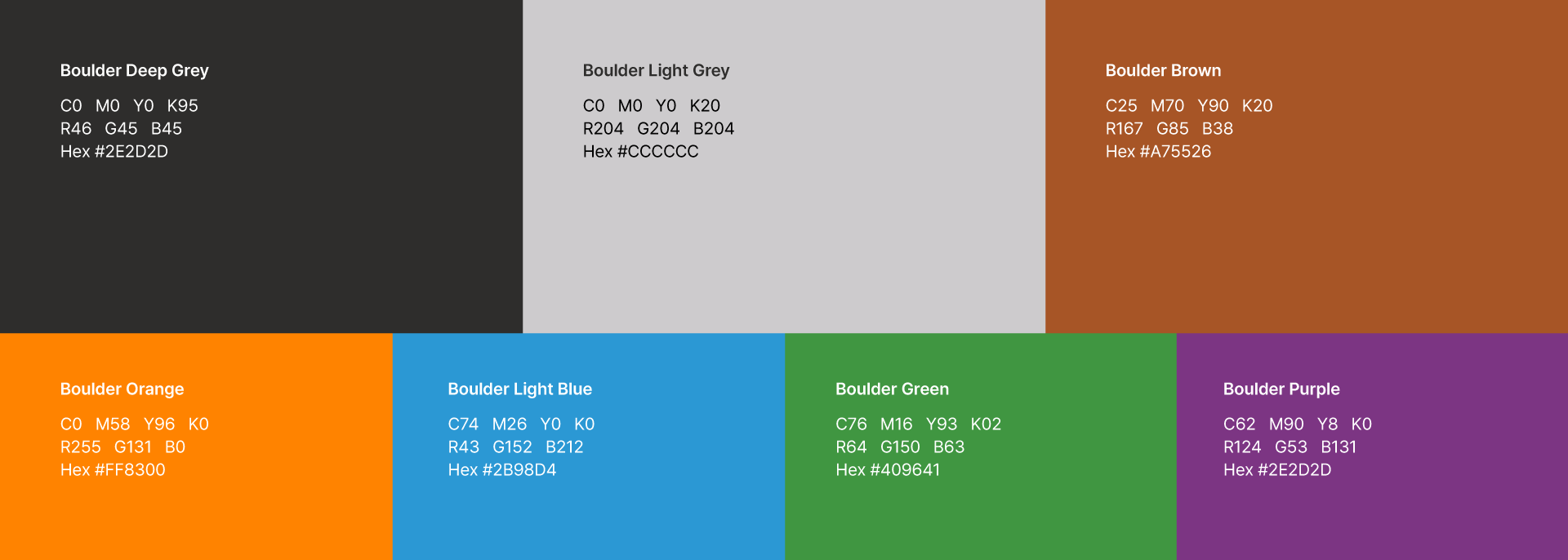
곰의 갈색과 검정색 및 무채색을 메인컬러로 활용하였고, 비비드한 홀드 색감을 통해 활기차며 스포티한 이미지를 브랜드 컬러 시스템에 담고자 하였습니다.
The bear’s brown, black, or achromatic colors is used as the main color, and we captured the sporty energy by adding vivid colors of the climbing holds to the brand color system.
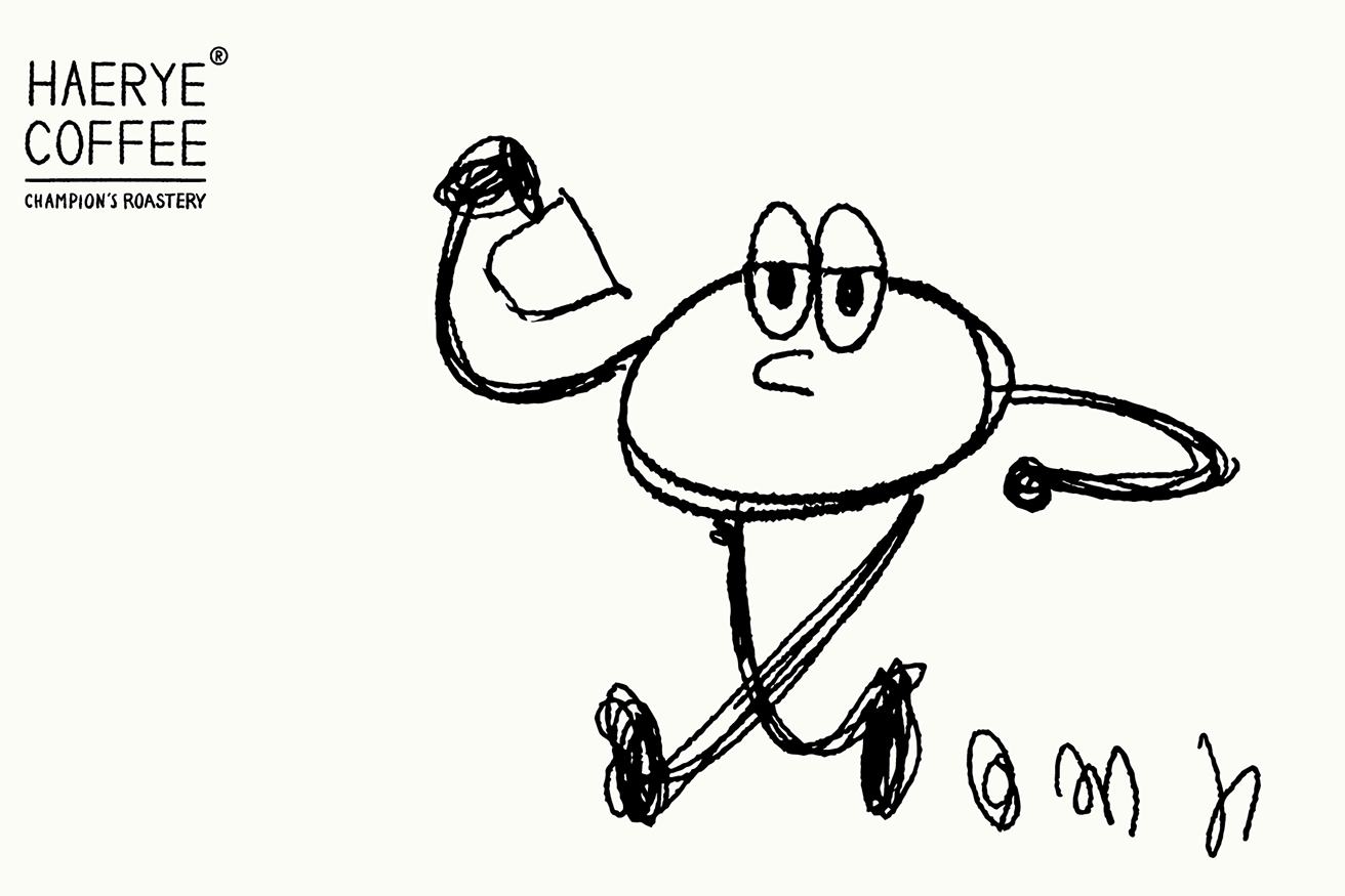
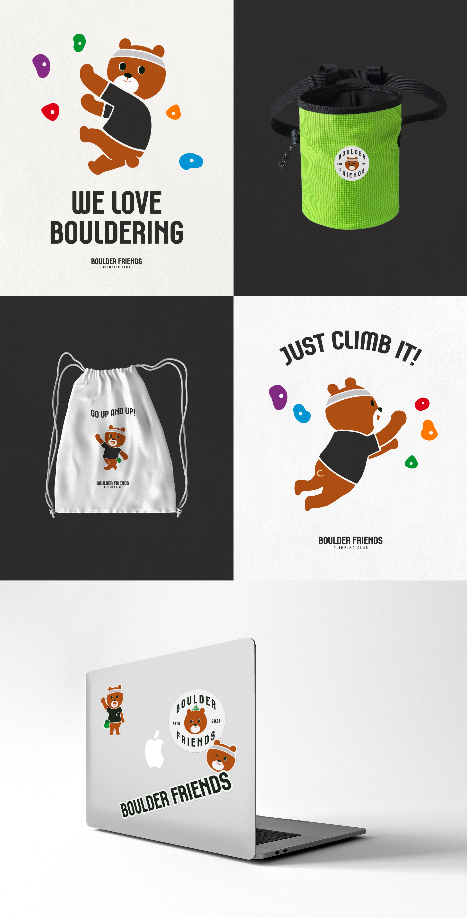
Brand Character
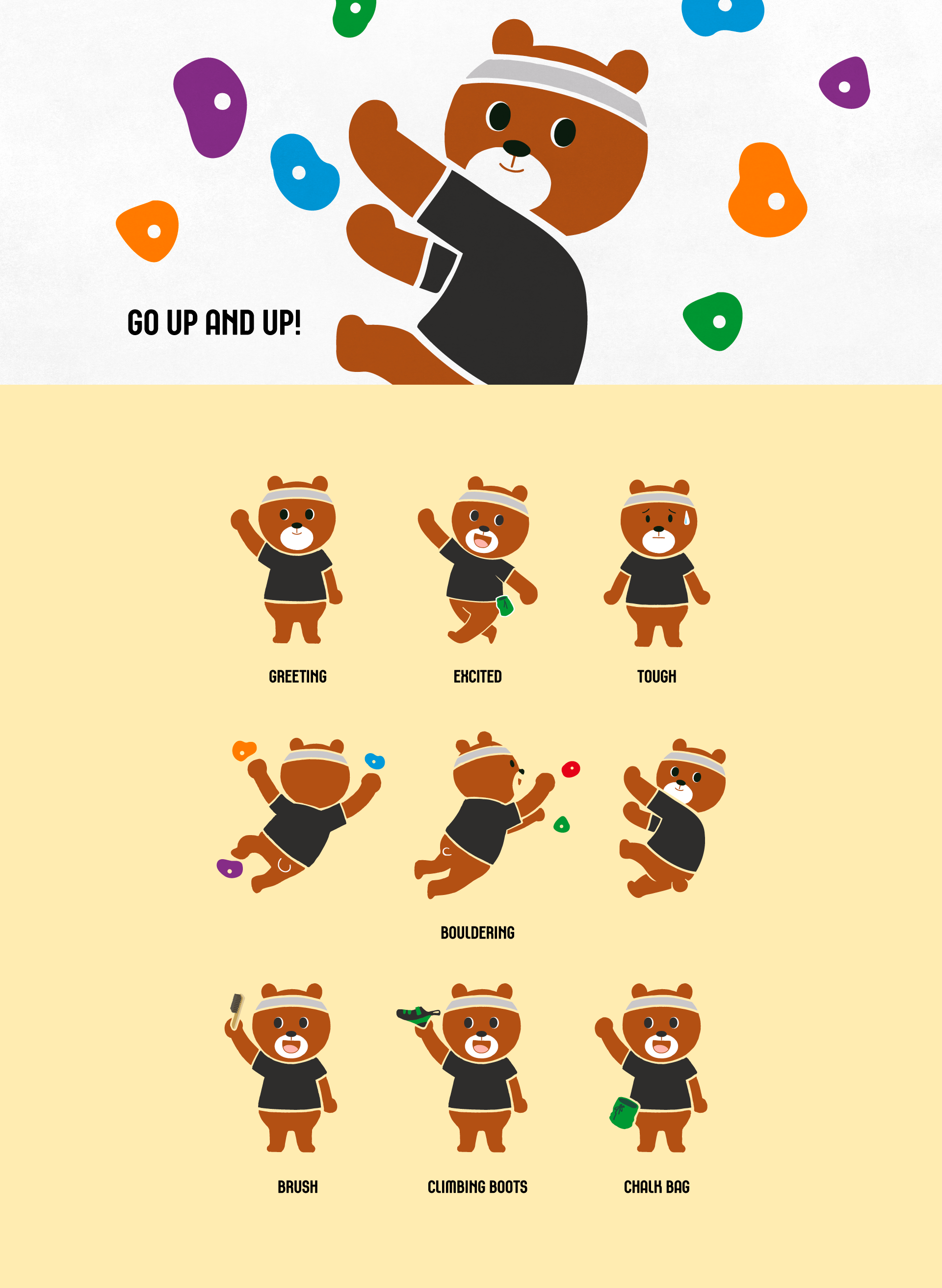
귀여우면서 클라이밍 운동을 하는 곰 캐릭터를 디자인하였습니다. 활동적인 동작과 홀드 색감을 통해 디자인을 구체화하였습니다.
We created a character design of a lovely bear that is rock-climbing. We visualized the dynamic poses.
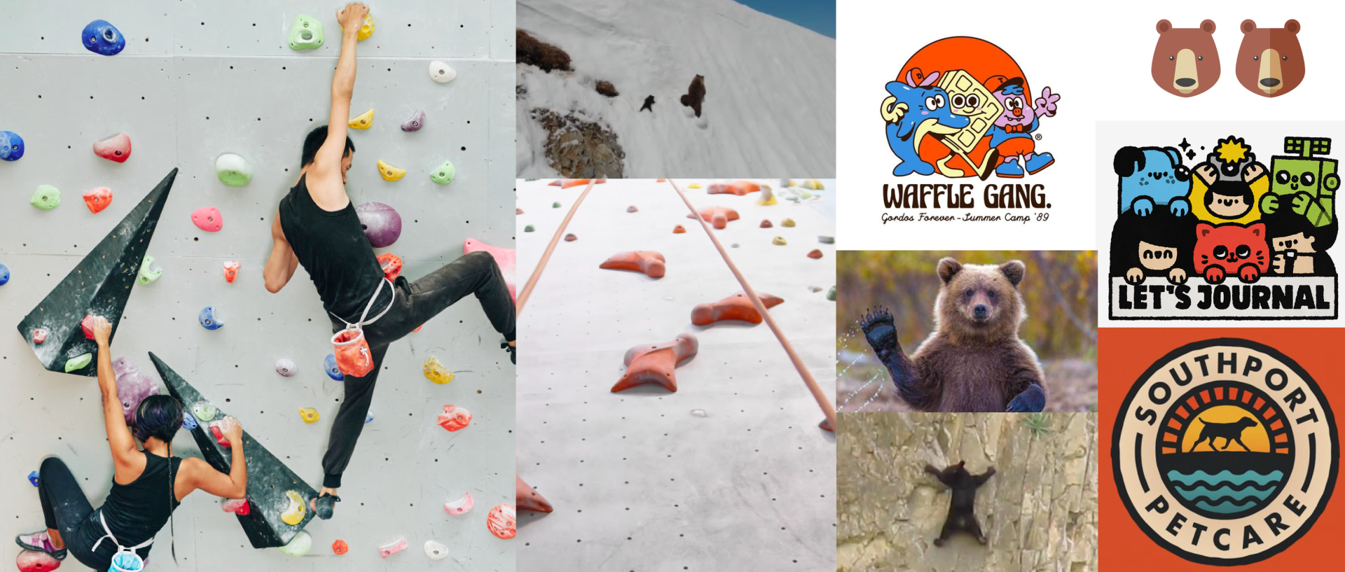
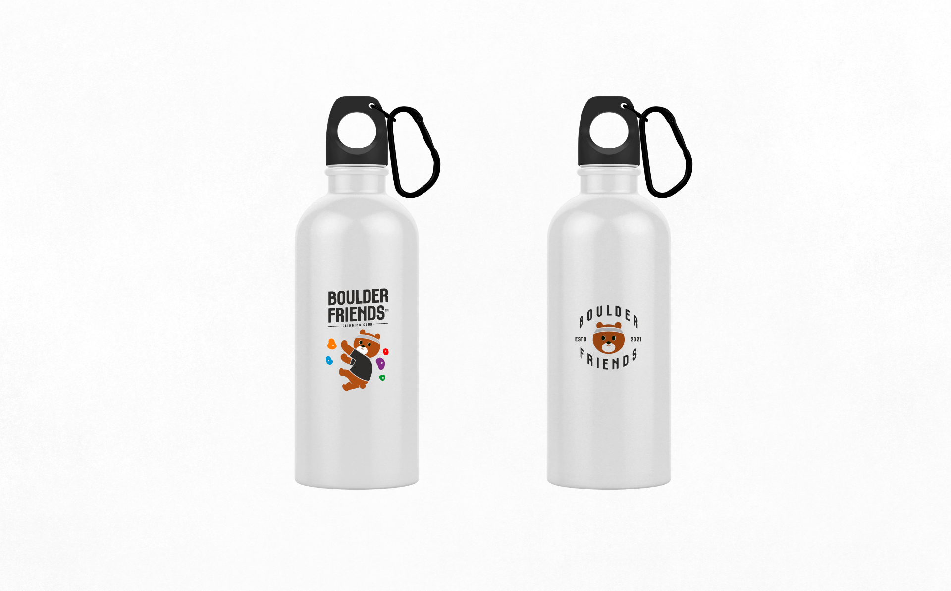
Application
Contact
@studioflatflag
studioflatflag@gmail.com
@studioflatflag
studioflatflag@gmail.com
copyrightⓒ 2021 All rights reserved by Studio Flat Flag