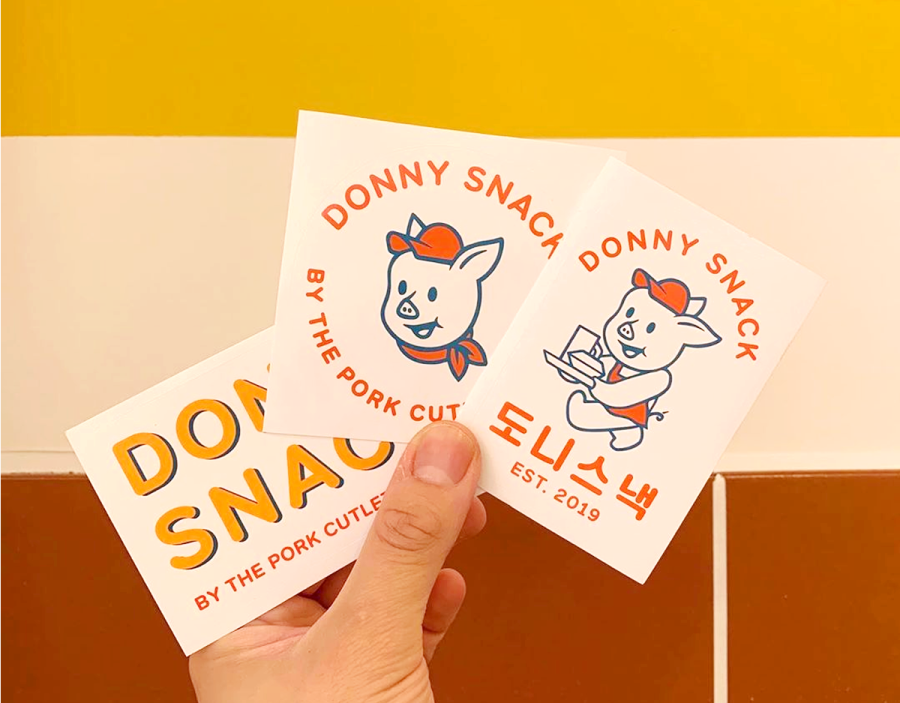
Overview & Background
펄프커피(PULP COFFEE)를 위한 브랜드 디자인입니다. 클라이언트는 커피 과육을 의미하는 PULP라는 이름으로 매장을 운영 중이셨고, 프랜차이즈화와 함께 브랜드 리뉴얼을 의뢰하셨습니다. 첫 미팅 때 타이포 중심의 깔끔하면서도 가시성 좋은 디자인과 스티커를 통한 경쾌한 분위기를 요청하셔서 최초 시안을 진행하였고, 심화 과정 이후에 브랜드 캐릭터를 원하셔서, 기존 시안을 엎고 추가견적으로 캐릭터가 어울리는 새로운 디자인으로 완성한 작업입니다.
This is a brand design for Pulp Coffee. Our client was running a store by the name Pulp, a name derived from the coffee pulp. They requested for it to become a franchise, and alongside a brand renewal as well. In the first meeting, they mentioned that they wanted the brand to have a minimal design and stickers with strong visibility that focuses on typography. After further progress, they requested a character design, so we had to discard the first draft and change it for a new one that fits better with the character.
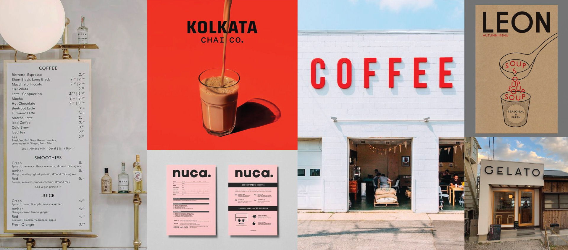
Reference Images via Pinterest
The First Proposal
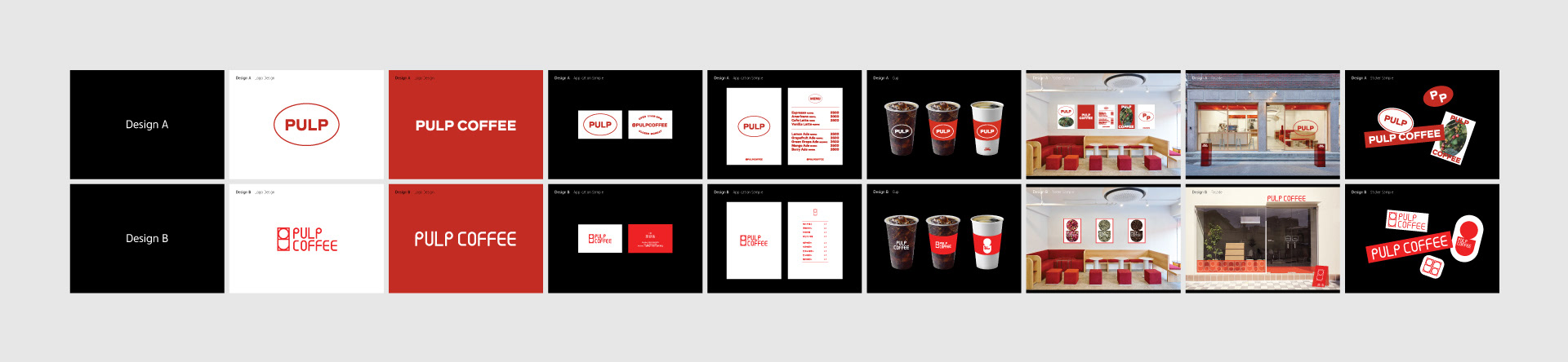
펄프커피의 첫 시안입니다. 커피과육을 은유하는 타원형을 그래픽 요소로 활용하여 미니멀하면서도 경쾌한 분위기의 A시안과 커피과육과 머그컵을 은유하는 심벌로고와 그 표현을 확장한 타이포그래피로 B시안을 제시하였습니다. A시안으로 선택하여 디자인 심화를 진행하였습니다.
This is the first proposal for Pulp Coffee. Design A is minimal yet cheerful looking that uses round graphic aspects that are a metaphor for a coffee pulp, and Design B is an extended version of Design A that uses a symbol logo as a metaphor for a coffee pulp and a coffee mug. Design A was selected for further process.
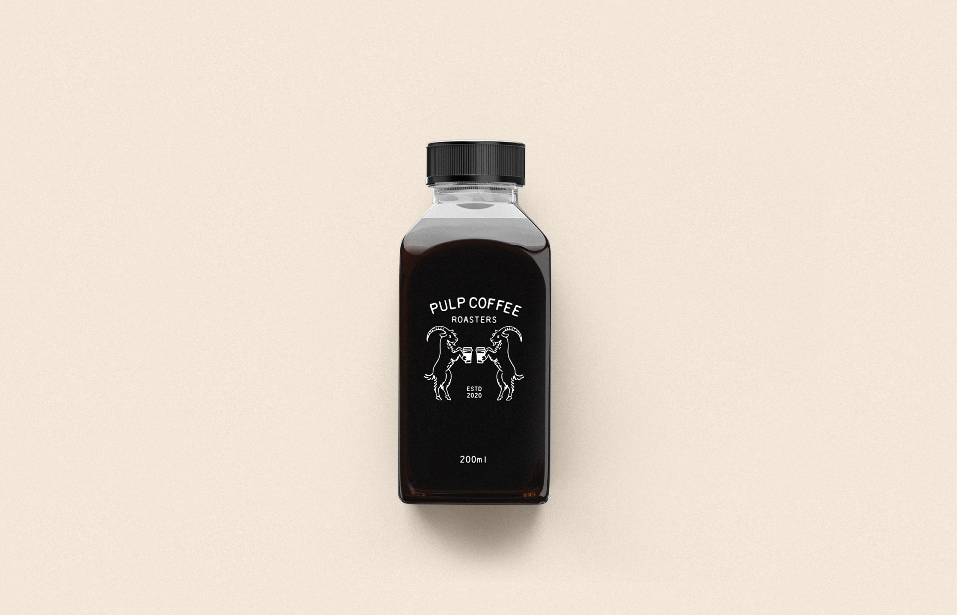
The Second Proposal
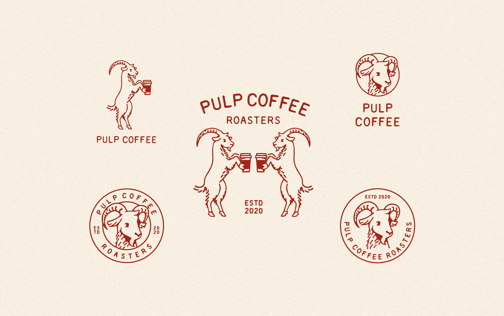
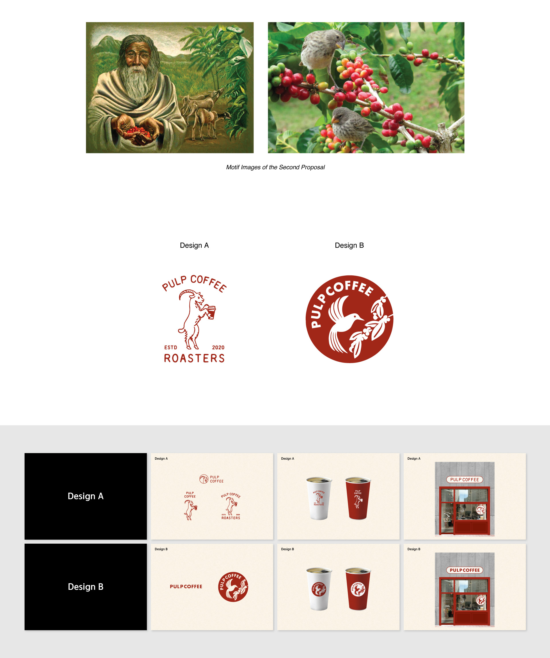
1차 채택시안 심화작업 이후 클라이언트가 동물이 들어간 캐릭터를 추가로 요청하셨습니다. 기존에 진행한 디자인 시안은 캐릭터를 염두에 두지 않은 디자인이어서 캐릭터 요소 만을 추가로 넣는 것은 어렵다고 판단하여 처음부터 다시 발상을 잡아 시안을 개발하였습니다.
시안 A는 커피의 기원에서 착안한 산양을 모티프로 하여 앤틱 스타일로, B는 커피나무를 맴도는 벌새를 모티프로 하여 모던한 분위기로 작업하였습니다.
After the first course of design development, our client requested an additional design that has an animal character. The previous proposals were hard to blend with a character design, so we had to work from the beginning. Design A has an antique style with the mountain goat as a motif from the idea of origin of coffee, and Design B has a modern mood with the hummingbird hovering around the coffee tree.
Design Development
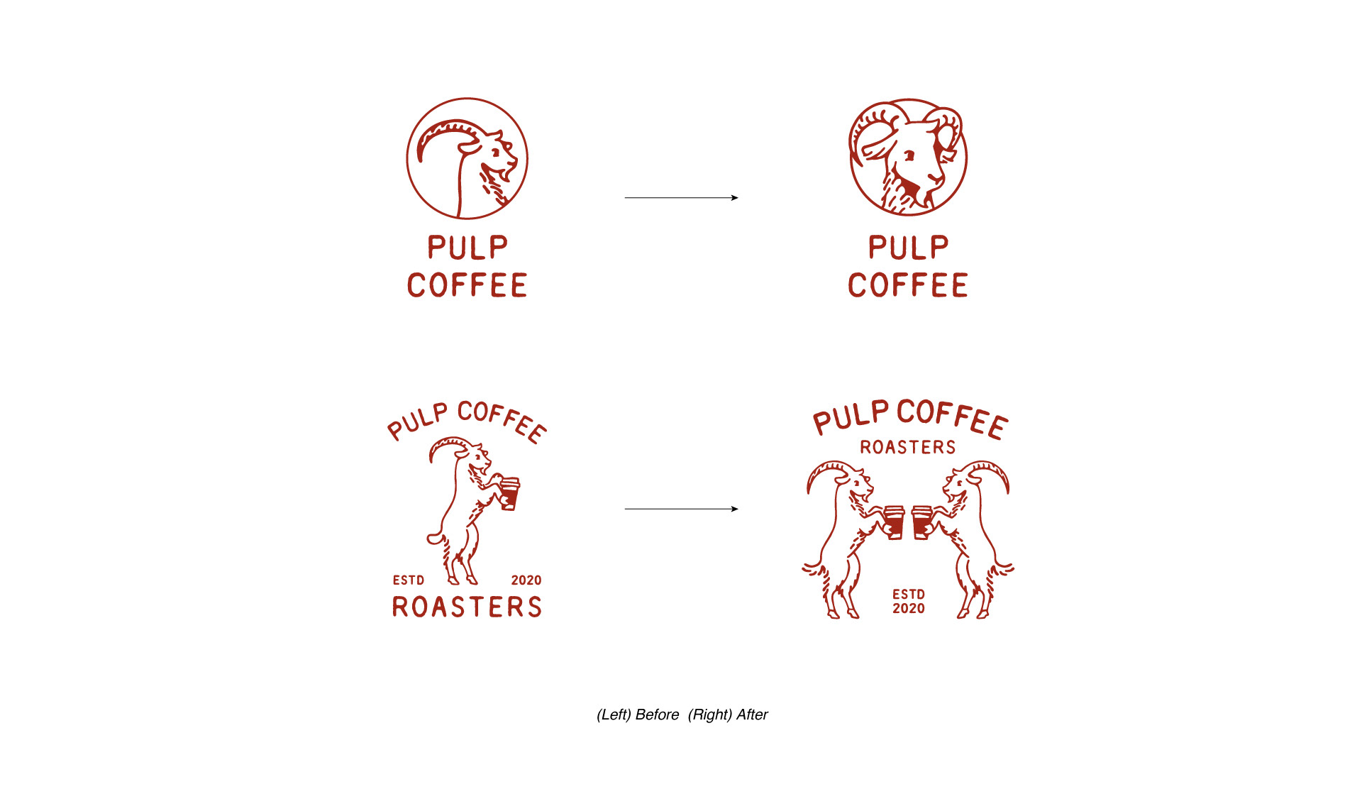
클라이언트는 두번째 시안의 A시안을 선택하셨고, 디자인 심화과정을 거쳐 아이덴티티를 확정하였습니다.
Our client chose Design A from the second draft. The brand identity was finalized after some intensive process of adjustment.

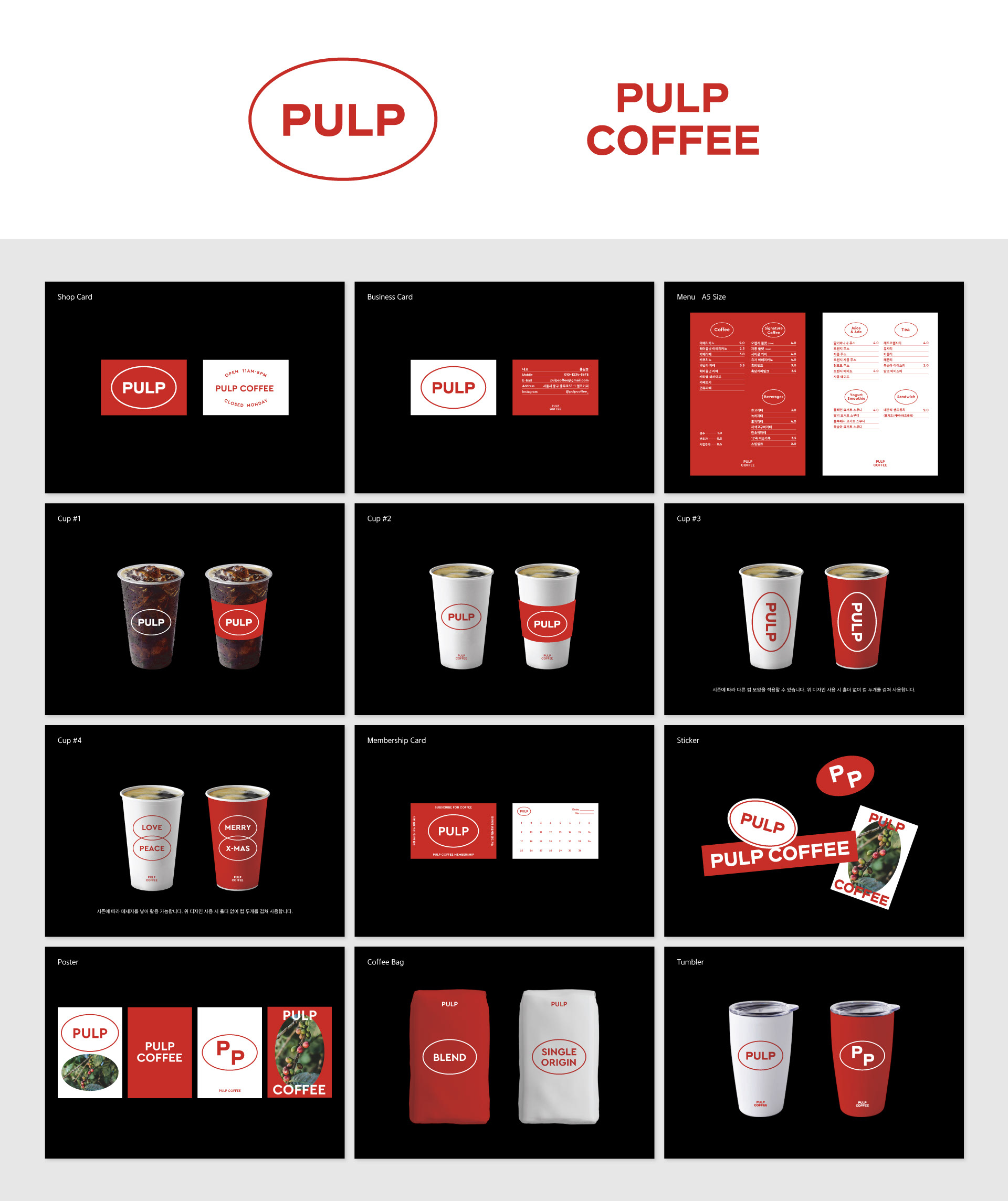
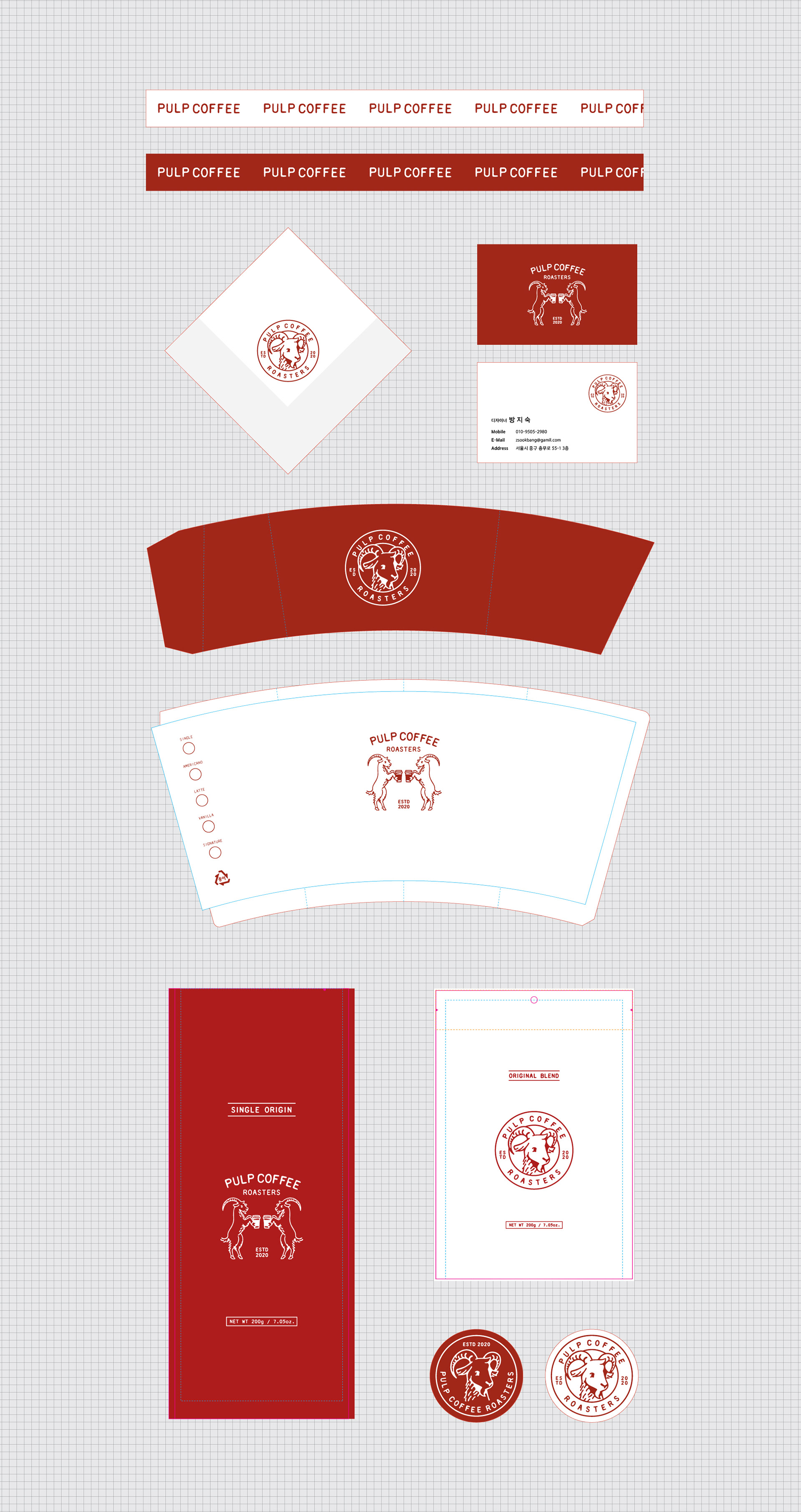
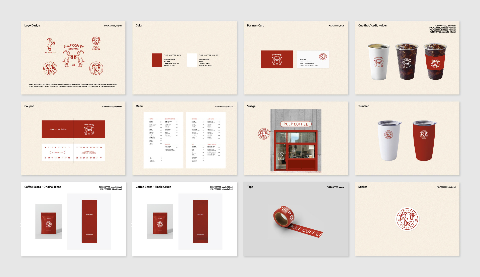
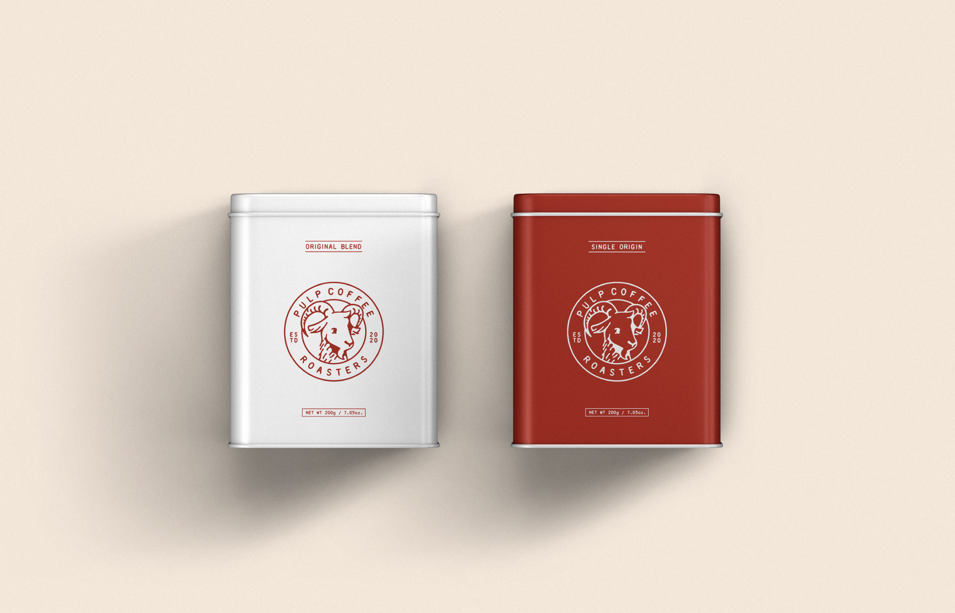
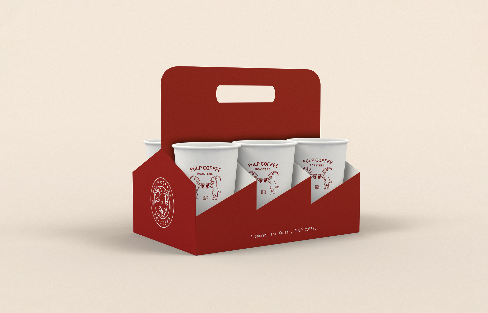
Application Design
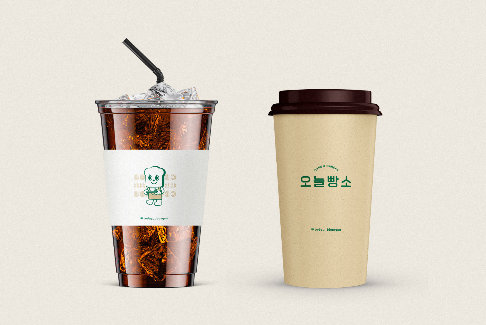
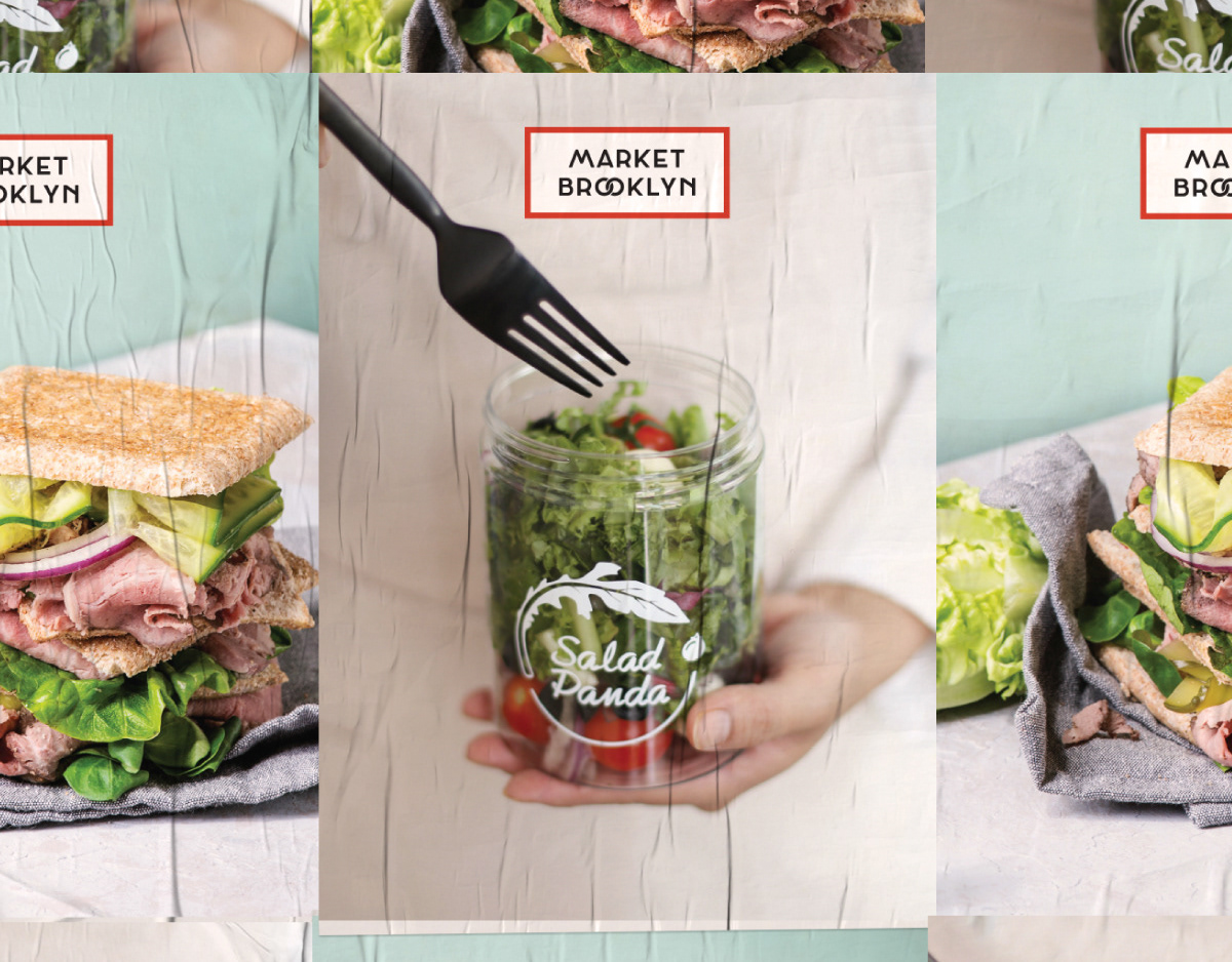
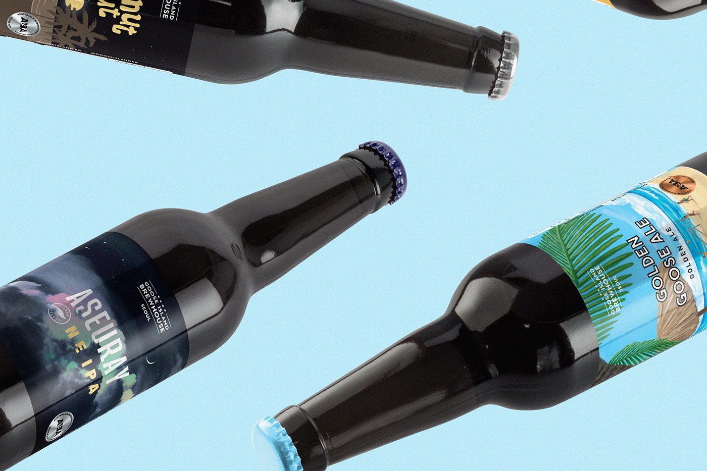
펄프커피의 어플리케이션 디자인입니다. 브랜드만의 아이덴티티를 살려 다양한 매체에 적용하였습니다.
This is an application design for Pulp Coffee. We applied the brand identity to various media.
Contact
@studioflatflag
studioflatflag@gmail.com
@studioflatflag
studioflatflag@gmail.com
copyrightⓒ 2020 All rights reserved by Studio Flat Flag