
Background
오티앤너티는 화학 첨가물, 방부제 없이 유기농, 친환경을 지향하는 수제 그래놀라 브랜드입니다. 기존에 [오네릭]이라는 이름으로 브랜드를 운영해오시다가 전문적인 디자인의 부재와 고객들이 그래놀라를 모르거나 어렵게 생각하는 부분을 한계로 느끼시고 새로운 이미지로 리브랜딩하기 위해 찾아주셨습니다.
Oaty & Nutty is a homemade granola brand that aims to be eco-friendly, organic, and not use preservatives or chemical additives. Under the previous name [Oneric], our client asked for a rebranding because their customers weren’t familiar with granola and had difficulty understanding the brand concept for the lack of professional design aspects.
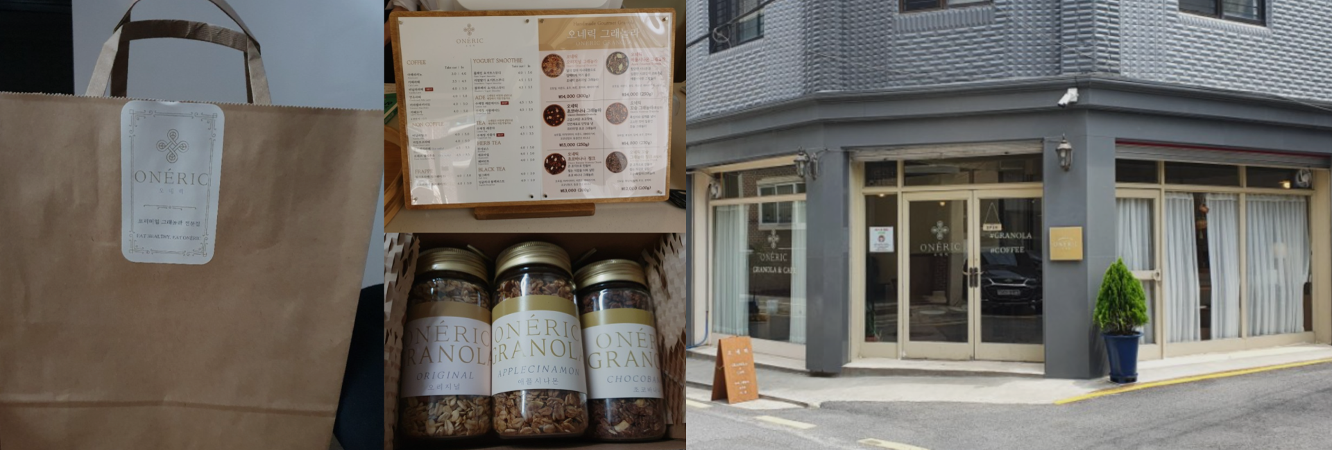
Before Rebranding
Brand Concept
주재료인 귀리, 넛을 캐릭터화하여 아직은 대중들에게 생소한 그래놀라를 친근하고 알기 쉽도록 표현하고, 이름 또한 곡물을 베이스로 하는 것이 느껴질 수 있도록 Oaty&Nutty로 변경하여 리브랜딩을 진행하였습니다.
We visualized oats and nuts since both were more known than the granola itself, which is unfamiliar to the public, and also considered the fact that both oats and nuts were the main ingredients of granola. Also changed the name of the brand to Oaty & Nutty to let the people know that their product is mainly made out of grains.
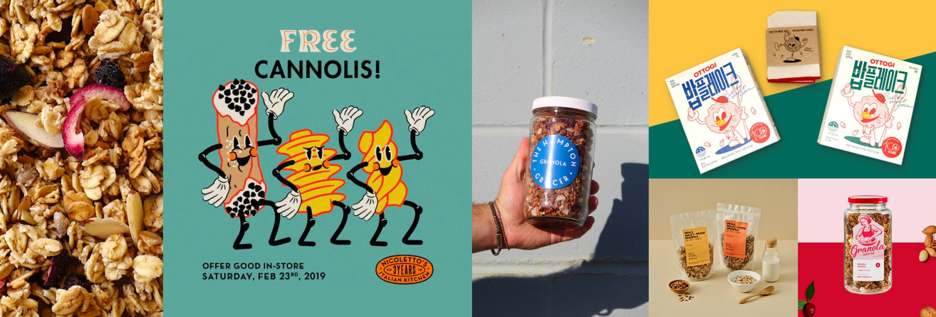
Reference Images
The First Proposal
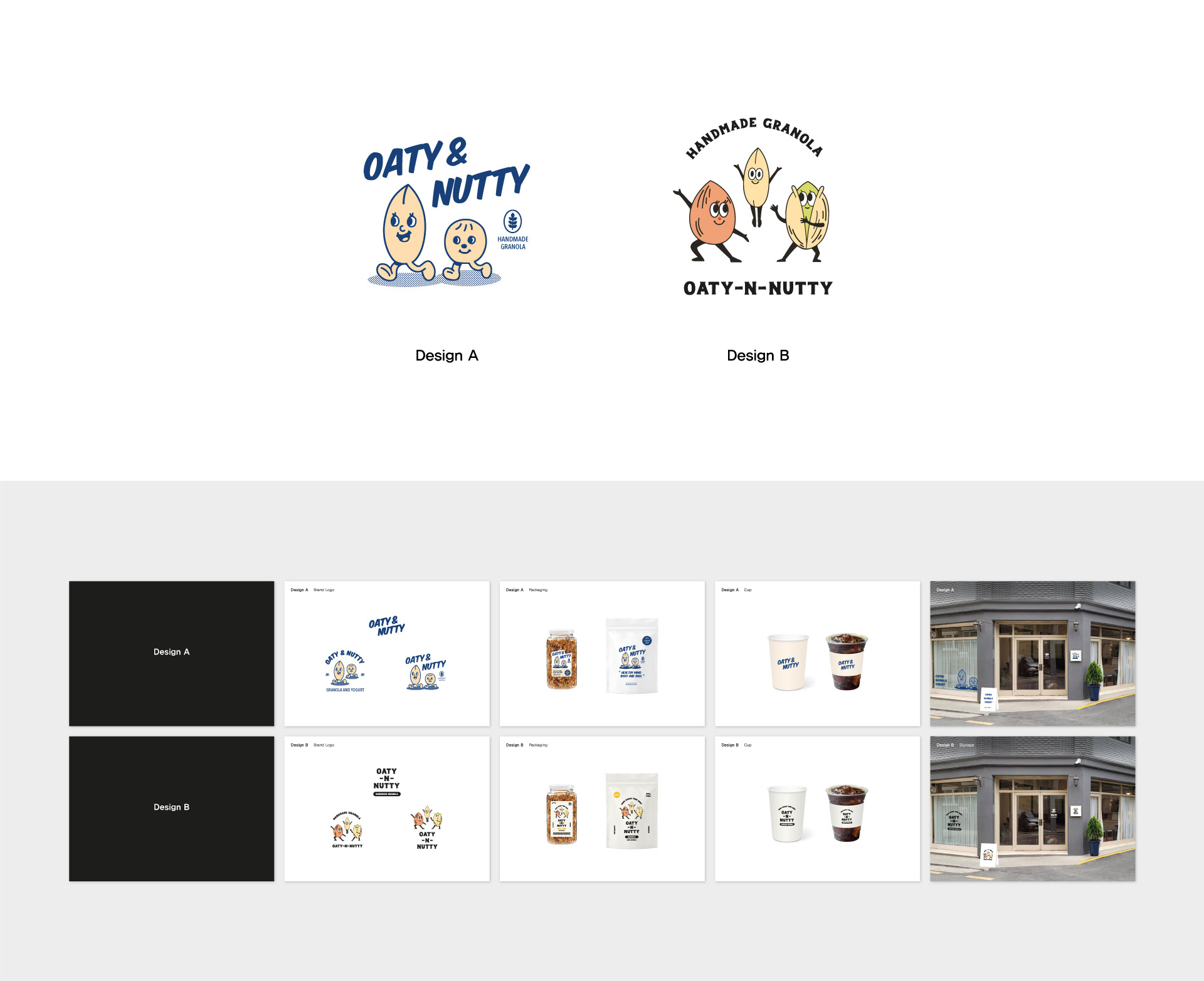
오티앤너티의 첫 디자인 시안입니다. 주재료인 귀리, 넛을 캐릭터화하여 모노톤, 코믹 스타일의 Design A, 귀리, 아몬드, 피스타치오를 캐릭터화하여 역동적인 느낌의 Design B 입니다.
This is the first proposal of Oaty & Nutty. Design A is comprised of a monotoned, comic-style of oats and nuts mascot, and Design B has a more dynamic feeling from a mascot made out of oats, almonds, and pistachios.
The Second Proposal
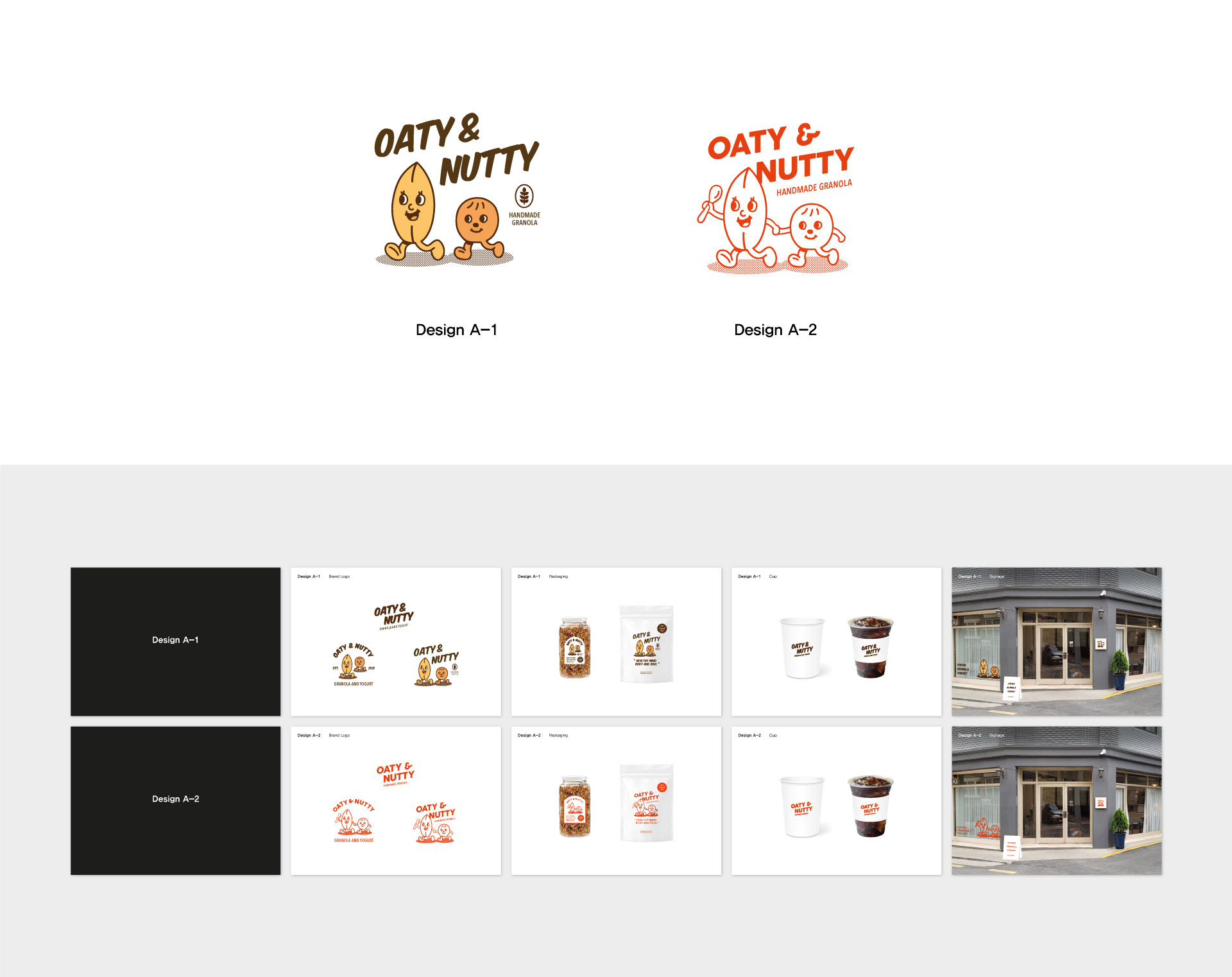
오티앤너티의 두번째 시안입니다. 첫번째 시안 Design A에서 클라이언트의 피드백을 반영하여 컬러링한 Design A-1, 손을 추가 드로잉하고 폰트를 변경한 Design A-2입니다.
This is the second proposal of Oaty & Nutty. Our client requested some variations on Design A: different color selection from Design A-1, and a font change and addition of hand-drawing as Design A-2.
The Third Proposal
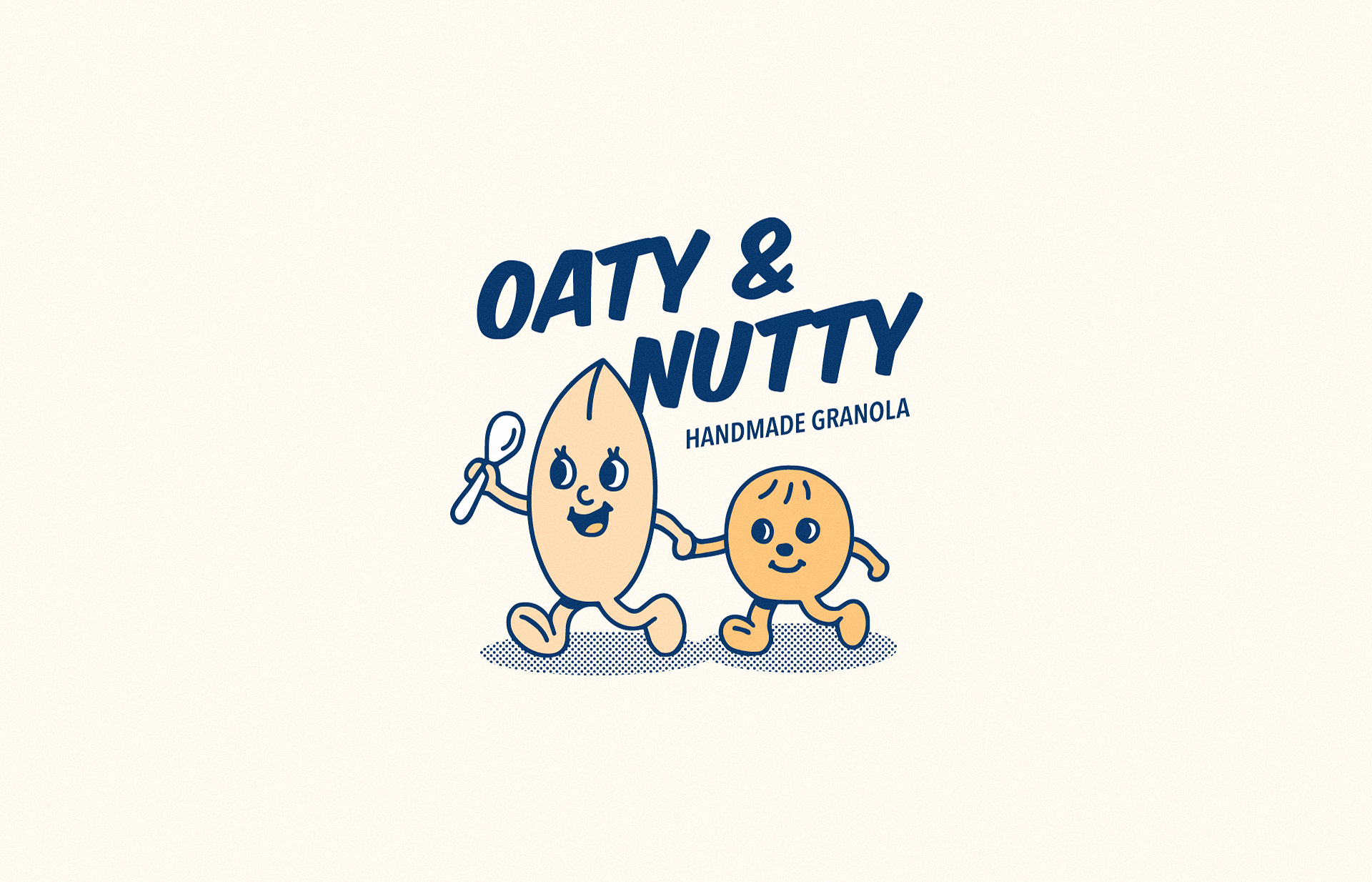
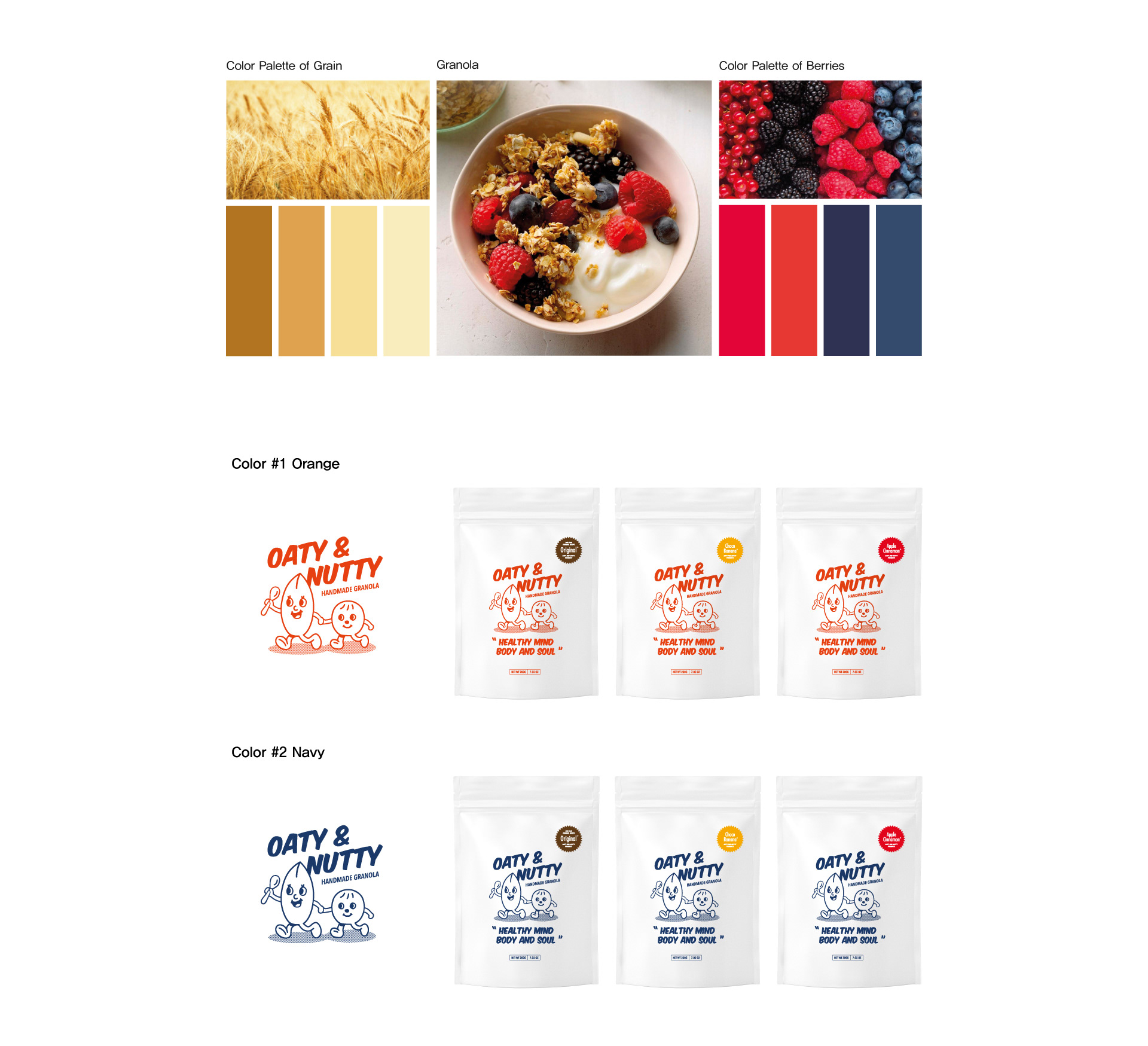
두번째 시안의 Design A-1의 서체와 A-2의 캐릭터를 합쳐 브랜드 로고를 확정짓고, 브랜드 메인 컬러를 선정하였습니다. 브랜드 컬러는 그래놀라 위에서 가장 어울리고 돋보일 수 있는 베리류의 컬러에서 차용하였습니다. 다만, 현재 시장에서 비슷한 포지셔닝에 있는 브랜드와의 중복을 막기 위하여 레드 계열 색상은 오렌지로 변경하여 #1 오렌지, #2 네이비로 제안하였습니다.
The finalized brand logo was combining the second proposal’s Design A-1 typeface and A-2’s character design, and selected the brand’s main color as well. The colors were derived from the colors of berries, which emphasizes and fits the best with granola. However, to differentiate with other brands in the current market, we had to change the red tone to orange. Finally, we suggested #1 color as Orange, and #2 color as Dark Blue.
Design Development
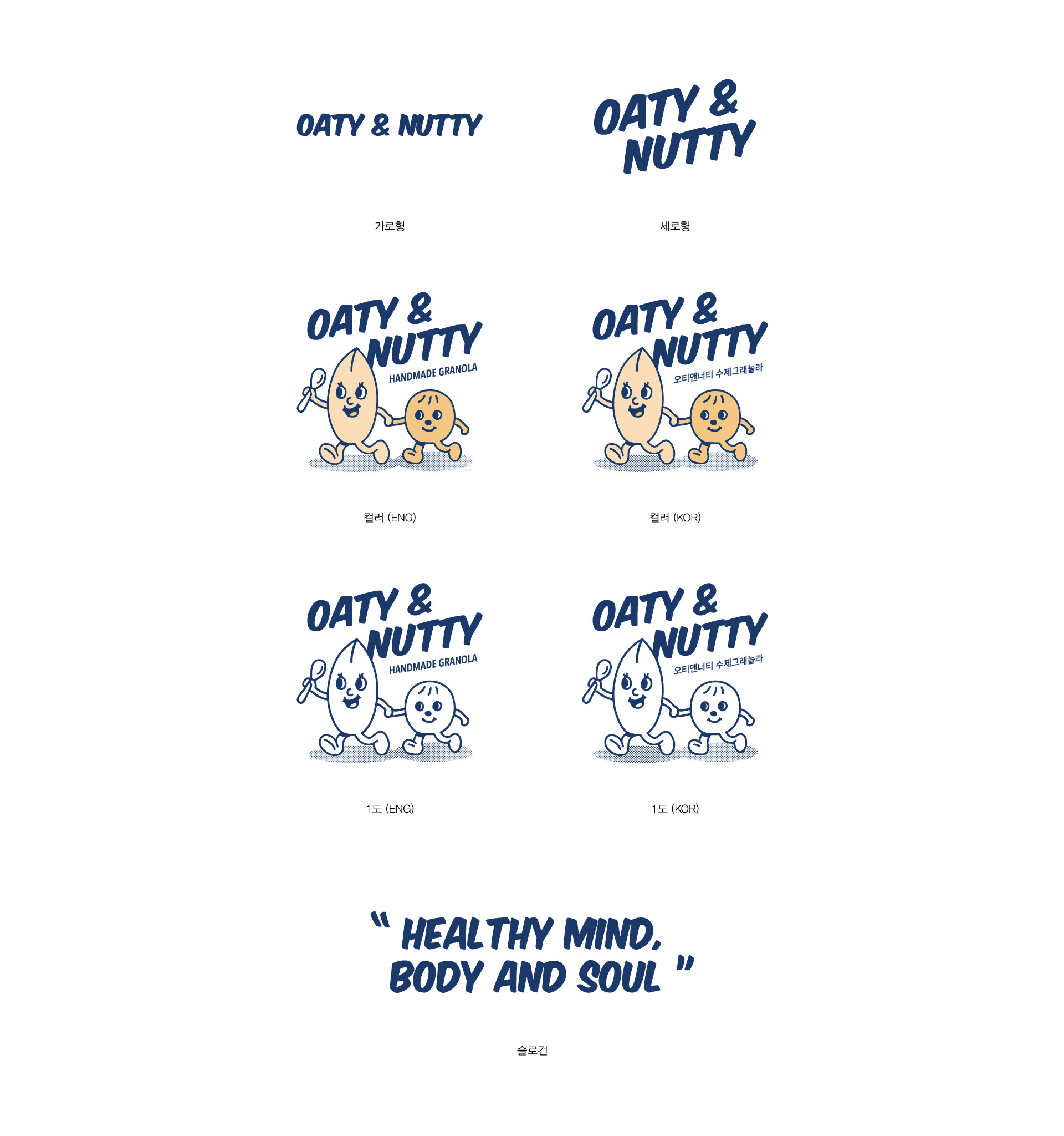
네이비 컬러로 확정된 로고를 심화과정을 거쳐 완성하였습니다. 다양한 활용이 가능하도록 여러 형태의 워드마크, 캐릭터 베리에이션을 작업하였습니다.
Through an intensive course of finalization, dark blue color was selected as the brand logo’s color. To utilize it in various media, we worked on different forms of the word mark and character variations.
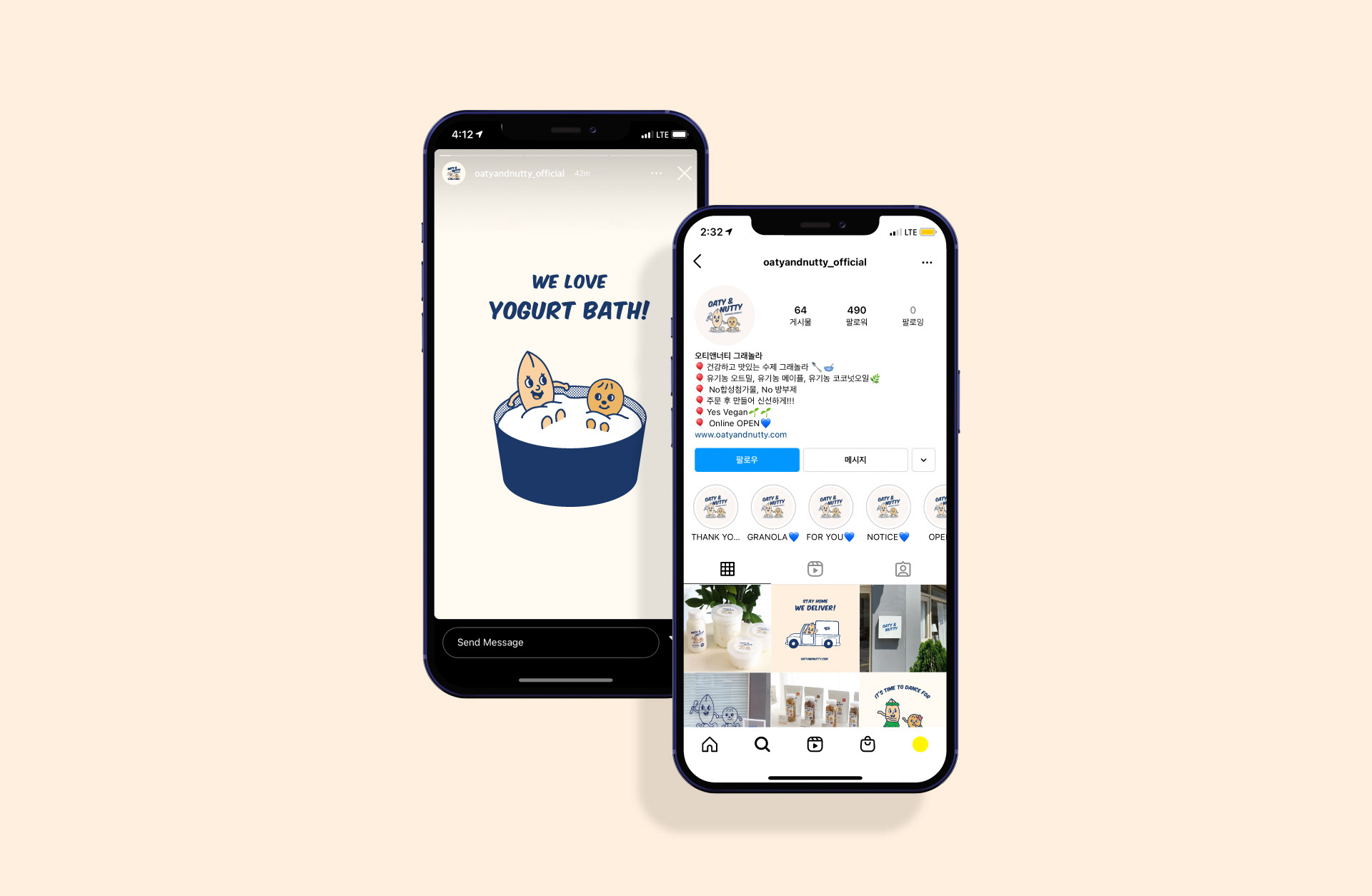
Application Design
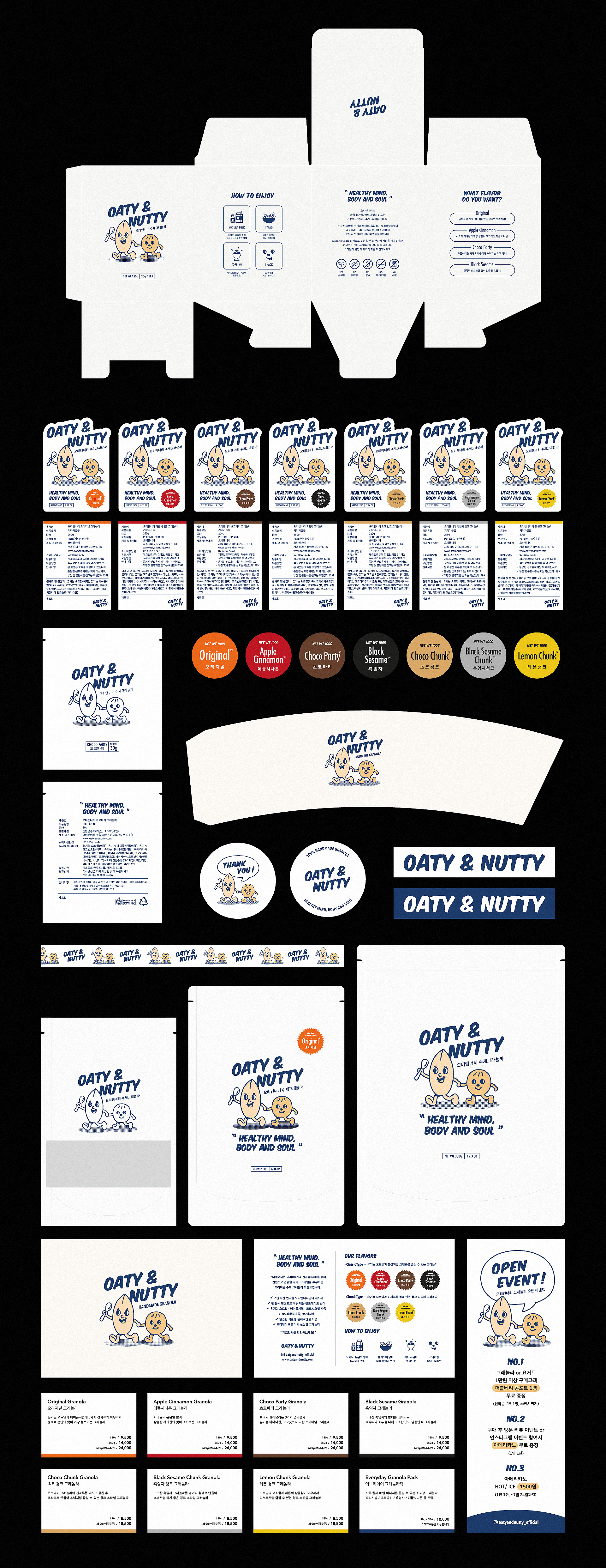
오티앤너티의 어플리케이션 디자인입니다. 그래놀라 패키지 디자인(보틀, 팩, 소포장, 박스), 명함, 엽서, 스티커, 포스터, SNS 등 다양한 매체에 브랜드 아이덴티티를 살려 적용하였습니다.
This is Oaty & Nutty’s application design. We applied the brand identity in different forms of media, such was granola package design(bottles, pouches, boxes, parcels), business cards, postcards, stickers, posters, social media, and etc.
Contact
@studioflatflag
studioflatflag@gmail.com
@studioflatflag
studioflatflag@gmail.com
copyrightⓒ 2021 All rights reserved by Studio Flat Flag