
Overview
세종 지역을 기반으로 한 버터샌드의 브랜드 네이밍, 슬로건, 패키지 디자인, 굿즈 디자인, 상세페이지 작업을 수행했습니다. 버터샌드를 통해 작은 행복을 나눌 수 있다는 컨셉으로 네잎클로버를 테마로 하여 브랜드를 완성했습니다.
We worked on the brand name, slogan, package design, merchandise design, and shopping page of bisquit based on the Sejong area. With the concept of sharing small happiness of the bisquit, we completed the brand with a four-leaf clover theme.
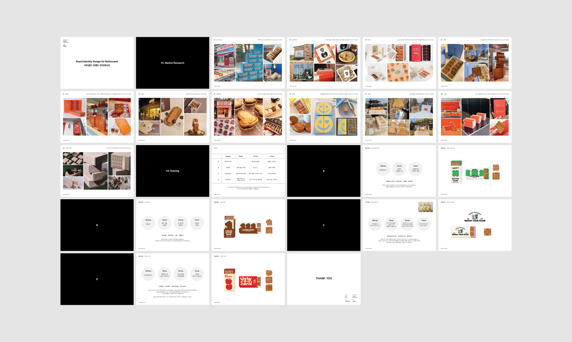
STEP 1. Research, Naming & Idation
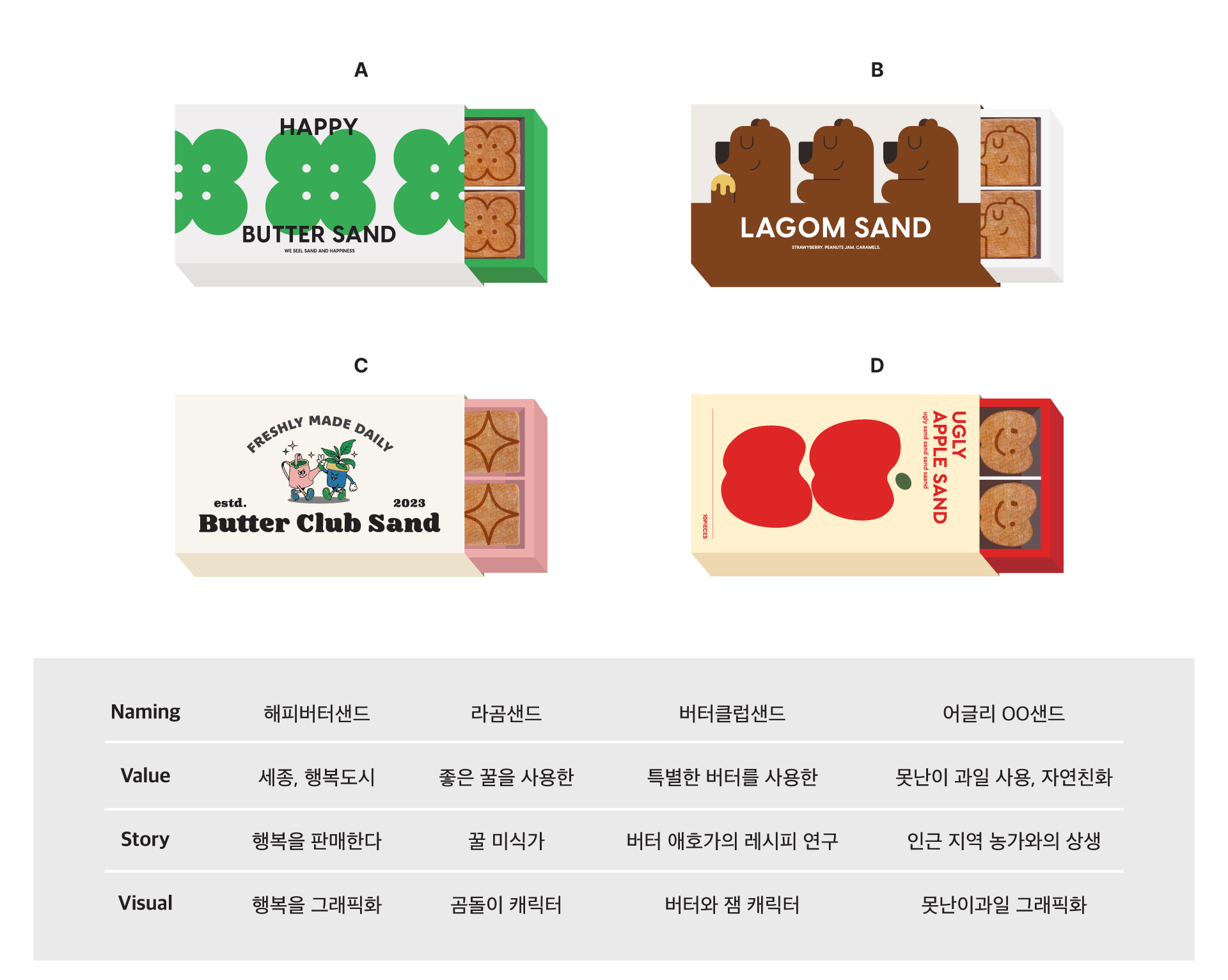
클라이언트의 특성과 시장 상황을 파악하고, 네가지 네이밍과 디자인 아이디어 시안을 산출했습니다. 네이밍 단계에서도 이름만 제안하는 것이 아니라, 공감각적인 디자인 아이디어를 함께 제공할 수 있는 것이 스튜디오 플랫플래그만의 강점입니다.
We identified the client’s condition and the market situation, and provided four naming and design idea drafts. We have provided multi-sensory namings which are combined with design ideas. This is the strength of Studio Flat Flag's naming work.
We identified the client’s condition and the market situation, and provided four naming and design idea drafts. We have provided multi-sensory namings which are combined with design ideas. This is the strength of Studio Flat Flag's naming work.
Step 2. Concept, Keyword & Slogan
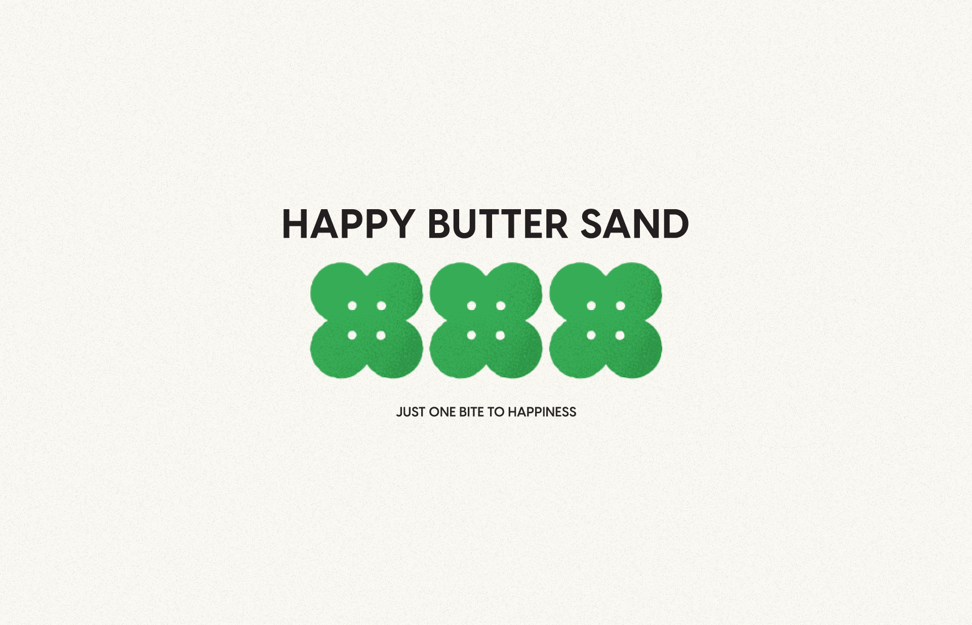
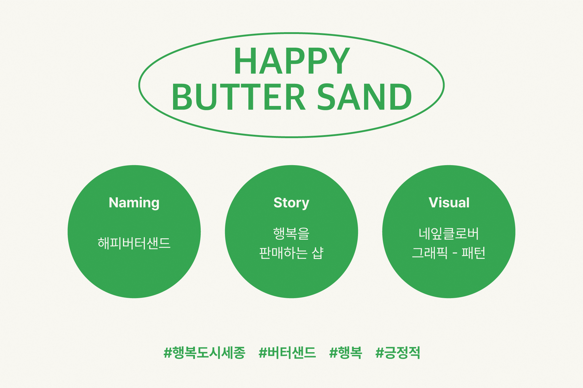
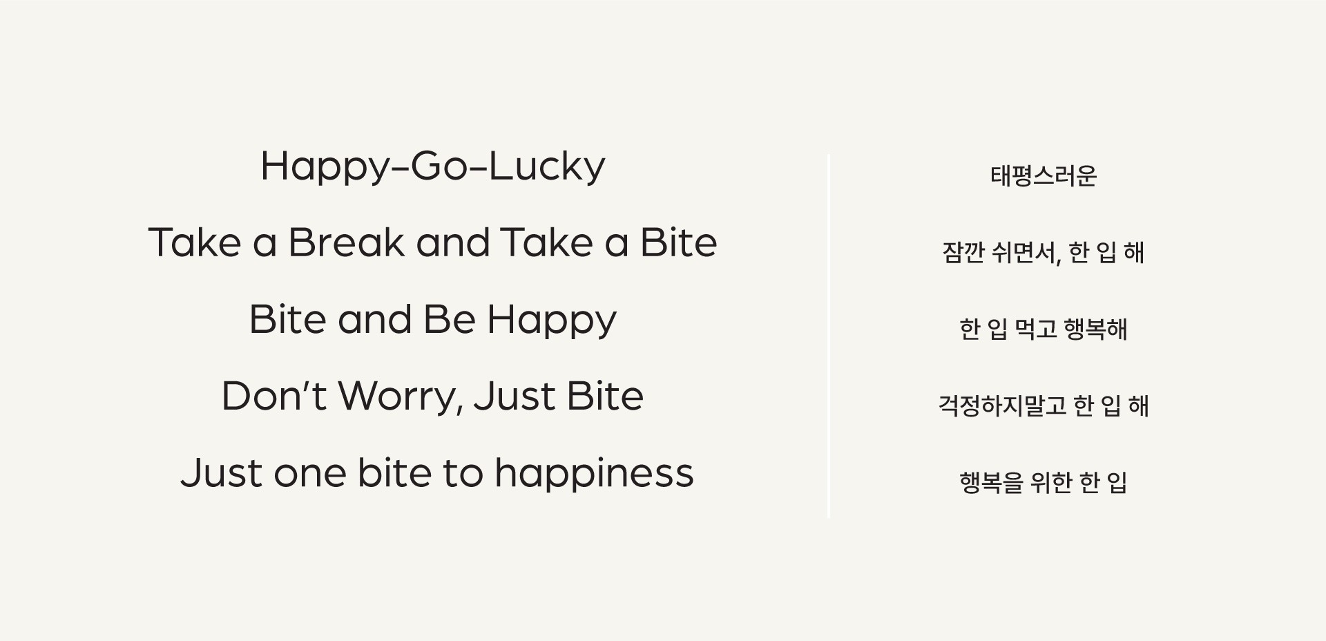
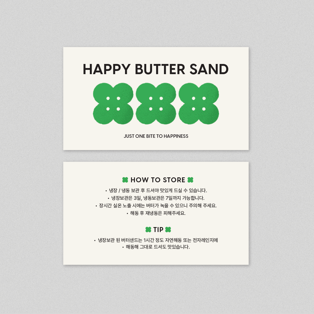
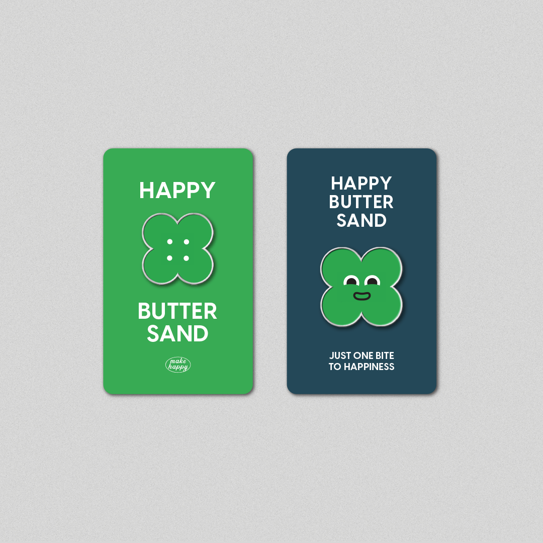
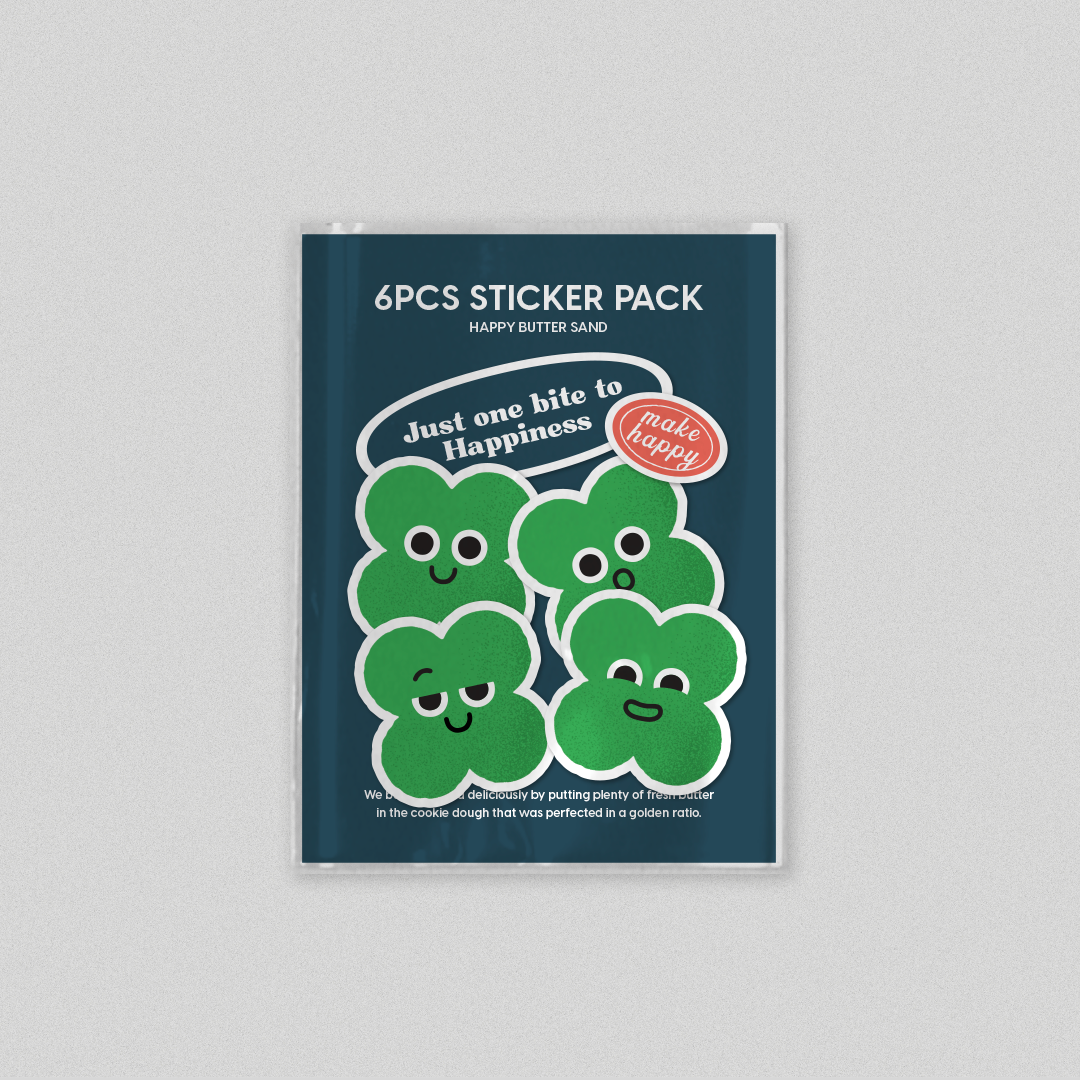
클라이언트는 A안 '해피버터샌드'를 선택했습니다. '행복도시, 세종'이라는 도시 슬로건에서 착안하여, 세종에서 행복의 버터샌드를 만든다는 컨셉입니다. 행복의 상징으로서 클로버를 키비주얼로 사용하고, 맛있는 버터샌드와 행복한 무드를 연상시키는 슬로건도 동시에 떠올려 제안했습니다.
The client chose A, 'Happy Butter Sand'. The concept is to make a butter bisquit of happiness, inspired by the city slogan, 'the Happy City, Sejong'. We uses a clover as a key visual of a symbol of happiness. At the same step, We also got the idea of slogans to creates a mood of delicious bisquit and happiness.
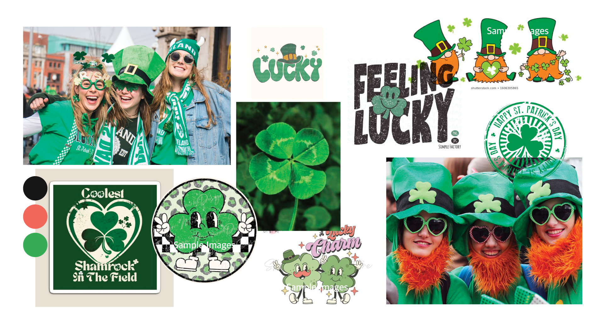
Reference images for Happy Butter Sand © Pinterest, Google
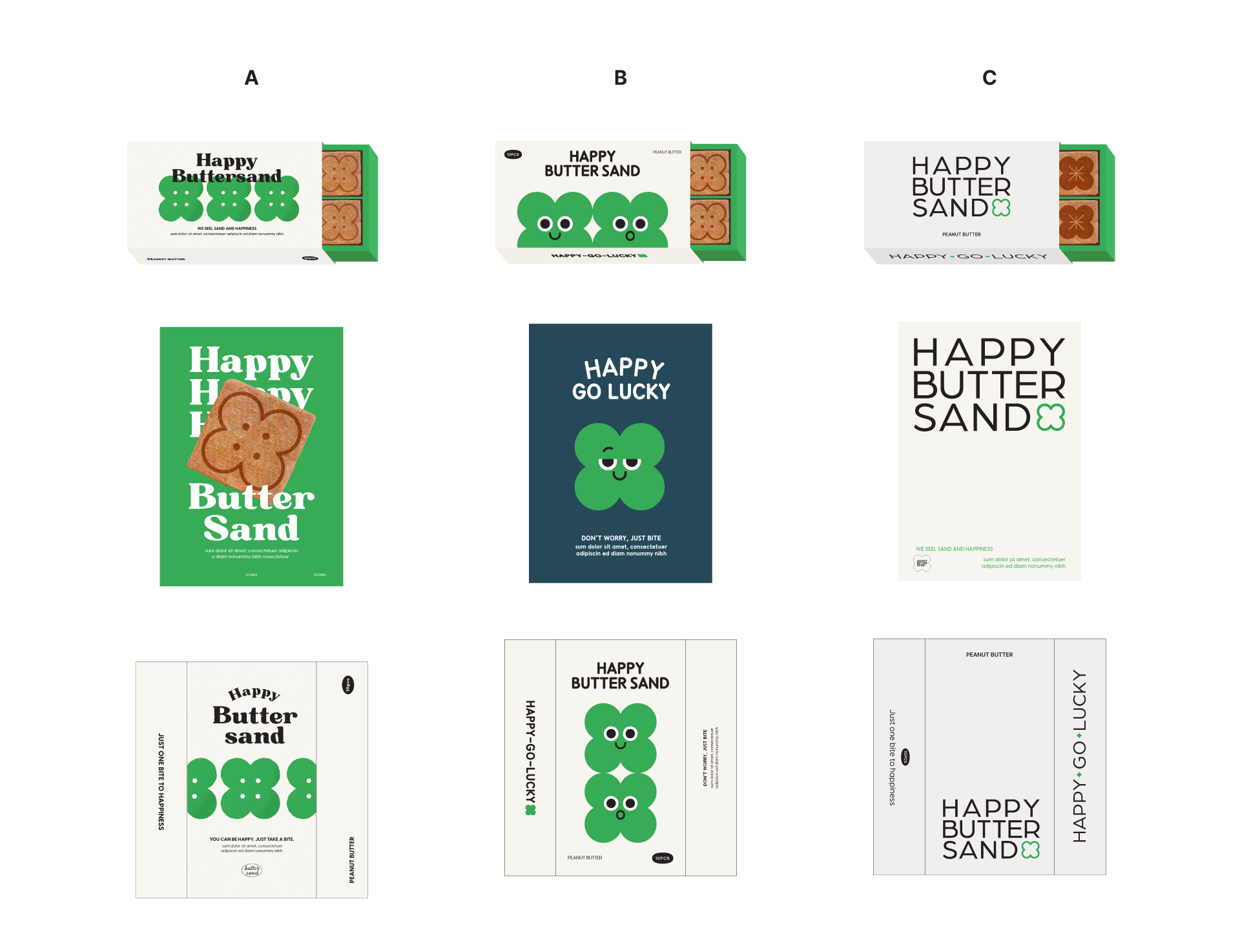
Step 3. Developement
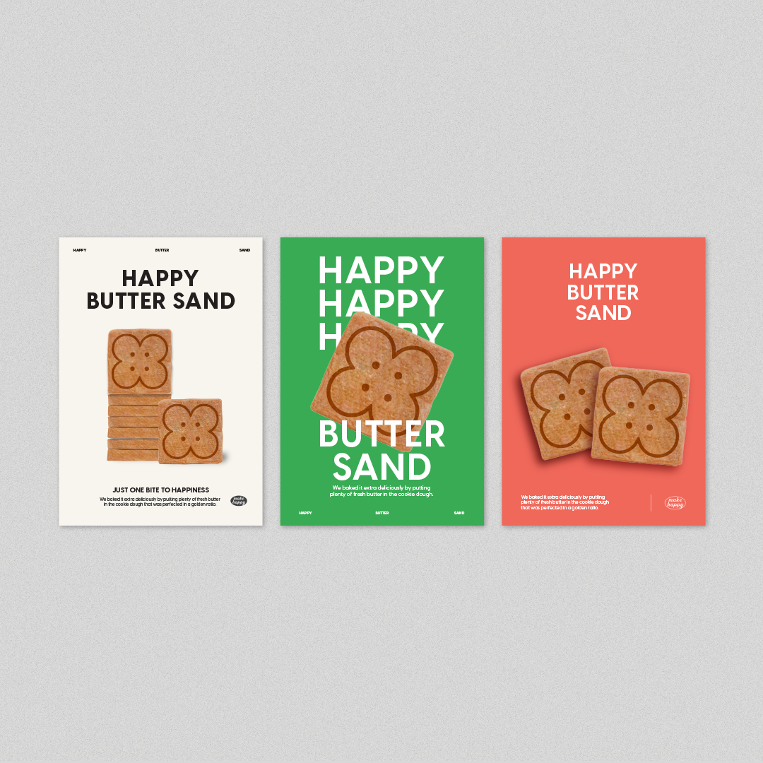
컨셉 안에서의 변주로 클라이언트에게 선택의 경우를 제시하며 완성도를 높였습니다.
Within the concept, we showed big and small design changes, increasing the completeness of the work.
Step 4. Final Report
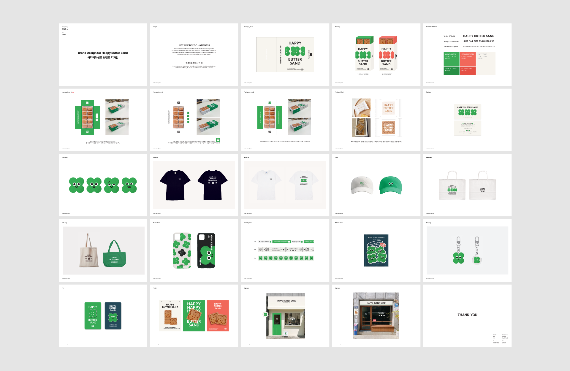
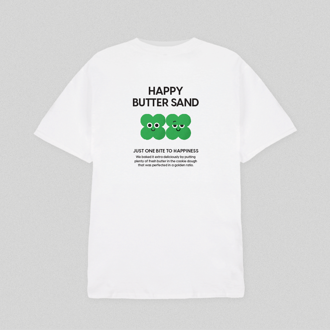
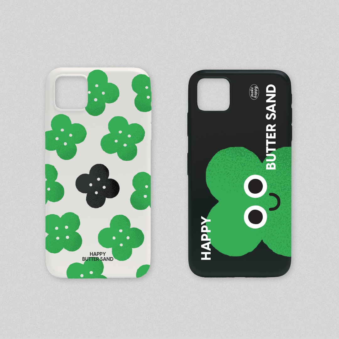
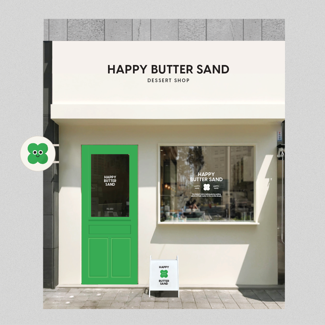
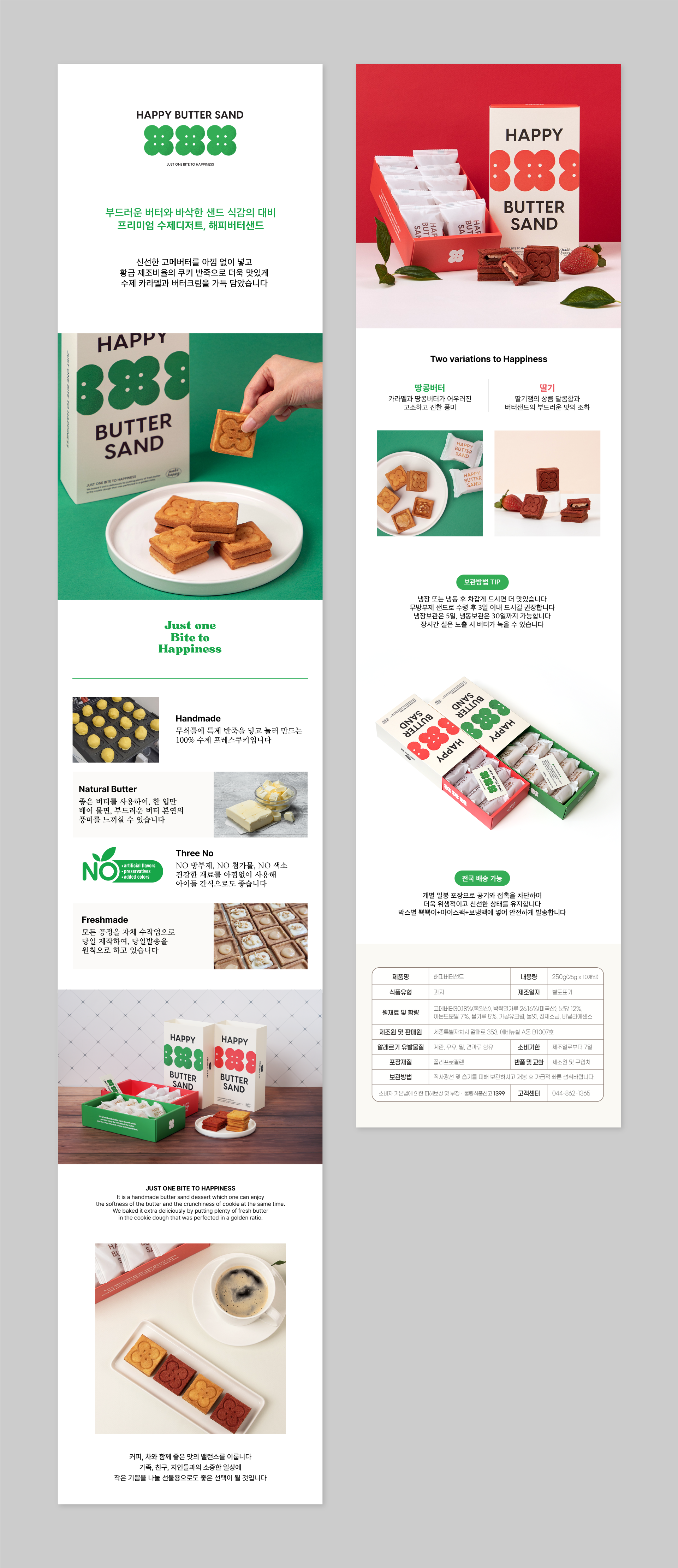
위트있는 클로버 일러스트, 매장 포스터, 딸기맛 베리에이션 패키지를 비롯하여 각종 브랜드 어플리케이션을 디자인하였고, 상세페이지, 패키지의 칼선 작업 등을 추가로 진행하여 통일된 한 묶음의 브랜딩 작업을 마무리했습니다.
We completed witty clover illustrations, various brand applications, shop posters, a package for strawberry-flavored butter sand, shopping pages and printed materials.
Contact
@studioflatflag
studioflatflag@gmail.com
@studioflatflag
studioflatflag@gmail.com
copyrightⓒ 2024 All rights reserved by Studio Flat Flag