
Overview
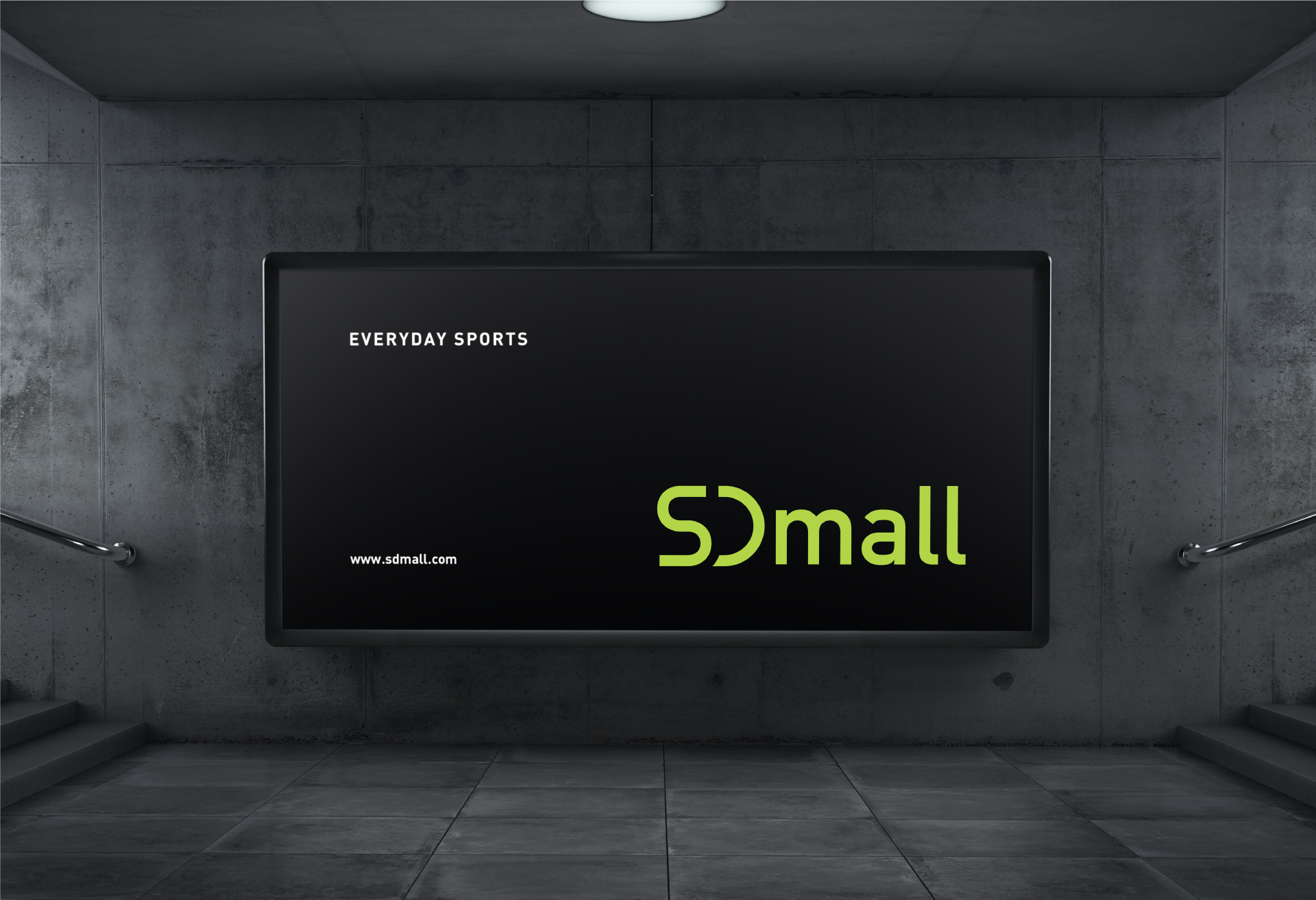
수영 전문 쇼핑몰로 시작한 SDMall이 토탈 라이프 스포츠 쇼핑몰로서 상품군을 확장하면서 브랜드 아이덴티티 디자인도 함께 리뉴얼하였습니다. 판매하는 다른 여러 브랜드 로고들과 부딪히지 않도록 로고를 모던하고 단순하게 디자인 변경하는 것이 큰 목표였습니다. 디자인 과정에서 스포츠를 즐기는 모든 사람들이 매일 가깝게 두고 이용한다는 의미에서 Everyday Sports라는 슬로건을 제안하였습니다.
SD Mall started off as a shopping mall specialized for swimming, but expanded their products as a total-life sports shopping mall. As they expanded, they requested for a renewal in the brand identity design as well. The biggest aim was to differentiate the brand design with other competitive brands existing in the market, by making it look modern yet simple. In the process of designing, we also suggested a slogan, ‘Everyday Sports’ which holds the meaning that the people who enjoys sports uses SD Mall everyday.

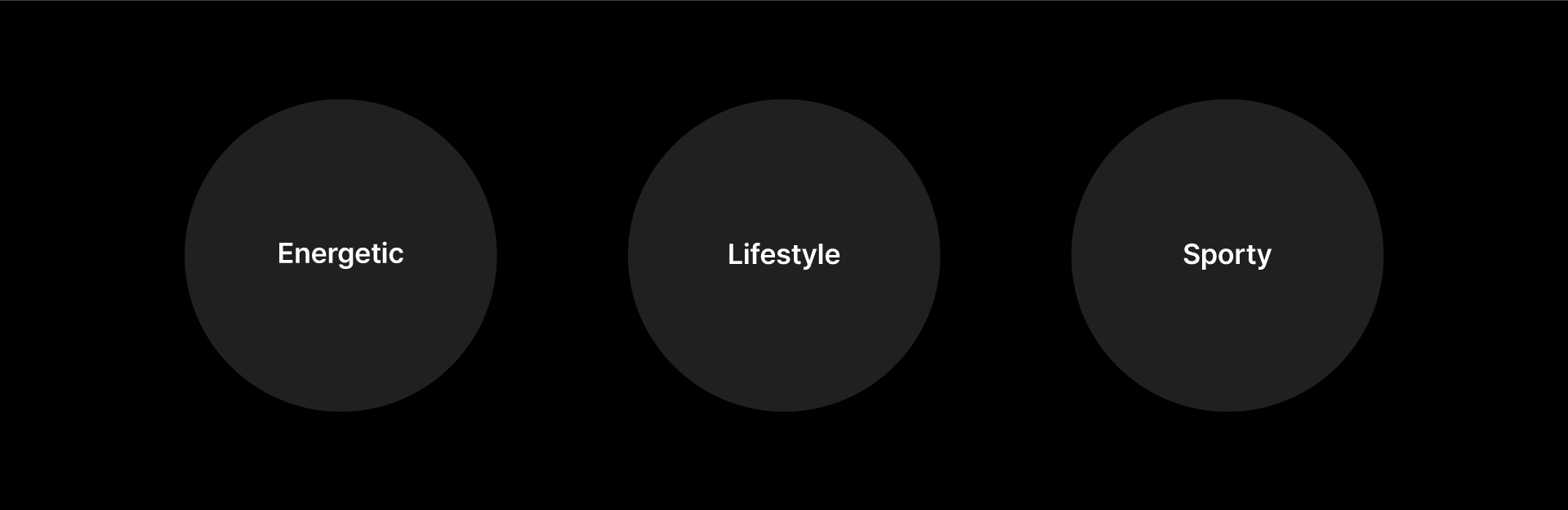
Brand Keyword
Identity Development
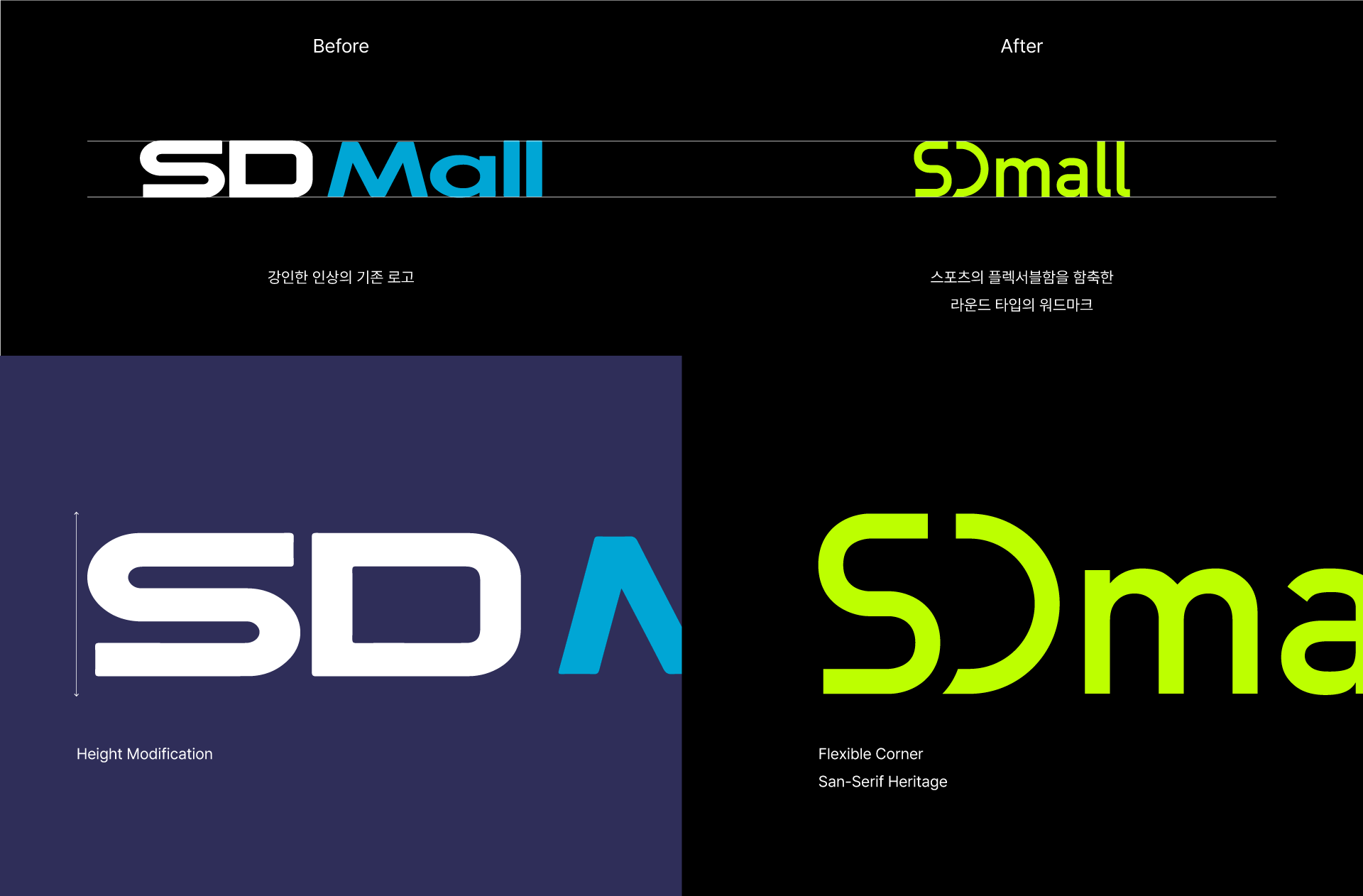
곡선과 직선의 느낌이 혼재하는 기존의 디자인으로부터 스포츠의 플렉서블함을 강조한 통일된 느낌의 브랜드 아이덴티티로 개선하였습니다. 유동적인 스포츠의 속성으로부터 디자인의 영감을 얻었고, D의 세로 획을 생략하여 S와 D가 한 덩어리로 흐르는 듯한 조형성을 표현하였습니다. 그로테스크-산스 계열의 폰트를 기준으로 워드마크를 정리하여 모던하고 스마트한 이미지를 연출하였습니다.
We improved the existing brand identity that had both curved and straight aspects to a more unified design, which focuses on the liveliness of sports. The design was inspired by the flexibility of sports, disregarded the vertical stroke of the letter D, and combined it with the letter S to make it look like a single form. We shaped up the word mark that used a Grotesque-Sans kind of typeface, to give a more modern and smart look.
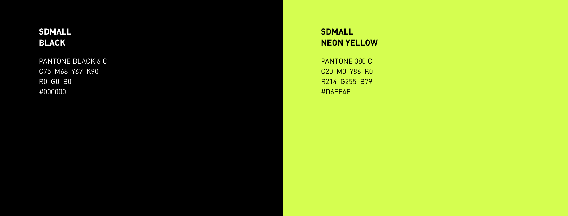
Color System
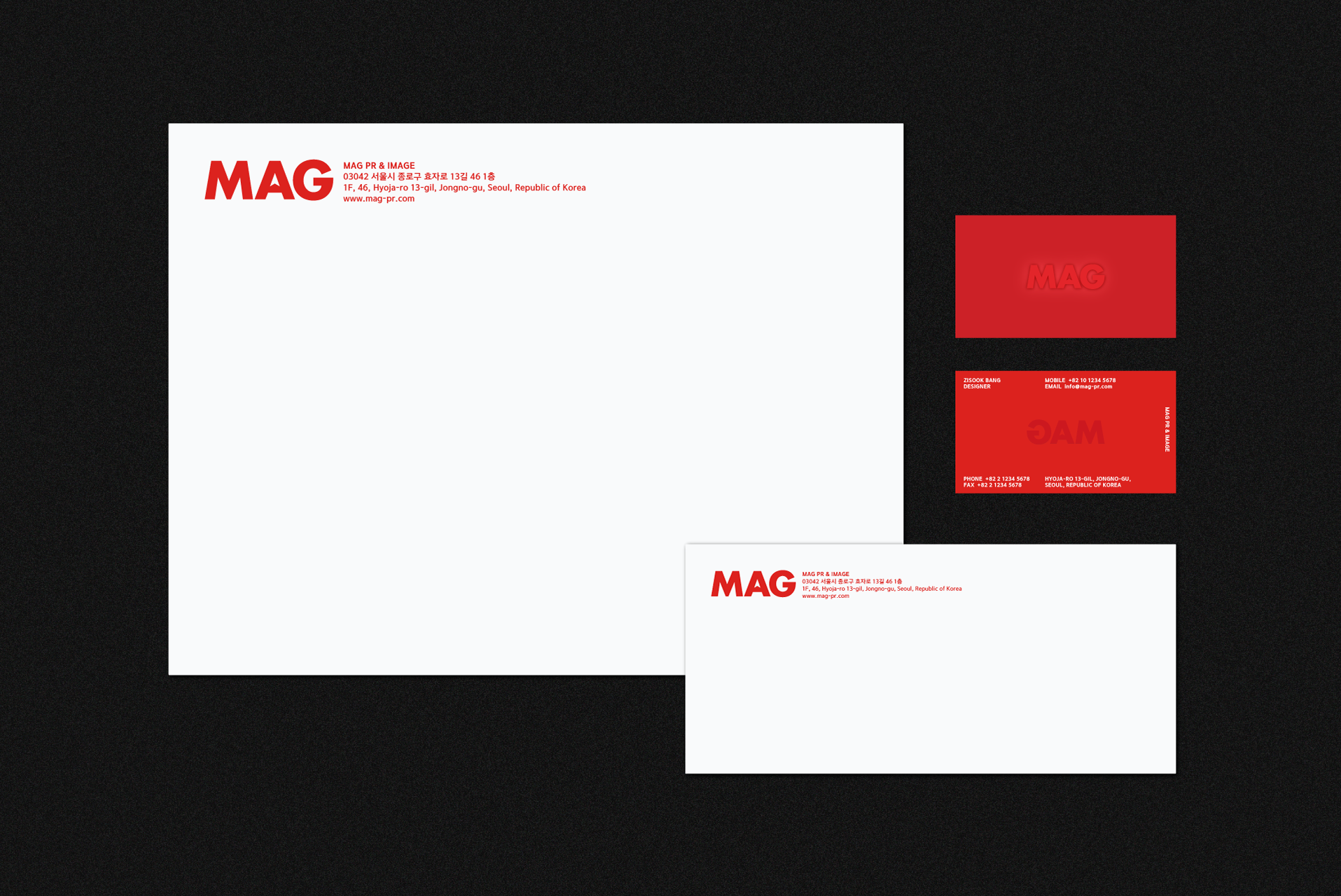
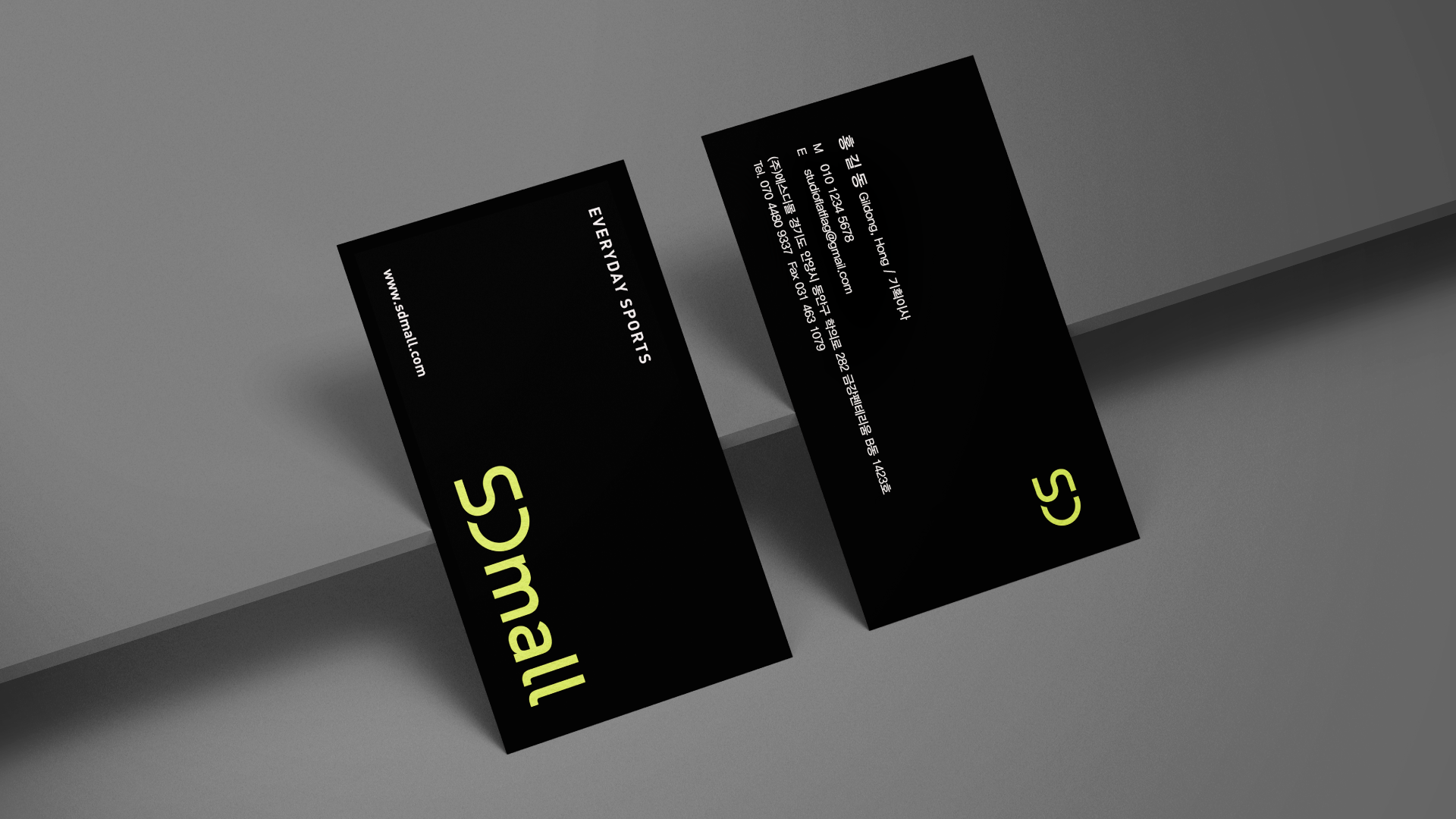
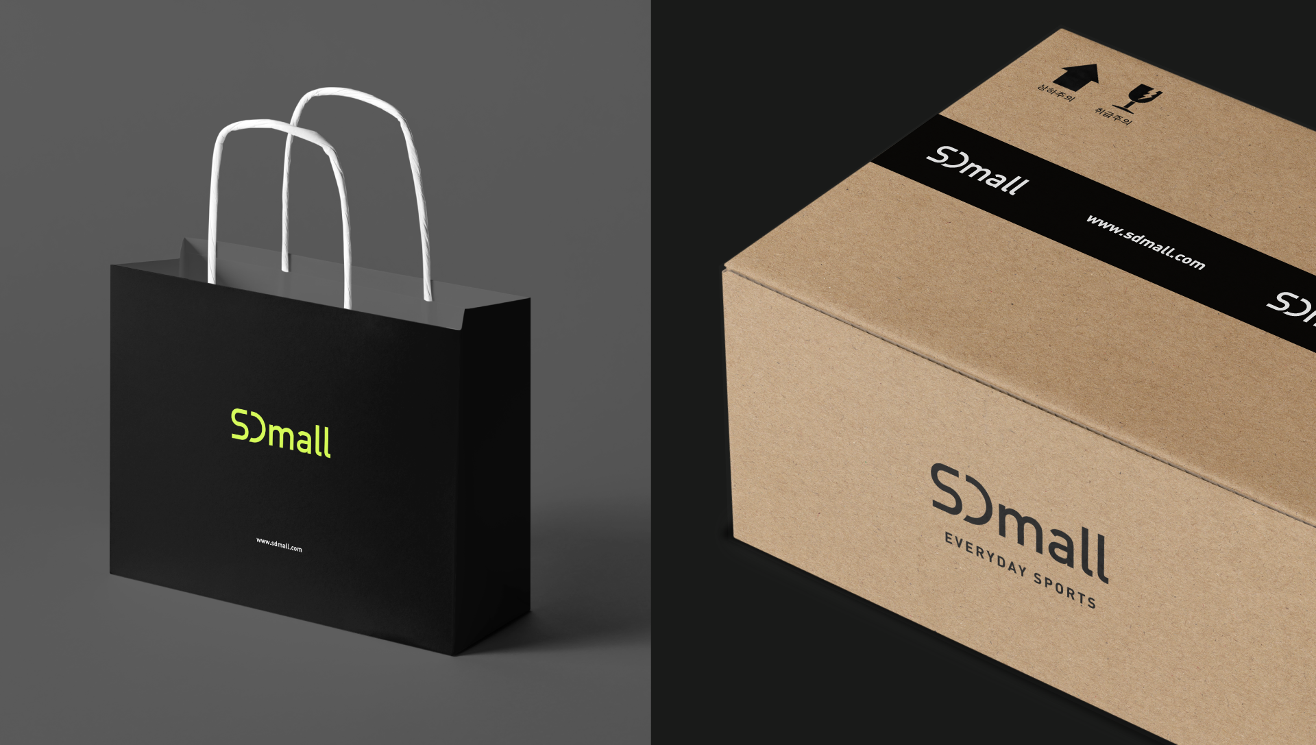
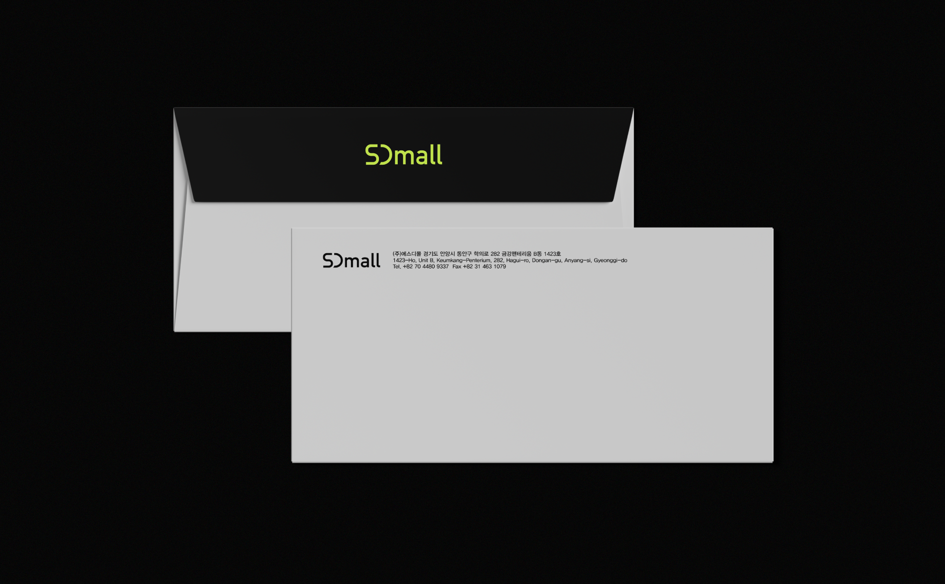
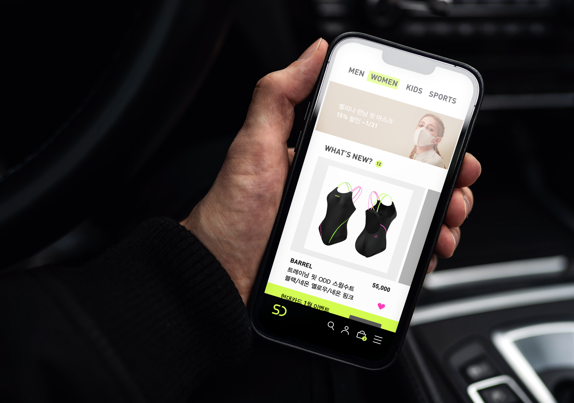
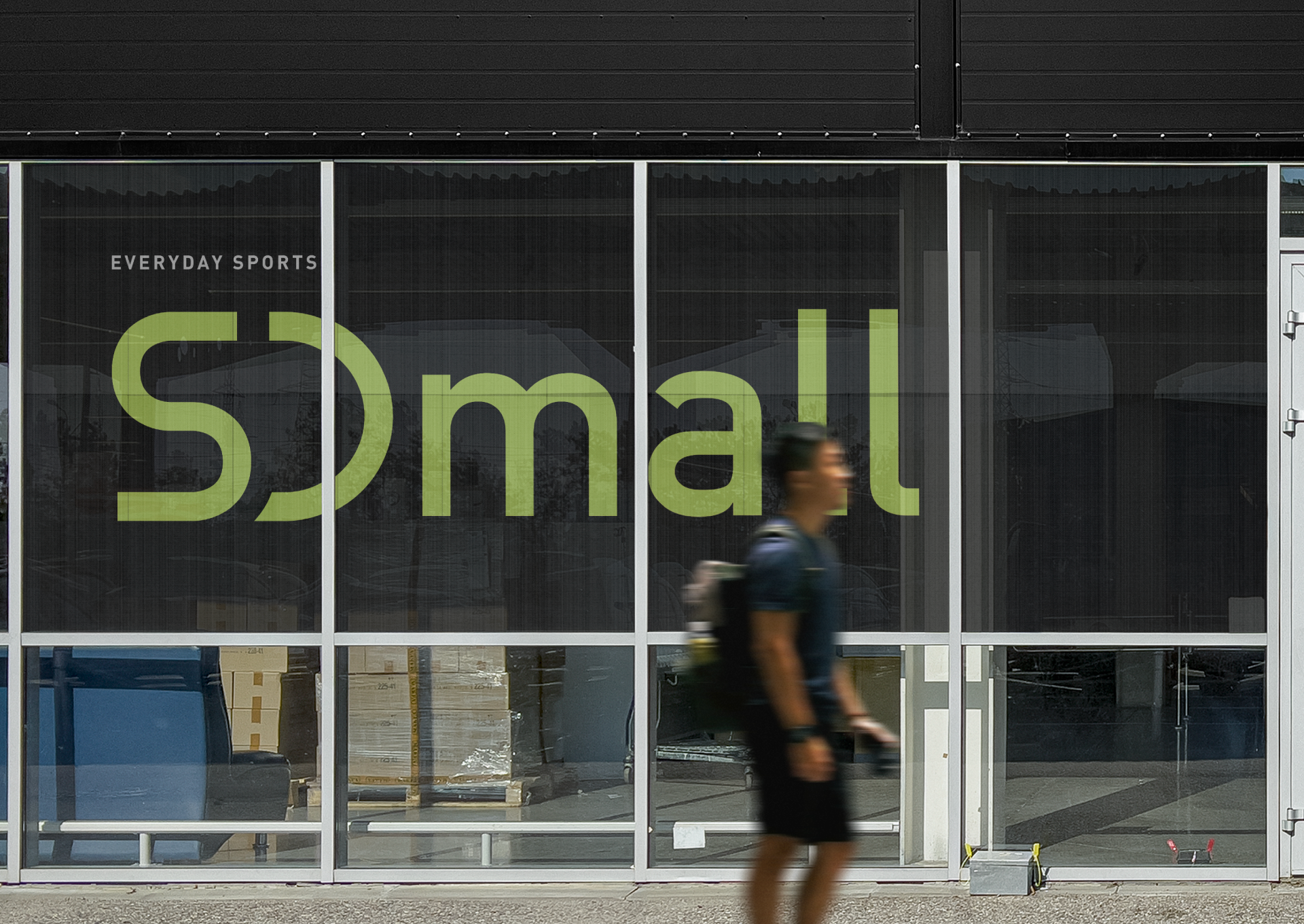
Application
Contact
@studioflatflag
studioflatflag@gmail.com
@studioflatflag
studioflatflag@gmail.com
copyrightⓒ 2021 All rights reserved by Studio Flat Flag